Forums > Digital Art and Retouching > Color Grading for fashion magazines..Top Secret?

Photographer

Paul Ferradas

Posts: 113

San Jose, California, US

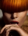
I'd like to revisit this topic and get everyones thought on this topic. Is there one thing that you notice that is missing from all these online tutorials, videos, books, etc.... Think about it.... We have tons of videos on retouching right? D&B, cloning, healing, fixing hair, masking, you name it, there's a video on it. Well, how about color grading? Do you know what color grading is? If you don't, open up a fashion magazine and take a close look at all those ads and editorials. Do you notice a certain "FEEL" to them that you just don't see anywhere else, including here on MM or Retouch Pro. This, is color grading. It;s the final piece of the puzzle that makes an image. Don't quote me on this but I'd assume that after a retouch is complete, the "mood" of the shot goes into place, and this heavily relies on the color grading. Have you ever looked at an ad by GUESS or UGGS or maybe Michael Korrs? You will notice a distinct coloring to them. We all know the Versace look right? And countless amount of retouchers have tried to reproduce this look without success.

I know there's another thread that went deep into color grading and everyone started posting their attempts at it, well, no one achieved a desired look that I would see in a magazine. Now why is this?

I strongly feel that this is the one topic in retouching that is still heavily guarded by the top professional retouchers that work with these high profile designers and ad agencies.

I still don't know what the secret ingredient is but I hope to some day figure it out.

All you retouchers out there, any thoughts on this?

I'd love to see some portfolios here on MM that have great color grading skills, that fund in magazines. Are you out there? A secret society? Show yourselves! LOL

Mar 28 12 10:57 am Link

Retoucher

Natalia_Taffarel

Posts: 7665

Buenos Aires, Buenos Aires, Argentina

It's easier to think there's some secret technique that successful people know and you don't right?

That's not the case. There's no such thing.

There are no secrets.

Most advertising work is composite, selectively colored and perfectly exposed from the start. Every inch is controlled and touched.

Paul Ferradas wrote:
I'd assume that after a retouch is complete, the "mood" of the shot goes into place

This is specially untrue.

Mar 28 12 11:05 am Link

Digital Artist

Koray

Posts: 6720

Ankara, Ankara, Turkey

The hardest part about color grading is getting my hands on an image thats worth it...in my case that is evilgrin

Mar 28 12 11:06 am Link

Photographer

Paul Ferradas

Posts: 113

San Jose, California, US

Natalia,

Do any of your tutorials go in depth on color grading? If not, is it something you will teach in the future?


Natalia_Taffarel wrote:
It's easier to think there's some secret technique that successful people know and you don't right?

That's not the case. There's no such thing.

There are no secrets.

Most advertising work is composite, selectively colored and perfectly exposed from the start. Every inch is controlled and touched.


This is specially untrue.

Mar 28 12 11:27 am Link

Photographer

dvwrght

Posts: 1300

Phoenix, Arizona, US

Paul Ferradas wrote:
I strongly feel that this is the one topic in retouching that is still heavily guarded by the top professional retouchers that work with these high profile designers and ad agencies.

...

I'd love to see some portfolios here on MM that have great color grading skills, that fund in magazines. Are you out there? A secret society? Show yourselves! LOL

sounds like you've got quite a conspiracy theory.

the reason the attempts you see on modelmayhem don't look like the images in the magazines is because there are multiple factors involved - so even if you get the color right, the shot is not going to have the same feel because of the model involved, the lighting, the styling, the pose, photographer, etc.

Mar 28 12 11:36 am Link

Photographer

790763

Posts: 2747

San Francisco, California, US

I also think there are "no secrets," but skills and vision. Think about this: take yourself and say Chef Emeril. Someone will give you the same budget and put you in the same grocery store.

Chances are regardless of the ingredients, I think Chef Emeril will be able to whip up a masterpiece with you...well...I don't know...unless you have a hidden chef-genius persona hidden.

You get my idea. :-)

Getting back to color grading. I think that if you look at the campaigns shot by current rise, Misters Mert and Marcus, their are toned like there is no tomorrow. Any rule of "color correction" has been broke. Shadows look purply-blue, skies look like cyan-blue-green (GUCCI ads for example) all the skin tones look "normal" and acceptable.

I doubt the retouchers who worked on those images have a "special" and "secret" version of Photoshop we don't know about. They're using the same Photoshop that you and I are using—probably one of the CS versions. I am on CS5.


If anyone revisit my chef analogy, we're using the same version of Photoshop yet why can't we produce the same stellar images?


Those retouchers have skills and visions and the protocols to "cook" up the final image. When you are someone like Misters Mert and Marcus you have pretty deep pockets to pay your creative staff. That helped a lot but the final touch as you say is the retouching and color grading which is like assembling all the ingredients and "cooking" the image to advertising perfection.

Mar 28 12 11:43 am Link

Photographer

790763

Posts: 2747

San Francisco, California, US

This mademoiselle know what she is talking about.

Qui Natalia? :-P


Natalia_Taffarel wrote:
It's easier to think there's some secret technique that successful people know and you don't right?

That's not the case. There's no such thing.

There are no secrets.

Most advertising work is composite, selectively colored and perfectly exposed from the start. Every inch is controlled and touched.


This is specially untrue.

Mar 28 12 11:44 am Link

Photographer

Ken Marcus Studios

Posts: 9421

Las Vegas, Nevada, US

Pre-Touch . . . . . rather than Re-touch


Know what you want to begin with and make it happen as much in the camera as you can. Save the retouching for those unwanted, unexpected surprises.

Mar 28 12 11:53 am Link

Photographer

WIP

Posts: 15973

Cheltenham, England, United Kingdom

Paul Ferradas wrote:
Natalia,

Do any of your tutorials go in depth on color grading? If not, is it something you will teach in the future?


If anyone know it's Natalia who retouches for advertising, it's not a secret and we all would be grateful if she'd share her knowledge.

Mar 28 12 11:53 am Link

Photographer

JamesMcGrew

Posts: 138

Lake Oswego, Oregon, US

This reminds me of many threads and articles written by "artists" looking for the secret medium of historic masters.  Yes, all technical aspects ultimately influence the painting's appearance including the types of oils, resins, pigments and their grinding, etc.  However, the bottom line is that there is no substitute for skill acquired through many years of painting and drawing and experimenting.  Today's artists have the ability to use the same or similar mediums as Old masters up through 19th century masters (which is when I think fine art painting hit its peak in terms of technical quality), however very few ever achieve the same look and feeling because few artists spend the countless hours of time drawing and painting all day, every day since childhood which we saw in most of the great painters throughout history.

Likewise, I don't think there is any secret formula to retouching, "color grading" etc.  Whenever I see my images reproduced in magazines or posters after the graphic design team deals with the image, the images always bring a smile to my face because they seem so much more dramatic when in context of a publication.  But the bottom line is that the image is still the same as it was on my computer screen, just in print, larger, and in a different context.

Mar 28 12 12:00 pm Link

Retoucher

ST Retouch

Posts: 393

Amsterdam, Noord-Holland, Netherlands

Paul,
I saw your port and I like your work a lot, very clean work .
Very professional and my compliments for your work.
Your question is very interesting and I will tell you why.
Many photographers ask similar questions , because by default, if they see some images in some "top magazines" , they think that is trendy.
But reality is opposite.
We can see in industry a tons of snap shots , captured with so many mistakes, retouched with so many mistakes, without any composite work.
And in a lot of cases color grading is tool to cover all amateur mistakes from original file or retoucher's work and to give to image " some professional effects".
Maybe for you it will be interesting to use next steps ( very quick steps) to add some "editorial effects" if you like with just few steps.
1. Open your file in Photoshop
2. Duplicate this layer
3. In palette layer on the bottom create new hue/saturation layer (fourth from the right side)
4. Put saturation on -100
5. Put on this new same layer blending mode to soft light
6. Duplicate this layer
7. Play with opacity on that duplicated layer until you are satisfied with results.
8. Flatten image
9. Duplicate this layer
10. Go to image- adjustment - photo filter ( or color balance) and add some colors effects which u like.
11. Go to curves and play around until u r satisfied with results.

With these very quick steps you can add very easy some " editorial effects" .
Try many times these steps until you find your way.
But I think you don't have mistakes in your work , so you don't need to use these steps to cover mistakes which is very trendy these days in "industry" .
Keep your good work , keep your own style , and remember on covers you can see sometimes great work but you can see and tons of snap shots covered with color grading.
Regards!

Mar 28 12 12:17 pm Link

Artist/Painter

sdgillis

Posts: 2464

Portland, Oregon, US

Special Colors (inks) have been used forever in printing to make things stand out more.  I suggest you also check out the Wired magazine covers that specifically use pantone inks to diversify imagery.  These inks are dropped in through separation.  It never hurts to learn how color separation works and how you can define those color spots you are seeking. 

I always thought grading was more about equalizing images by coating to a certain sheen, I'll have to check that more.

Mar 28 12 12:52 pm Link

Retoucher

Rob Mac Studio

Posts: 1105

London, England, United Kingdom

sdgillis wrote:
Special Colors (inks) have been used forever in printing to make things stand out more.  I suggest you also check out the Wired magazine covers that specifically use pantone inks to diversify imagery.  These inks are dropped in through separation.  It never hurts to learn how color separation works and how you can define those color spots you are seeking. 

I always thought grading was more about equalizing images by coating to a certain sheen, I'll have to check that more.

Sorry but you are talking out your hat.

Mar 28 12 01:03 pm Link

Photographer

Paul Ferradas

Posts: 113

San Jose, California, US

Thank you for the kind words and the technique work. You have some great work yourself.


I'm just curious as to why there's not one tutorial out there on color grading? Makes no sense.


ST Retouch wrote:
Paul,
I saw your port and I like your work a lot, very clean work .
Very professional and my compliments for your work.
Your question is very interesting and I will tell you why.
Many photographers ask similar questions , because by default, if they see some images in some "top magazines" , they think that is trendy.
But reality is opposite.
We can see in industry a tons of snap shots , captured with so many mistakes, retouched with so many mistakes, without any composite work.
And in a lot of cases color grading is tool to cover all amateur mistakes from original file or retoucher's work and to give to image " some professional effects".
Maybe for you it will be interesting to use next steps ( very quick steps) to add some "editorial effects" if you like with just few steps.
1. Open your file in Photoshop
2. Duplicate this layer
3. In palette layer on the bottom create new hue/saturation layer (fourth from the right side)
4. Put saturation on -100
5. Put on this new same layer blending mode to soft light
6. Duplicate this layer
7. Play with opacity on that duplicated layer until you are satisfied with results.
8. Flatten image
9. Duplicate this layer
10. Go to image- adjustment - photo filter ( or color balance) and add some colors effects which u like.
11. Go to curves and play around until u r satisfied with results.

With these very quick steps you can add very easy some " editorial effects" .
Try many times these steps until you find your way.
But I think you don't have mistakes in your work , so you don't need to use these steps to cover mistakes which is very trendy these days in "industry" .
Keep your good work , keep your own style , and remember on covers you can see sometimes great work but you can see and tons of snap shots covered with color grading.
Regards!

Mar 28 12 01:50 pm Link

Retoucher

Natalia_Taffarel

Posts: 7665

Buenos Aires, Buenos Aires, Argentina

There's no "one" as you call it "grading"

Every image is different.

Show us what you mean by grading.

Mar 28 12 02:18 pm Link

Retoucher

Natalia_Taffarel

Posts: 7665

Buenos Aires, Buenos Aires, Argentina

dp monster strikes again

Mar 28 12 02:18 pm Link

Photographer

Marcus Turner Photo

Posts: 201

Chicago, Illinois, US

Yeah it's just messing around until you get something you like.  De-saturation or making colors vibrant.  I don't think there's anything real special about it other than certain retouches or photographers taste of color blend choices.

Now the choice to that colors (or color combination) or tones to us some of it based of color theory.

Mar 28 12 02:25 pm Link

Photographer

Fashion Photographer

Posts: 14388

London, England, United Kingdom

Natalia_Taffarel wrote:
There's no "one" as you call it "grading"

Every image is different.

Show us what you mean by grading.

Natalia, "Grading" is a fairly standard term in post-production.

Mar 28 12 02:37 pm Link

Retoucher

ST Retouch

Posts: 393

Amsterdam, Noord-Holland, Netherlands

Paul ,
I am not so perfect in English , because English is not my native language , but I 'll try to explain.
There are no classic tutorials for color grading, you have to make your own color grading with your imagination.
Let me say one example.
I work a lot this kind of retouching with fashion companies, composite work and similar styles.
And the worst thing what I can find in my job is when I receive file for composite work  from fashion company and at the same time they send me some example which they saw from some magazines or cover with some color grading.
And they tell me we want exactly like this , then I start to laugh.
Why I start to laugh?
Because I can not copy color grading, because I don't know which colors, with which opacity, with which blending previous retoucher made on  file.
It is the same if you want to try to copy my work let me show one example.
https://photos.modelmayhem.com/photos/120215/10/4f3bf52d7f445.jpg
You can not copy this, because you don't know which colors I used for blending and whit which opacity.
Maybe you can make something similar but not exactly the same.
Even myself, If I try again to make same file , I can not make again this file with exactly same colors, simply I forgot which colors I used and with which opacity and blending with this file.
I hope so u can understand me what I mean.
I gave u quick steps , you have to spend with these steps 2-3 days and to try tons of examples , to find your way.
Also between these steps you can play your own steps, you can play these steps on the different parts of the image, for example separate sky and make sky with one style of color grading, in next step separate model, and on model make another style of color grading, leave your imagination to work.
That's the color grading smile be creative with colors, you know the steps .
Thank you and regards!

Mar 28 12 02:48 pm Link

Photographer

Paul Ferradas

Posts: 113

San Jose, California, US

Here you go Natalia, this is one example

http://www.ibarraphoto.com/

He teaches his coloring or "grading" as some know it.

You can ask most retouchers to take an image and make it look like his, I'd like to see how many come close. There's a certain methodology, trait, technique, call it what you will to get this sort of look. I think his grading is more on the artistic extreme but it gives you an idea of what I'm talking about. It's beyond all the retouching techniques that I've seen out there. It must be some sort of blending mode combinations... selective coloring.... curves.... all at once? Who knows...


Natalia_Taffarel wrote:
There's no "one" as you call it "grading"

Every image is different.

Show us what you mean by grading.

Mar 28 12 02:51 pm Link

Photographer

Paul Ferradas

Posts: 113

San Jose, California, US

Thanks for posting this, it's a great example. I too try to figure out the same. I'll look at an ad online and try to match the colors but it's not that easy. You would think just by taking CMYK or RGB readings from the source image it would give you the exact color but I guess there's more to it than that. Adding those values just gives you the HUE value? Does it not give Saturation and Luminosity? I will look at certain muted skin tones in magazine ads and try to replicate them but I find it very hard to do and i wonder sometimes if i'm just doing it wrong and there's an easier way to do it.


ST Retouch wrote:
Paul ,
I am not so perfect in English , because English is not my native language , but I 'll try to explain.
There are no classic tutorials for color grading, you have to make your own color grading with your imagination.
Let me say one example.
I work a lot this kind of retouching with fashion companies, composite work and similar styles.
And the worst thing what I can find in my job is when I receive file for composite work  from fashion company and at the same time they send me some example which they saw from some magazines or cover with some color grading.
And they tell me we want exactly like this , then I start to laugh.
Why I start to laugh?
Because I can not copy color grading, because I don't know which colors, with which opacity, with which blending previous retoucher made on  file.
It is the same if you want to try to copy my work let me show one example.
https://photos.modelmayhem.com/photos/120215/10/4f3bf52d7f445.jpg
You can not copy this, because you don't know which colors I used for blending and whit which opacity.
Maybe you can make something similar but not exactly the same.
Even myself, If I try again to make same file , I can not make again this file with exactly same colors, simply I forgot which colors I used and with which opacity and blending with this file.
I hope so u can understand me what I mean.
I gave u quick steps , you have to spend with these steps 2-3 days and to try tons of examples , to find your way.
Also between these steps you can play your own steps, you can play these steps on the different parts of the image, for example separate sky and make sky with one style of color grading, in next step separate model, and on model make another style of color grading, leave your imagination to work.
That's the color grading smile be creative with colors, you know the steps .
Thank you and regards!

Mar 28 12 02:57 pm Link

Photographer

mathieu drut

Posts: 404

Santa Clara, California, US

Fashion Photographer wrote:

Natalia, "Grading" is a fairly standard term in post-production.

I'm pretty sure Natalia meant: there isn't one style/technique of grading. She didn't say it didn't exist.

Mar 28 12 03:16 pm Link

Retoucher

ST Retouch

Posts: 393

Amsterdam, Noord-Holland, Netherlands

Paul
I made one quick example, maybe it is too much, but I spend 4 minutes on file.
I made mix from blue, orange and yellow colors
Just to see how quick it can be
https://photos.modelmayhem.com/photos/120328/15/4f738cf6b85da.jpg

Results are no perfect, because I really made this with 4 minutes job, but just to see how fast u can play with colors
regards!

Mar 28 12 03:17 pm Link

Photographer

Paul Ferradas

Posts: 113

San Jose, California, US

It's on an interesting track. For this type of image which has that Maxim, FHM feel to it I would probably leave it as close as possible to the normal colors except for some warming colors. i think your technique will definitely work better with fashion. What were your steps?


ST Retouch wrote:
Paul
I made one quick example, maybe it is too much, but I spend 4 minutes on file.
I made mix from blue, orange and yellow colors
Just to see how quick it can be
https://photos.modelmayhem.com/photos/120328/15/4f738cf6b85da.jpg

Results are no perfect, because I really made this with 4 minutes job, but just to see how fast u can play with colors
regards!

Mar 28 12 03:22 pm Link

Retoucher

ST Retouch

Posts: 393

Amsterdam, Noord-Holland, Netherlands

Same file without orange colors, just blue-yellow blending
https://photos.modelmayhem.com/photos/120328/15/4f7390c7c7c13.jpg

Mar 28 12 03:30 pm Link

Retoucher

ST Retouch

Posts: 393

Amsterdam, Noord-Holland, Netherlands

You can see difference between colors , I used in first file blue, orange and yellow colors in second example only blue and yellow, you can try and with other colors , leave your imagination, that's why I told u to try tons of examples with different colors
I gave u steps in one of my previous posts, play  with opacity on steps 5 and 7 , on step 10 play with colors with photo filters or color balance whatever u want and finally curves.
Also u can use contrast later, brightness , selective colors, play around with imagination.

Mar 28 12 03:41 pm Link

Photographer

Paul Ferradas

Posts: 113

San Jose, California, US

Cool, I'll give it a try. Thanks


ST Retouch wrote:
You can see difference between colors , I used in first file blue, orange and yellow colors in second example only blue and yellow, you can try and with other colors , leave your imagination, that's why I told u to try tons of examples with different colors
I gave u steps in one of my previous posts, play  with opacity on steps 5 and 7 , on step 10 play with colors with photo filters or color balance whatever u want and finally curves.
Also u can use contrast later, brightness , selective colors, play around with imagination.

Mar 28 12 03:57 pm Link

Retoucher

George Thomson

Posts: 699

Concord, California, US

Paul Ferradas wrote:
I still don't know what the secret ingredient is but I hope to some day figure it out.

All you retouchers out there, any thoughts on this?

you may find your answer in the videos here:
(notice the capture-monitors and the direct result of the capture)
http://www.vogue.it/en/magazine/vogue-s … te-couture
pay attention to:
time: 00:53
time: 01:18
time: 01:38
time: 01:58
...etc
and notice the session printouts on the board in the end of the video, which is just after the photo-session.
(before any retoucher has touched them)


or in the video here:
http://www.youtube.com/watch?v=ieFxCM1WS1o


I can't see any photographer leaving too much creative latitude to some retoucher.

Mar 29 12 10:05 am Link

Photographer

Tyler C Johnson

Posts: 164

San Diego, California, US

Imho I think the difference between the "attempts" you are speaking of and what a pro retoucher accomplishes is the attention to detail in the actual color composition of the photo. If you take a photo as shot with a standard all over curves adjustment or some such and simply layer over a few soft light toning layers its simply going to look like you put a flat layer of color over a flat photo. Selective color adjustment is what makes a pro image pop like your speaking of.

Mar 29 12 10:34 am Link

Photographer

Brian Morris Photography

Posts: 20901

Los Angeles, California, US

Study Video color grading to get more familiar with the term... also take some Color Theory classes so that it makes sense how colors work with and against each other.


This Video applies to Still images as well for most intensive purposes..... Its about the detail! http://www.youtube.com/watch?v=2xTZtgApuDI

http://www.colormatters.com/color-and-d … lor-theory

Mar 29 12 10:46 am Link

Photographer

Fashion Photographer

Posts: 14388

London, England, United Kingdom

mathieu drut wrote:

I'm pretty sure Natalia meant: there isn't one style/technique of grading. She didn't say it didn't exist.

Fair enough. Yes, that's absolutely the case.

Mar 29 12 10:48 am Link

Retoucher

Sofia Zasheva

Posts: 154

Sofia, Sofija grad, Bulgaria

JamesMcGrew wrote:
This reminds me of many threads and articles written by "artists" looking for the secret medium of historic masters.  Yes, all technical aspects ultimately influence the painting's appearance including the types of oils, resins, pigments and their grinding, etc.  However, the bottom line is that there is no substitute for skill acquired through many years of painting and drawing and experimenting.  Today's artists have the ability to use the same or similar mediums as Old masters up through 19th century masters (which is when I think fine art painting hit its peak in terms of technical quality), however very few ever achieve the same look and feeling because few artists spend the countless hours of time drawing and painting all day, every day since childhood which we saw in most of the great painters throughout history.

Likewise, I don't think there is any secret formula to retouching, "color grading" etc.  Whenever I see my images reproduced in magazines or posters after the graphic design team deals with the image, the images always bring a smile to my face because they seem so much more dramatic when in context of a publication.  But the bottom line is that the image is still the same as it was on my computer screen, just in print, larger, and in a different context.

This is pretty much what I think about colors... Coloring is as much theory and work as it is talent. The fact that there's something in common between editorials colorwise is that the one who made some of them knows theory, has the skill and has watched those before him/her.. and they did the same and it's all down to someone else's experience and harmonious combinations between color stains.

Conspiracy theory and single-click solutions for the win...

Mar 29 12 11:48 am Link

Photographer

J O H N A L L A N

Posts: 12221

Los Angeles, California, US

I'm not an expert at this and I really don't do it on my images - but I have eyes and I read the fashion magazines, as well as read this forum when it talks about this process and attempts to mimic it.

From what I see, it SO much depends on the original coloring (colors present) in the shot from camera. As well as the lighting.
Then for lack of a better (more accurate explanation), specific colors are pulled through the image.

This is why the formulaic approaches constantly fail I believe. Because you can't just apply some arbitrary (worked for one image) color process to a given image and have it look like anything but a rather poor PS filter. One really has to understand color and how it mixes.

Mar 29 12 09:42 pm Link

Photographer

_volt_

Posts: 4

Manila, National Capital Region, Philippines

i couldnt follow through! waaah
can you attach a psd file example please?

Oct 14 12 02:25 pm Link

Retoucher

Alena Hovorkova

Posts: 123

Brno, Jihomoravsky, Czech Republic

John Allan wrote:
I'm not an expert at this and I really don't do it on my images - but I have eyes and I read the fashion magazines, as well as read this forum when it talks about this process and attempts to mimic it.

From what I see, it SO much depends on the original coloring (colors present) in the shot from camera. As well as the lighting.
Then for lack of a better (more accurate explanation), specific colors are pulled through the image.

This is why the formulaic approaches constantly fail I believe. Because you can't just apply some arbitrary (worked for one image) color process to a given image and have it look like anything but a rather poor PS filter. One really has to understand color and how it mixes.

+1

For me - as I understand (and use) it - ´grading´ is some more complex ´image-equalizing´ process - where not only color, but also all other related aspects of an image are involved (color /tone /brightness /contrast /level of detail left, enhanced or - ´sacrificed´ on the other hand, color/tone clipping limits, etc.).
But - whatever technique(s) may be used to alter those aspects/values of image (sometimes even the most basic simple techniques may do the trick) - the workflow /and therefore the final result/ always, imo, is just relative to (and dependent on) the initial quality/type/lighting/characteristics of the original photo.
No ´general/universal´ rules/techniques here, imo.
(That may also be why there are only few tutorials available on that. It is not easy - if possible at all - to define/describe some ´universally applicable/generally working/ rules´ for such a relative-based task .. As already mentioned.)

Since magazines usually have their photos on a very high quality level - the final ´visual feel´ to it (after some post-work has been done) also usually feels so great - but - that is not due the post-work only, but - a combination of both: both great photo and post-work (with either some subtle/traditional - or experimental - or just simply random/accidental-effect approach applied), imo.

I do not work for top magazines myself - so my experience can´t come from there -
but - (both as a retoucher and a Photoshop instructor/teacher myself) - I can see many people are trying to find  - or asking for (in my workshops) ´revealing´ the ´secret techniques´ behind many postproduction workflows.
That applies not only for ´grading´ - but also for ´masking´, ´compositing´, ´carving´ .. whatever. And/But - (in my experience/workshops, at least) they are usually pretty dissappointed, literarly, in the end - when they find out that (for example) masking hair in pixel-level can actually be done with just a (well chosen/planned/organized, though) combination of a few very essential simple steps/techniques/tools only, in some cases, actually. No ´magic secret tool nor workflow´ applied, as they expected.

Just an off-topic example - but - the same perhaps applies for ´grading secrets´ (or whatever else in post-work, basically), imo.
Just my thoughts, though.
a.

Oct 15 12 04:18 am Link

Retoucher

pixel dimension ilusion

Posts: 1550

Brussels, Brussels, Belgium

ST Retouch wrote:
Paul ,
I am not so perfect in English , because English is not my native language , but I 'll try to explain.
There are no classic tutorials for color grading, you have to make your own color grading with your imagination.
Let me say one example.
I work a lot this kind of retouching with fashion companies, composite work and similar styles.
And the worst thing what I can find in my job is when I receive file for composite work  from fashion company and at the same time they send me some example which they saw from some magazines or cover with some color grading.
And they tell me we want exactly like this , then I start to laugh.
Why I start to laugh?
Because I can not copy color grading, because I don't know which colors, with which opacity, with which blending previous retoucher made on  file.
It is the same if you want to try to copy my work let me show one example.
https://photos.modelmayhem.com/photos/120215/10/4f3bf52d7f445.jpg
You can not copy this, because you don't know which colors I used for blending and whit which opacity.
Maybe you can make something similar but not exactly the same.
Even myself, If I try again to make same file , I can not make again this file with exactly same colors, simply I forgot which colors I used and with which opacity and blending with this file.
I hope so u can understand me what I mean.
I gave u quick steps , you have to spend with these steps 2-3 days and to try tons of examples , to find your way.
Also between these steps you can play your own steps, you can play these steps on the different parts of the image, for example separate sky and make sky with one style of color grading, in next step separate model, and on model make another style of color grading, leave your imagination to work.
That's the color grading smile be creative with colors, you know the steps .
Thank you and regards!

next time make an action from it smile

Oct 15 12 05:22 am Link

Photographer

Giacomo Cirrincioni

Posts: 22232

Stamford, Connecticut, US

Natalia_Taffarel wrote:
There's no "one" as you call it "grading"

Every image is different.

Show us what you mean by grading.

Fashion Photographer wrote:
Natalia, "Grading" is a fairly standard term in post-production.

It comes from cinema where there were at least two steps to the process, controlled by different people in different films.

The first step was color correction (you only had 3200 and 5500 balanced films) where you corrected for any white balance and basic contrast/hsl issues.  Then it went to be graded to develop a "look".  The "look" part was/is called grading (to differentiate it from color correction).

Oct 15 12 06:53 am Link

Photographer

Kelvin Hammond

Posts: 17397

Billings, Montana, US

Natalia_Taffarel wrote:
There's no "one" as you call it "grading"

Every image is different.

Show us what you mean by grading.

While true, it could also be said that the images contained in a campaign are markedly similar, even when shot at different locations,

...which gives rise to what i think the OP is fishing for: predictable workflow for color grading.

I've noticed that Pascal Dangin's group can maintain a signature color graded look for their clients over a period of years, regardless of the diversity of images the photographer gives them.

Oct 15 12 08:19 am Link

Photographer

NothingIsRealButTheGirl

Posts: 35726

Los Angeles, California, US

Ronald Nyein Zaw Tan wrote:
I think that if you look at the campaigns shot by current rise, Misters Mert and Marcus, their are toned like there is no tomorrow.

They are the subjects of a New Yorker article

http://www.newyorker.com/archive/2004/0 … 27fa_fact1

Smedley Whiplash wrote:
I've noticed that Pascal Dangin's group can maintain a signature color graded look for their clients over a period of years, regardless of the diversity of images the photographer gives them.

He is also the subject of a New Yorker article

http://www.newyorker.com/reporting/2008 … ct_collins

Just fyi

Oct 15 12 08:27 am Link

Photographer

Gulag

Posts: 1253

Atlanta, Georgia, US

take a look at this video:

http://youtu.be/z8OaHAQT1fA

or here: http://youtu.be/g0yfeqafLIY

Oct 15 12 09:06 am Link