|
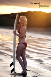
go for it  Aug 25 12 02:55 am Link A Murrain Photography wrote:
Aug 25 12 02:58 am Link JustinAllenPhotography wrote: Justin - the rules are: You ask questions. You dont comment on other's portfolios in this thread, thats my job Aug 25 12 10:33 am Link JustinAllenPhotography wrote: Unless there is a compelling story line, I disapprove of composites as they confuse the viewer. Pick the best image of the series and post that one only. MM is about photography (still images) not movie making. The only clear benefit to post composites would be for MUA's or retouchers to show before/after effect. Aug 25 12 10:39 am Link Art of the nude wrote: Here is just a pretty naked girl posing with no unique concept. Yea, the photography is good (light , contrast), but no unique concept behind. Of the 7000 viewers only 7 commented, which means only 1 in 1000 viewers liked it enough to leave a note. Aug 25 12 10:50 am Link Erin Dawson Photography wrote: Light is no good and neither is the concept clear Aug 25 12 10:56 am Link Liquid Mind wrote: Once you get more images into your port, delete this image as one can see neither your face , nor your body. Also delete the one to the left. Aug 25 12 11:04 am Link Go head Aug 25 12 11:15 am Link If you're still doing critiques, I'd be amenable as to hearing what you have to say. Aug 25 12 11:19 am Link A Murrain Photography wrote: Both pose and expression are clearly contrived. Delete. Aug 25 12 11:20 am Link Farenell Photography wrote: 15,000+ posts in this forum means you are spending way too much time here, rahter than using your talents shooting Aug 25 12 11:27 am Link [url=http://florida.arrests.org/Arrests/Tyler_Waitt_2207044 wrote: Delete them all as they seem amateurish snapshots and you are just smiling in most. Feel free however to send them to your mom, she will love them. Aug 25 12 11:30 am Link I was skipped as well. If you could give me some advice, that would be great Aug 25 12 11:58 am Link Yes, please let me know - I am trying to clean up my port... If you have time, I would be open to (2) images Aug 25 12 12:09 pm Link Rosemarie Bennet wrote: Delete all MedievalIce images (except the purple dress, which I love). While the setting is great, a standing pose is not the best way to display large boobs like yours as they are bound to droop. If you want to show your bare breasts, do so in a laying position. The results will be very alluring. Similar position like the photo with the purple dress would be ideal Aug 25 12 12:17 pm Link justforfunphotography wrote: As mentioned again and again previously, delete images that are just variations of the same shoot. This includes, but not limited to: Aug 25 12 12:25 pm Link Please? I have very stuff on here tho. Heh. Aug 25 12 01:16 pm Link if you could i'd muchly appreciate it (i posted yesterday as well but i understand its easy to miss some )Aug 25 12 04:04 pm Link Thank you I appreciate it! Aug 25 12 06:30 pm Link ForealsPhotography wrote: The light seems very harsh in this and its sister image and I just frankly dont see anything unique or captivating. Aug 25 12 06:43 pm Link JashManuel wrote: This photo is ok, but its just one step above from a snapshot. THe background is blurry yet enough seen to confuse - is it perhaps a cemetery? Just delete it. Aug 25 12 06:47 pm Link im curious, as ive done a lot of weeding and revamping Aug 25 12 07:00 pm Link lets do this Aug 25 12 08:15 pm Link Cole Morrison wrote: This nude one does not stand out as you offer similar expression like in several other photos, plus you have another, better composed image from the same stairell scene. If I were to advise one thing for you that would be to work on a wider range of emotive expressions as you develop your port. Aug 26 12 06:07 am Link MidnightSun Designs wrote: Your entire top row ought to go as the girls just stand there and smile. This particular one's smile is most visibly contrived. Ddi you tell her to say cheese ? Aug 26 12 06:13 am Link Yes please Aug 26 12 06:17 am Link My port has alot of bad images, good luck trying to find the worst one. Lol! But sure, i would love to know Aug 26 12 06:28 am Link Love this. Lets play. Aug 26 12 06:47 am Link Becki H wrote: Congratulations Becki. Yours just got selected as poster child of poorly constructed ports. Your portfolio in its current form is like a flower garden needing intense tender loving care to rid it of overgrown bushes and its encroaching weeds. The good news is that some basic trimming and weeding can clean it up to expose some of its gems and offer visitors a positive viewing experience. Aug 26 12 08:17 am Link I would like to know what photo(s) I should remove :-) Aug 26 12 08:38 am Link KyleeBelle wrote: Unlike your other images, this one is amateurish so get rid of it. I know your intent was to highlight your interest in fitness modelling, but you need to maintain certain minimum standards of photography which this image does not meet. I suggest in the future you create a snowboarding scene with some action as well. BTW I am an avid snowboarder myself Aug 26 12 10:29 am Link I've not been able to update with my latest professional jobs yet, so when I do I'll definitely be wanting to delete a lot of my current portfolio. As such, I'd love your opinion! Aug 26 12 10:33 am Link Ms Cupcake Couture wrote: Hey Ms Cupcake. First I would suggest removing "Couture" from your name because it makes things confusing. Couture indicates you are a wardrobe stylist, however it is apparent from your port that you are a model. Thus I will critique you as a model only. Aug 26 12 12:33 pm Link Jessie Talulah wrote: While the photography is good, your first 6 images offer the same expression. At the least, delete this one: Aug 26 12 01:25 pm Link H Jules wrote: Wardrobe is not my expertise, but since you asked.... Aug 26 12 03:51 pm Link I need to clean house anyway. Have at it. Aug 26 12 03:54 pm Link ikonas wrote: thanks! Aug 26 12 04:19 pm Link I would love to know if you have the time. Aug 26 12 04:24 pm Link ikonas wrote: Yeah, I totally know what you mean. Thank you! Aug 26 12 04:25 pm Link Help me out? Thanks Aug 26 12 04:46 pm Link |