Model
Brenda MacSwan
Posts: 66
Los Angeles, California, US
Would Love your critique.
Model
CamiAnn
Posts: 794
Los Angeles, California, US
I'm always looking to improve so would love your opinion...thank you!

Model
KCLynne
Posts: 466
Omaha, Nebraska, US

Photographer
ikonas Boston
Posts: 736
Boston, Massachusetts, US

CamiAnn wrote:
I'm always looking to improve so would love your opinion...thank you! Over photoshopped and unlike your other images, your smile is contrived. Delete.
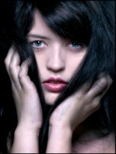
![https://photos.modelmayhem.com/photos/120701/22/4ff131a45077f_m.jpg]()
great port, and here is one of my favorite as it conveys class, elegance, beauty. Great light and vintage rendering provide nice ambiance.
![https://photos.modelmayhem.com/photos/120203/23/4f2ce523aff4d_m.jpg]()
Photographer
ikonas Boston
Posts: 736
Boston, Massachusetts, US
Elizabeth Michellle wrote:
I would really like to know your opinioN  Mediocre B&W rendering with little contrast and not an exciting expression. An ok image, but has no "wow" factor. Delete it.
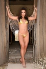
![https://photos.modelmayhem.com/photos/120620/12/4fe21f6979751_m.jpg]()
Your AVI is a superb image - light , pose, composition, etc - editorial stuff. My personal favorite though is your nerdish, sensual look. Its close, its personal, curvy and super alluring.
![https://photos.modelmayhem.com/photos/120620/12/4fe21e68df74f_m.jpg]()
Photographer
ikonas Boston
Posts: 736
Boston, Massachusetts, US
Kristen Mussari wrote:
You skipped me  The makeup here is minimal, and you did not provide sufficient foundation thus exposing her skin imperfection from this closeup view. No excitment here.
![https://photos.modelmayhem.com/photos/120813/20/5029c880e3f01_m.jpg]()
I love this image, both for the model's beauty (as enhanced by your work), composition and photography
![https://photos.modelmayhem.com/photos/120402/18/4f7a56c99a4fa_m.jpg]()
Photographer
ikonas Boston
Posts: 736
Boston, Massachusetts, US
Arwendur wrote:
Tell me my worst Compared to your other images, this one is the weakest due to the model's expression.
![https://photos.modelmayhem.com/photos/090317/17/49c03f0c75d11_m.jpg]()
While the following image got very few comments considering all the views, it is my favorite. The zipper, her pose and expression tell a story. I find it super erotic.
![https://photos.modelmayhem.com/photos/071015/19/4713f2b161d80_m.jpg]()
Photographer
ikonas Boston
Posts: 736
Boston, Massachusetts, US
Michaela181 wrote:
I would love to hear your opinion This image should be the first to go as it projects you somewhat heavier than you really are. Even worse, your expression is undefined and the image is blurry.
![https://photos.modelmayhem.com/photos/120514/16/4fb197cec4b88_m.jpg]()
Makeup, accessories and great photography enhance your beauty here. A truly gorgeous Cleaopatra look alike.
![https://photos.modelmayhem.com/photos/111128/19/4ed450e4a5711_m.jpg]()
Photographer
ikonas Boston
Posts: 736
Boston, Massachusetts, US
Brenda MacSwan wrote:
Would Love your critique. I always recommend posting only one image from one scene if the dress and concept are the same. Less is more. Here is an example and there are several other near duplicates in your posrt so you should delete them.
![https://photos.modelmayhem.com/photos/120623/20/4fe6873fb78e5_m.jpg]()
This one, while a bit over photoshopped is still breathtaking. In the future, make sure your photographer retouch work is moderate and less obvious.
![https://photos.modelmayhem.com/photos/120801/11/50197bd2e0488_m.jpg]()

Model
Elizabeth Michelle
Posts: 49
Garden Grove, California, US
ikonas wrote:
Mediocre B&W rendering with little contrast and not an exciting expression. An ok image, but has no "wow" factor. Delete it.
![https://photos.modelmayhem.com/photos/120620/12/4fe21f6979751_m.jpg]()
Your AVI is a superb image - light , pose, composition, etc - editorial stuff. My personal favorite though is your nerdish, sensual look. Its close, its personal, curvy and super alluring.
![https://photos.modelmayhem.com/photos/120620/12/4fe21e68df74f_m.jpg]() thanks!
Photographer
ikonas Boston
Posts: 736
Boston, Massachusetts, US
KCLynne wrote:
Count me in. Frankly I do not know much about plus size modeling field and what specifically would be prospective clients looking for. Should you look as heavy as possible ? Or is there certain ideal dress size? So I will avoid this issue.
Your first image expression to me means fright. Is that what you intended? If not, delete it.
![https://photos.modelmayhem.com/photos/120815/18/502c4ffd78941_m.jpg]() . .
Great light, composition and super B&W rendering here:
https://www.modelmayhem.com/portfolio/pic/29336037

Makeup Artist
PaulaMUAH
Posts: 36
Houston, Texas, US
I'd love to hear! Thank you!

Model
Jason Rahim
Posts: 32
Miller Place, New York, US
please, would like to know

Model
HillaryPaige
Posts: 1
Rochester, New York, US
Just Starting and Curious

Photographer
Arwendur
Posts: 35
Worcester, England, United Kingdom
ikonas wrote:
Compared to your other images, this one is the weakest due to the model's expression.
![https://photos.modelmayhem.com/photos/090317/17/49c03f0c75d11_m.jpg]()
While the following image got very few comments considering all the views, it is my favorite. The zipper, her pose and expression tell a story. I find it super erotic.
![https://photos.modelmayhem.com/photos/071015/19/4713f2b161d80_m.jpg]() Thanks, appreciated
Photographer
ikonas Boston
Posts: 736
Boston, Massachusetts, US
PaulaMUAH wrote:
I'd love to hear! Thank you! While the photo is beautiful, I dont perceive any unique hairstyle here.
![https://photos.modelmayhem.com/photos/120729/12/50158eb50d4a0_m.jpg]()
Here is a dramatic transformation, however in the future I propose combining before/after in the same image for easier viewing and comparison.
![https://photos.modelmayhem.com/photos/120815/16/502c32f764e14_m.jpg]()
Photographer
ikonas Boston
Posts: 736
Boston, Massachusetts, US
Jason Rahim wrote:
please, would like to know Get rid of this couple image and its twin as this particular female pose and expression does not add to the value of your port
![https://photos.modelmayhem.com/photos/120808/09/5022930e59585_m.jpg]()
I love this image, just because
![https://photos.modelmayhem.com/photos/120717/07/5005759b8be12_m.jpg]()
Photographer
ikonas Boston
Posts: 736
Boston, Massachusetts, US
HillaryPaige wrote:
Just Starting and Curious You only have three images, and they are good, so keep them all. Here is my fave due togreat light, location and composition
![https://photos.modelmayhem.com/photos/120813/12/50295047edeb6_m.jpg]()
In your future work, you ought to strive to display a wider range of emotions.
Model
Polly Anther
Posts: 53
Leicester, England, United Kingdom
Yes please
Photographer
ZeeZedZee
Posts: 38
Kansas City, Missouri, US
Go ahead and check mine out, thanks.
Photographer
KFPhotography
Posts: 67
New York, New York, US
Would love to find out which one
Photographer
ikonas Boston
Posts: 736
Boston, Massachusetts, US
Polly Anther wrote:
Yes please Sorry to lay this on you, but this image, which you got most comments, should go. While the wardrobe, pose and expressions are cute, you look way beyond your age, plus the pose is not flattering to your stomach.
![https://photos.modelmayhem.com/photos/120720/17/5009f3c9e040e_m.jpg]()
This one is my fave. You look absolutely stunning, great pose and expression, and the photgraphy is superb.
https://www.modelmayhem.com/portfolio/pic/29553118
Great wardrobe, pose, expression and setting here
![https://photos.modelmayhem.com/photos/120728/16/50147821576a2_m.jpg]()
Photographer
ikonas Boston
Posts: 736
Boston, Massachusetts, US
KFPhotography wrote:
Would love to find out which one You posted way too many images in your port, many are variations of the same concept. For example this one should be deleted but there are many such examples. Prune your port to leave only 20-30 images and your port value will go up 200%
https://www.modelmayhem.com/portfolio/pic/24376875
Photographer
ikonas Boston
Posts: 736
Boston, Massachusetts, US
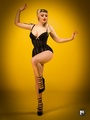
KFPhotography wrote:
Would love to find out which one I love this concept. Great job!
![https://photos.modelmayhem.com/photos/110808/20/4e40ae4d31440_m.jpg]()
Model
Anne Winterson
Posts: 13
Taipei City, Taipei City, Taiwan
Please let me know! Thanks!
Model
KCLynne
Posts: 466
Omaha, Nebraska, US
never mind that.....i forgot i was already here
Photographer
RS_Images
Posts: 5
London, England, United Kingdom
Photographer
ikonas Boston
Posts: 736
Boston, Massachusetts, US
Rob Steele Images wrote:
I'm game! It is evident at a glance that you are a first class photographer. Your use of light, beautiful models in great pose placed in interesting setting help create visually pleasing, sensual, and often erotic images.
I think you went a bit overboard by posting too many images of Model Jenny. Yeah, she is gorgeoous, and you have done superb job capturing her beauty, but this is your port, not hers. You pick which ones to remove (or hide). One particular I would delete is this composite image as I see no unique concept, plus in general composites are a liability. Remember, less in more.
https://www.modelmayhem.com/portfolio/pic/29106034
As it is hard to chose your "worst" it is even harder to select a favorite as I see many. Here is one of them for the model's expression and pose. The light provides a great ambiance.
![https://photos.modelmayhem.com/photos/120713/01/4fffe253a50d0_m.jpg]()
Photographer
ikonas Boston
Posts: 736
Boston, Massachusetts, US
Anne Winterson wrote:
Please let me know! Thanks! I propose deleting this composite s the sub images are too small to see clearly. I know the port is your resume and this is your tear sheet, but I recommend you pick one of the images and post that one only.
![https://photos.modelmayhem.com/photos/120604/20/4fcd76851249a_m.jpg]()
Your AVI is superb and I also love this portrait series for its sheer beauty.
![https://photos.modelmayhem.com/photos/120423/00/4f950a455e368_m.jpg]()

Model
EmilyDoll
Posts: 399
Fontana, California, US
Would love to know your opinion
Photographer
RS_Images
Posts: 5
London, England, United Kingdom
Julius, thanks so much for your feedback. Really appreciate that and totally agree with you on the montage and too many of one model.. A consequence of only doing it for 6 months part time, but hopefully I'll resolve that in due course with some more talent.
Thanks again
Rob
Photographer
Chris Maxwell
Posts: 684
Sterling, Virginia, US
let me know what should go...

Model
Aleks Buldocek
Posts: 8
Chicago, Illinois, US
So which one has got to go?

Model
Rosemarie Bennet
Posts: 156
Southampton, Pennsylvania, US
I would appreciate your feedback. Thanks
Photographer
KFPhotography
Posts: 67
New York, New York, US
ikonas wrote:
You posted way too many images in your port, many are variations of the same concept. For example this one should be deleted but there are many such examples. Prune your port to leave only 20-30 images and your port value will go up 200%
https://www.modelmayhem.com/portfolio/pic/24376875 Many thanks, great comments, someone did say exactly the same, time to redo my port to trim it down... thank you again for your pointers

Photographer
Sean C
Posts: 45
Frisco, Texas, US
I'm in! Hit me with your best shot!

Photographer
Kaylin Amabile
Posts: 2
Tampa, Florida, US
Please help! I'm an amateur photographer with no schooling and limited equipment, I just updated my portfolio and I would love some advice on my work! Most things are trial and error, it would be nice to have some professional feedback =] Thank you!
Photographer
ikonas Boston
Posts: 736
Boston, Massachusetts, US
loveitphotography wrote:
Please help! I'm an amateur photographer with no schooling and limited equipment, I just updated my portfolio and I would love some advice on my work! Most things are trial and error, it would be nice to have some professional feedback =] Thank you! Like you describe yourself, I am also an "amateur", but this term in my mind refers to how I make my living (which is in the high tech), and hopefully does not imply my work is amateurish.
As a matter of fact, I find that many models and photographers on MM who are hobbyists, show more creative work than the "professionals", BECAUSE their primary goal is art rather than profit, so they put their heart into it.
Regardless whether you charge for your work or not, I find your port to be superb. And like your MM name, yours is a work of LOVE.
Ok, now back to the original theme, which photo to delete. I would say your first one. It is a nice image, but unlike your others, there is no strong concept behind it. I would also recommend putting captions on your images as some concepts, while seemingly unique, need some explanation.
![https://photos.modelmayhem.com/photos/120819/17/5031841b0561f_m.jpg]()
While you posted many great images, I love this one for its composition, light and ambiance.
![https://photos.modelmayhem.com/photos/120819/17/503180ed96781_m.jpg]()
|