|
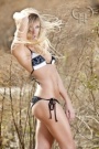
What do you think? https://www.modelmayhem.com/portfolio/pic/31336926 18+ https://www.modelmayhem.com/portfolio/p … 6#31336925 18+ Jan 18 13 08:40 am Link It gets a "meh" from me. The weird photoshop fade you did at the bottom is totally unnecessary. The pose is nice enough, but doesn't really do her figure any favors. I do love the color in it though. Jan 18 13 08:47 am Link I think both images are good. Like the soft look. Jan 18 13 08:48 am Link Should they be mark'd 18 +???? Jan 18 13 08:56 am Link I like the first image allot. The second image I would have done the focus differently, but the FIRST thing I would do would be move or remove you logo from the middle of the photo and put it in the corner or get rid of it totally. Jan 18 13 08:58 am Link Did you add the gradient in PS? I would try ditching it. Both shots seem dark and dull due to the dark gradient/ vignette effect. The second shot does nothing for me. That pose is over used with boudoir and it isn't very flattering or interesting to look at. The first pose is more interesting. The watermark right in the middle of the shot sucks. Jan 18 13 09:10 am Link I would lighten under her arm pits, they are a bit dark and distracting. Don't care for the gradient either on the lower part of the shot. Jan 18 13 09:23 am Link I think I like your color pallet and that you want me to look at your watermark, which is not that interesting. Jan 18 13 09:32 am Link Wicked LA Pix wrote: This exactly Jan 18 13 09:34 am Link Both links do need to be marked 18+ I agree that the effects are not needed and detract from tje images. The first image illustrates a key issue with nudes. That pose would likely be great if she was wearing a top, but as a topless, it's very unflattering to her based on her breast shape and firmness. The second one is quite cliche. The biggest missing element for me in both is any idea WHY she is topless. Keep at it. Jan 18 13 09:35 am Link You're not topless at all! The model is. Ok - I like them both. For a first time, esp, it's super. Jan 18 13 09:38 am Link Very nice for a first time topless shoot. Very clean and simple. You should be very proud of them. With those images I can see you getting more work with topless and eventually fully nude llamas. Jan 18 13 09:41 am Link It's ehh.. Not very exciting Pose, and expression are boring Lighting is good except for the big shadow on the lower half Jan 18 13 09:46 am Link Wicked LA Pix wrote: ShotbyRon wrote: Interesting, I found the first image to be the weaker of the two. Without being offensive, I agree with the "meh." I think it is a good first attempt, but neither image "pops." These are not fine art, they are glamour. I'd spend less time on post production and more time on execution. I'd start with the lighting and go from there. Jan 18 13 10:11 am Link With the first image, the whole style and pose lends itself to a clothed model. The toplessness comes across as absolutely surplus to requirements and unflattering to the model. Jan 18 13 10:56 am Link Keep your editing as natural as possible. Your poses work, but the softness and editing looks very amateur. Do you have the raw images? I'm a retoucher, send them over and Ill show you what I'm talking about. Hope this helps! Erin Delsigne Photography https://www.facebook.com/EDPhotos Jan 18 13 11:16 am Link GPS Studio Services wrote: Wicked LA Pix wrote: Interesting, I found the first image to be the weaker of the two. Without being offensive, I agree with the "meh." I think it is a good first attempt, but neither image "pops." These are not fine art, they are glamour. I'd spend less time on post production and more time on execution. I'd start with the lighting and go from there. I agree. Take this as a learning experience. Jan 18 13 11:27 am Link Thank you all, All the feedback is very much appreciated. You can believe I am taking notes. Jan 18 13 12:09 pm Link Tre-Mont wrote: Please go back to your first post and used the edit link, add 18+ next to each image link. Jan 18 13 12:11 pm Link |