Forums >
Critique >
What's my weakest image? Then I'll tell you yours!

Model
Tara Babcock
Posts: 191
Seattle, Washington, US
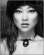
I've got a little time to kill this past week. Would love to hear from you all and give it a shot with your books too!  EDIT: NEW QUESTION! What do you think of this image? ![https://img822.imageshack.us/img822/2766/90728319.th.jpg]() Do you think it will benefit my book?
Photographer
Tropical Photography
Posts: 35564
Sarasota, Florida, US
First image last row.. Basically it's "Here's my tits!!"... While I don't mind in your face images, this one just doesn't seem to have any direction, or at the least a positive one.
Model
Tara Babcock
Posts: 191
Seattle, Washington, US
Keith aka Wolfie wrote:
First image last row.. Basically it's "Here's my tits!!"... While I don't mind in your face images, this one just doesn't seem to have any direction, or at the least a positive one. Interesting. It really just is a portrait showing off my personality, to be honest. Pink polka dot bra with huge cleavage. tongue sticking out to show character and my piercing and flowing blonde hair. Instead of showing my face I have the silver chain around my neck that says, "Tara Babcock" to further strengthen the image. Thanks for your opinion, though!
Now you:
https://www.modelmayhem.com/portfolio/pic/5122463
I don't like this because, firstly, it's "dreamy" appearance is just blurry to me and hurts my head. The hair over one eye can be a good, artistic or playful thing, but in this it looks messy and unintentional. The image also has a bluish hue that is weird. Sexy model, though!
Photographer
Creative E-llusions
Posts: 1229
Port Orchard, Washington, US
TARA BABCOCK wrote:
I've got a little time to kill this past week. Would love to hear from you all and give it a shot with your books too! ![https://modelmayhm-8.vo.llnwd.net/d1/photos/091122/03/4b091c76355c9_m.jpg]()
I think this image ages you. Obviously you are young and amazing, for me this just doesnt do it....
But you know I love your work and think you have WOW

Model
T A Y L O R
Posts: 2990
Seattle, Washington, US
You have a really great portfolio overall, and unlike the person above me- that's one of my favorite shots  These are the only ones I don't really care for: ![https://modelmayhm-8.vo.llnwd.net/d1/photos/091122/03/4b091c76355c9_m.jpg]() It almost makes you look old? If it's going to be casual I'd rather it be no makeup, and if it's going to be the big hair and the makeup then I want to see a shoot. Just me. ![https://modelmayhm-8.vo.llnwd.net/d1/photos/101125/23/4cef606932c6e_m.jpg]() It's just not a good photo. You look good, but the quality doesn't compete with your other pics. ![https://modelmayhm-8.vo.llnwd.net/d1/photos/091126/03/4b0e66de4cc66_m.jpg]() If it's a pic of the tatto then I'd like to see the whole tattoo. I wouldn't get rid of it for foot fetish people, but I just don't see otherwise what it adds to your port. Love the tattoo though And you already did me, so thanks!
Model
Tara Babcock
Posts: 191
Seattle, Washington, US
Creative E-llusions wrote:
![https://modelmayhm-8.vo.llnwd.net/d1/photos/091122/03/4b091c76355c9_m.jpg]()
I think this image ages you. Obviously you are young and amazing, for me this just doesnt do it....
But you know I love your work and think you have WOW Thanks, Hun! How does it age me, out of curiosity?
You:
![https://modelmayhm-1.vo.llnwd.net/d1/photos/090921/18/4ab82f6199bac_m.jpg]()
Again with the dreamy, blurry filter thing. I just think it ruins the image and makes it look a tad amateurish, which you are not. It especially doesn't work for portraiture or casual clothing, in my opinion. I like the location and model, though! I feel the crop could use a little work too.

Photographer
Pixel Fist
Posts: 3404
Knoxville, Tennessee, US
There are a few images that have some problems and nobody would miss those images, but this one tops my list: ![https://modelmayhm-8.vo.llnwd.net/d1/photos/100928/20/4ca2b38c993ee_m.jpg]() Another one that came close has already been chosen, and is shown above by Creative E-....
Photographer
Creative E-llusions
Posts: 1229
Port Orchard, Washington, US
TARA BABCOCK wrote:
Thanks, Hun! How does it age me, out of curiosity?
You:
![https://modelmayhm-1.vo.llnwd.net/d1/photos/090921/18/4ab82f6199bac_m.jpg]()
Again with the dreamy, blurry filter thing. I just think it ruins the image and makes it look a tad amateurish, which you are not. It especially doesn't work for portraiture or casual clothing, in my opinion. I like the location and model, though! I feel the crop could use a little work too. I would way it kind of gives you a Dolly Parton look. The hair is lifeless and just kind of old looking. Maybe is it wasnt flat it would make a difference. I agree on your feedback on mine. By the way would you consider working with me  ? ?
Model
Tara Babcock
Posts: 191
Seattle, Washington, US
I would way it kind of gives you a Dolly Parton look. The hair is lifeless and just kind of old looking. Maybe is it wasnt flat it would make a difference. I agree on your feedback on mine. By the way would you consider working with me ? Thanks! Sure, I would! Where the hell is that place you live in WA!?
Photographer
Creative E-llusions
Posts: 1229
Port Orchard, Washington, US
TARA BABCOCK wrote:
I would way it kind of gives you a Dolly Parton look. The hair is lifeless and just kind of old looking. Maybe is it wasnt flat it would make a difference. I agree on your feedback on mine. By the way would you consider working with me ? Thanks! Sure, I would! Where the hell is that place you live in WA!? LOL im just north of Bellingham but always traveling through
Photographer
Pixel Fist
Posts: 3404
Knoxville, Tennessee, US
TARA BABCOCK wrote:
What are the problems that nobody would miss? ... I'm sorry, I meant that "nobody would miss those pictures"
In that pic, everything is saturated except your upper body, and there, the skin tones are washed-out. - That's for starters.
Model
Tara Babcock
Posts: 191
Seattle, Washington, US
JoshuaDavisPhotography wrote:
Somebody said this (https://www.modelmayhem.com/portfolio/pic/15270288) image aged you... I think that's part of why I don't like it, but compared to your other work it just isn't nearly as creative. Thanks! I think we have a popular hated image in my book! Perhaps I'll chuck it and just add a snapshot to my page!
You:
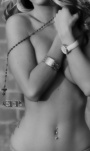
![https://modelmayhm-7.vo.llnwd.net/d1/photos/100810/11/4c6193a826c2b_m.jpg]()
Besides just not fitting at all with your professionalism and other awesome work in your book, this has many problems in my eyes. Firstly, the model's thong is way too high, makes her figure look worse and doesn't frame her butt well. The ruffled almost-nude colored shirt made me first picture her with a bunch of back rolls, which is not nice and doesn't work well with the already unflattering thong placement. Next, the composition looks like one of those amateur pay-site images usually named something like Kandysplayground.com or something. It looks kinda like cheap soft core to me. Lastly, colorful and intricate make-up is lost in a full body image and is best done in beauty in my opinion.
I hope this wasn't too harsh. I really like your other work and feel this just doesn't fit. Cool concept, though!
Photographer
JoshuaDavisPhotography
Posts: 2430
San Francisco, California, US
TARA BABCOCK wrote:
Thanks! I think we have a popular hated image in my book! Perhaps I'll chuck it and just add a snapshot to my page!
You:
![https://modelmayhm-7.vo.llnwd.net/d1/photos/100810/11/4c6193a826c2b_m.jpg]()
Besides just not fitting at all with your professionalism and other awesome work in your book, this has many problems in my eyes. Firstly, the model's thong is way too high, makes her figure look worse and doesn't frame her butt well. The ruffled almost-nude colored shirt made me first picture her with a bunch of back rolls, which is not nice and doesn't work well with the already unflattering thong placement. Next, the composition looks like one of those amateur pay-site images usually named something like Kandysplayground.com or something. It looks kinda like cheap soft core to me. Lastly, colorful and intricate make-up is lost in a full body image and is best done in beauty in my opinion.
I hope this wasn't too harsh. I really like your other work and feel this just doesn't fit. Cool concept, though! This is the exact type of feedback I was looking for, thanks. I might consider using a different image from this shoot as many have said this looks like a "cheap" shot.
Model
Tara Babcock
Posts: 191
Seattle, Washington, US
KMA2SQ wrote:
I'm sorry, I meant that "nobody would miss those pictures"
In that pic, everything is saturated except your upper body, and there, the skin tones are washed-out. - That's for starters. Thank you. Feel free to add more. I am not a photographer so sometimes I add things to my book without noticing those problems. I look for the basic stuff that is a no-no, then I look to see if I think I look hot. Haha.
Model
Tara Babcock
Posts: 191
Seattle, Washington, US
JoshuaDavisPhotography wrote:
This is the exact type of feedback I was looking for, thanks. I might consider using a different image from this shoot as many have said this looks like a "cheap" shot. Thank you for not getting angry. I meant it in a very respectful way and I honestly see this as your only sub-par image. Oh, and she kinda has a double chin going on from the facial expression too!
I look forward to seeing what awesomeness you replace it with if you do!
Model
Tara Babcock
Posts: 191
Seattle, Washington, US
Creative E-llusions wrote:
TARA BABCOCK wrote:
I would way it kind of gives you a Dolly Parton look. The hair is lifeless and just kind of old looking. Maybe is it wasnt flat it would make a difference. I agree on your feedback on mine. By the way would you consider working with me ? Thanks! Sure, I would! Where the hell is that place you live in WA!? LOL im just north of Bellingham but always traveling through PM me, let's stay on topic here.

Photographer
This User Is Not Here
Posts: 1964
Durango, Colorado, US
I agree, this one ages you horribly. It looks like you're wearing a wig, as well. ![https://modelmayhm-8.vo.llnwd.net/d1/photos/091122/03/4b091c76355c9_m.jpg]() And this, simply because it doesn't really benefit you as a model much. Maybe link it on your page if you're looking to display your tattoo? It's not really fit for a spot in your actual portfolio, in my opinion. ![https://modelmayhm-8.vo.llnwd.net/d1/photos/091126/03/4b0e66de4cc66_m.jpg]()
Model
Tara Babcock
Posts: 191
Seattle, Washington, US
Alicia Hansen Photo wrote:
I agree, this one ages you horribly. It looks like you're wearing a wig, as well.
![https://modelmayhm-8.vo.llnwd.net/d1/photos/091122/03/4b091c76355c9_m.jpg]()
And this, simply because it doesn't really benefit you as a model much. Maybe link it on your page if you're looking to display your tattoo? It's not really fit for a spot in your actual portfolio, in my opinion.
![https://modelmayhm-8.vo.llnwd.net/d1/photos/091126/03/4b0e66de4cc66_m.jpg]() Thank you very much! This is so interesting and helpful. I dunno about looking like I was wearing a wig... I just really like to do my hair huge!
At what point would the leg and foot image be justified? If I was primarily a parts or fetish model? Thanks again! Very helpful!
You:
Firstly, your portfolio is extremely strong!
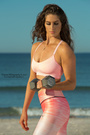
![https://modelmayhm-5.vo.llnwd.net/d1/photos/101012/10/4cb49b8c4ce9e_m.jpg]()
The 1st image in this set just doesn't flatter the model, in my opinion. Her strength is the long, slender legs and I feel this plays them down, while playing up her little belly pudge that is barely noticeable until I saw this shot. The crop is a bit weird to me too, but I can totally see the artistic value in it as well. I could go either way.
![https://modelmayhm-5.vo.llnwd.net/d1/photos/090915/08/4aafb75f51da2_m.jpg]()
This above image is great, but I feel the model would benefit from a more toward-the-camera pose. It makes her nose look a bit long and I'm losing sight of her left eye. I would like to see her facing the camera more, but not straight-on and still looking off into the distance with the strong expression she has!
Wonderful!
Photographer
Creative E-llusions
Posts: 1229
Port Orchard, Washington, US
TARA BABCOCK wrote:
Creative E-llusions wrote:
TARA BABCOCK wrote:
I would way it kind of gives you a Dolly Parton look. The hair is lifeless and just kind of old looking. Maybe is it wasnt flat it would make a difference. I agree on your feedback on mine. By the way would you consider working with me ? Thanks! Sure, I would! Where the hell is that place you live in WA!? LOL im just north of Bellingham but always traveling through PM me, let's stay on topic here. ok sent
Model
Anggi
Posts: 273
Serpong, Banten, Indonesia
![https://modelmayhm-8.vo.llnwd.net/d1/photos/091122/03/4b091c76355c9_m.jpg]() You look much older here than your real age... which isn't really flattering (at least that's my personal opinion)
Model
Tara Babcock
Posts: 191
Seattle, Washington, US
Anggi wrote:
![https://modelmayhm-8.vo.llnwd.net/d1/photos/091122/03/4b091c76355c9_m.jpg]()
You look much older here than your real age... which isn't really flattering (at least that's my personal opinion) Thanks! Anyone have any idea what it may be that makes me look so old? Can't be the hair... I do the big hair thing all the time! Is it my Abercrombie clothes? Haha!
You:
You are just gorgeous! I love your port, but if I have to choose one that doesn fit it would be this one below.
![https://photos.modelmayhem.com/photos/100912/18/4c8d7dc093691_m.jpg]()
I feel like it is more of a vacation image than an actual modeling picture. I don't really like the near-black and white it is either. It doesn't do you justice, you care a colorful, beautiful girl and unless it's an art image I feel you should be in color! The smile is a bit weird too. Your other smiling image is great, though, so it's not like you have a poor smile! Definitely a cute image, though! You can't take a "bad" picture!

Photographer
Thorn Hill Studios
Posts: 379
Springfield, Massachusetts, US
The question of which one is "weakest" - is subjective - and everyone is going to have an opinion. Objectively, I see that there is a reason to include each image ... your portfolio has an amazing range of styles!
But if the question was which image does not fit (the theme of the portfolio)?" then, again, I would say the Legs/Shoes.
... but otherwise it's a wonderful "stock" type image, uniquely with the tattoo and cool shoes ... could be used for a variety of usages ....
Model
Anggi
Posts: 273
Serpong, Banten, Indonesia
TARA BABCOCK wrote:
Thanks! Anyone have any idea what it may be that makes me look so old? Can't be the hair... I do the big hair thing all the time! Is it my Abercrombie clothes? Haha!
You:
You are just gorgeous! I love your port, but if I have to choose one that doesn fit it would be this one below.
![https://photos.modelmayhem.com/photos/100912/18/4c8d7dc093691_m.jpg]()
I feel like it is more of a vacation image than an actual modeling picture. I don't really like the near-black and white it is either. It doesn't do you justice, you care a colorful, beautiful girl and unless it's an art image I feel you should be in color! The smile is a bit weird too. Your other smiling image is great, though, so it's not like you have a poor smile! Definitely a cute image, though! You can't take a "bad" picture! Thank you for the compliments ^-^
Yes, I've been getting similar critiques for that pic recently, so that pic's going to be taken down next.
As for your little dilemma  .... I can't really pin point the exact reason as to why you seem a bit older there.... It's just the first impression that came up to me when I saw that pic and compared it with your other pics. .... I can't really pin point the exact reason as to why you seem a bit older there.... It's just the first impression that came up to me when I saw that pic and compared it with your other pics.
Model
Tara Babcock
Posts: 191
Seattle, Washington, US
Francis Moran wrote:
The question of which one is "weakest" - is subjective - and everyone is going to have an opinion. Objectively, I see that there is a reason to include each image ... your portfolio has an amazing range of styles!
But if the question was which image does not fit (the theme of the portfolio)?" then, again, I would say the Legs/Shoes.
... but otherwise it's a wonderful "stock" type image, uniquely with the tattoo and cool shoes ... could be used for a variety of usages .... Thank you! This is helping a lot as I am trying to decide what goes for some new beauty stuff I've shot recently.
You:
I really like your work! Your very versatile and you achieve many looks and styles well. Not many photographers can do this, hence titles like "beauty" or "glamour" photographer.
![https://modelmayhm-3.vo.llnwd.net/d1/photos/100227/23/4b8a1867ba245_m.jpg]()
This image because I feel it shouldn't be simply on a white background. I have actually been wanting to do a cheer theme a lot lately and my vision is in a grassy field with many different actual cheer poses, stunts, jumps, stretches, etc. (I'm an ex-cheerleader!) some in motion maybe. Or in a stadium. This would add the the image's authenticity and make it more interesting. I feel you just put this model into the outfit and posed her boringly. I want to feel like the model has an idea of how to cheer and what it entails.
In my opinion, the only way this would work is if it was sexier, showing cleavage or a thong or some booty. Then it would be purposeful as a glamour, erotic or pornographic image. Now it's just too clothed and/or staged and boring to be relevant.
Model
Tara Babcock
Posts: 191
Seattle, Washington, US
Anggi wrote:
Thank you for the compliments ^-^
Yes, I've been getting similar critiques for that pic recently, so that pic's going to be taken down next.
As for your little dilemma .... I can't really pin point the exact reason as to why you seem a bit older there.... It's just the first impression that came up to me when I saw that pic and compared it with your other pics. Thank you so much! You're too sweet and helpful! Keep it up! I look forward to checking out some new work of yours!

Model
E_V_A
Posts: 1722
Redondo Beach, California, US
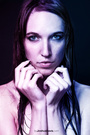
I'd love to hear your opinion! This is my least favorite photo of you: ![https://modelmayhm-8.vo.llnwd.net/d1/photos/101122/11/4ceaca6d72ab6_m.jpg]() You look beautiful, but falls short compared to your other photos.
Photographer
Thorn Hill Studios
Posts: 379
Springfield, Massachusetts, US
Great ideas; thanks for the feedback ... It would be fun to do a sexy outdoor version, but not during the wintertime!
Model
E_V_A
Posts: 1722
Redondo Beach, California, US
TARA BABCOCK wrote:
Ah, why is this? Please explain!
You:
OMFG, you are gorgeous! It's not so often I see models as young as I am with an immensely strong and versatile port like yours. I'm going to have to nit pick in order to pick a bad one... so here goes:
![https://modelmayhm-1.vo.llnwd.net/d1/photos/091118/19/4b04bf61c67b5_m.jpg]()
This one has a weird crop and the make-up is good for clean beauty, but not so much this image.
![https://modelmayhm-1.vo.llnwd.net/d1/photos/100629/11/4c2a3ea72a991_m.jpg]()
Why pull the shirt away from your figure? I also feel you're squishing your back are a bit. So... doesn't do your figure as much justice as it deserves. Thank you Tara! Likewise, I've admired your work for a bit, thats a big compliment comming from you . The 1st one you picked out was from my first "real" photoshoot lol, I think it's time to go too! And I think I've out grown the 2nd one as well, just leaves more upload slots for improvement
The reason why I picked that one out is because I feel with your stunning eyes, lips, and bone structure the lighting in that picture doesn't enhance you at all. The lighting falls a bit flat for me. The picture to me lacks a bit of technical depth and your eyes don't seem as connected and energized as some of your other shots. It's a pretty picture, but other ones in your port I like much more. Was definitley hard to pick one!
Photographer
This User Is Not Here
Posts: 1964
Durango, Colorado, US
TARA BABCOCK wrote:
Thank you very much! This is so interesting and helpful. I dunno about looking like I was wearing a wig... I just really like to do my hair huge!
At what point would the leg and foot image be justified? If I was primarily a parts or fetish model? Thanks again! Very helpful!
-snip-
-snip snip- I don't mind the huge hair so much, it's just in that particular shot that it doesn't really seem real. You're a stunning model, I just don't think that first image does you any justice.
And I agree, if you were primarily a parts or fetish model, I think it may be useful. But since that's not your niche, I'd just leave it as a note on your profile information that says something like "I have a tattoo, here's the link to see what it looks like".
Model
Tara Babcock
Posts: 191
Seattle, Washington, US
Alicia Hansen Photo wrote:
I don't mind the huge hair so much, it's just in that particular shot that it doesn't really seem real. You're a stunning model, I just don't think that first image does you any justice.
And I agree, if you were primarily a parts or fetish model, I think it may be useful. But since that's not your niche, I'd just leave it as a note on your profile information that says something like "I have a tattoo, here's the link to see what it looks like". Thank you!
Model
Tara Babcock
Posts: 191
Seattle, Washington, US
Eva Barda wrote:
Thank you Tara! Likewise, I've admired your work for a bit, thats a big compliment comming from you . The 1st one you picked out was from my first "real" photoshoot lol, I think it's time to go too! And I think I've out grown the 2nd one as well, just leaves more upload slots for improvement
The reason why I picked that one out is because I feel with your stunning eyes, lips, and bone structure the lighting in that picture doesn't enhance you at all. The lighting falls a bit flat for me. The picture to me lacks a bit of technical depth and your eyes don't seem as connected and energized as some of your other shots. It's a pretty picture, but other ones in your port I like much more. Was definitley hard to pick one! Thank you! I mostly just love how it looks for natural light. And it's new!
Look forward to seeing more of you! So pretty!
Photographer
Pixel Fist
Posts: 3404
Knoxville, Tennessee, US
Eva Barda wrote:
...
The lighting falls a bit flat for me. ... +1
Photographer
Henri3
Posts: 7392
Minneapolis, Minnesota, US
Think you already know.
The last 4 images... IMO ... and do you really need 2 almost identical shots in yellow bikini top?...nope!
You look superfab so keep the very very best and cut anything that doesn't truly stand out.
You have a tremendous look so don't sell yourself short with anything less than the best.
If you REALLY want to stand out as you should.
Model
Tara Babcock
Posts: 191
Seattle, Washington, US
Henri3 wrote:
Think you already know.
The last 4 images... IMO ... and do you really need 2 almost identical shots in yellow bikini top?...nope!
You look superfab so keep the very very best and cut anything that doesn't truly stand out.
You have a tremendous look so don't sell yourself short with anything less than the best.
If you REALLY want to stand out as you should. What is wrong with the Barbie shot and the couple shot? I also don't see how the yellow image is detrimental because the second image isn't taking up a spot in my port. I feel that they are not identical and compliment each other well in a set... or are you saying you don't like either of them at all?
You:
Your beauty work rocks! I love it!
![https://modelmayhm-1.vo.llnwd.net/d1/photos/060908/10/45018709d6515_m.jpg]()
I don't like this because it looks a bit amateurish and the concept is lost on me. Who hasn't done the two cliches, the sexy nurse outfit and the showing the fan that's blowing the hair thing and then you put it on a plain wall. I also don't like the lighting.
Model
Tara Babcock
Posts: 191
Seattle, Washington, US
KMA2SQ wrote:
+1 I dunno what that means... I'm not a photographer or lighting specialist, but it's natural light.
|


 ?
?


 .... I can't really pin point the exact reason as to why you seem a bit older there.... It's just the first impression that came up to me when I saw that pic and compared it with your other pics.


