|
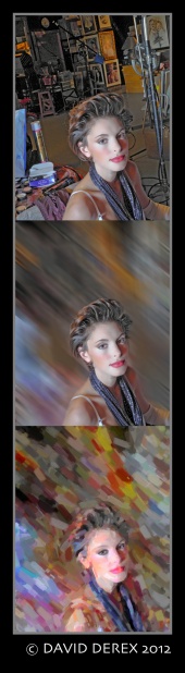
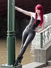
Which pics have to go? Tell me straight up and I will LIST your best pic. Leave a comment on my best pic and i will return the favor. Oct 22 12 12:31 pm Link I don't think you really have any truly awful shots in there, but here's my least favorite one.  Oct 22 12 12:38 pm Link  Composition doesn't work for me. don't have this in image paste thing workin yet https://www.modelmayhem.com/portfolio/p … 1#28802511 Oct 22 12 12:43 pm Link I'd drop this one.....  Pose and crop doesn't work for me. Oct 22 12 12:43 pm Link Interesting idea. I have chosen:  Only because I have to choose one and I don't really like logos on photographs. Too many photographers have no idea about type. Oct 22 12 12:45 pm Link Your worst: Oct 22 12 12:46 pm Link In my opinion this is your worst: I just find this image too busy, and I'm not a fan of the harsh shadows. Despite that, you do have some really awesome images in your port  Oct 22 12 12:50 pm Link this image has an awkward expression and pose, not sure what the story here is and I am not intrigued to find out. some nice images in your port otherwise. https://www.modelmayhem.com/portfolio/p … 9#28652809 Oct 22 12 12:53 pm Link number 14 Oct 22 12 01:59 pm Link SPV Photo wrote: Thanks! My fav of yours: Oct 23 12 02:55 pm Link Image Magik wrote: Thanks for responding. This one is awesome: Oct 23 12 02:58 pm Link Chris Maxwell wrote: Love this one: Oct 23 12 03:01 pm Link Pantelis Palios wrote: Appreciate it! This one was easy: Oct 23 12 03:04 pm Link Oct 23 12 03:08 pm Link great port I chose this because you made me Oct 23 12 03:17 pm Link I love most of your work there, this one seems a bit unexciting for me though, compared to how well you do amazing photo themes. I know it's probably suggesting "relaxed" but feels a bit...too relaxed if you will.. Oct 23 12 03:18 pm Link There is no "worst"; however, the red dress doesn't seem to go with the other images in your collection. https://www.modelmayhem.com/portfolio/p … 7#29598657 Oct 23 12 03:18 pm Link L Raye wrote: Thanks for responding. I really like this 18+ one. Oct 23 12 05:02 pm Link ID Imaging wrote: Good point, thanks. Love this one: Oct 23 12 05:05 pm Link JohnsPhotos wrote: Thanks! This is awesome. Wish i took it: Oct 23 12 05:07 pm Link Dina Khrapko wrote: Thanks! This is my favorite: Oct 23 12 05:12 pm Link Not because its particularly bad, for some reason it doesn't really grab me, maybe its the blown sky. I can't really put my finger on it. Oct 23 12 05:18 pm Link The photo in the first reply was in my humble opinion by far the worst. Cute girl, cute concept but it has no place in your port. Also the last one in your portfolio.. Something about it strikes me as inherently wrong. Her expression or maybe how large the frame is compared to her body. Great concept wonderful colors but it still seems very.. Blegh and off for some reason. Other than that you have a beautiful vibrant portfolio! Oct 23 12 05:51 pm Link SPV Photo wrote: I agree with this but you can also afford to toss this one Oct 23 12 07:15 pm Link https://www.modelmayhem.com/portfolio/p … 1#28888321 I can't put my finger on it, but something bothers me about this one. Oct 23 12 08:00 pm Link Personal Photograph wrote: Okay, thanks. Love this one. Oct 23 12 08:39 pm Link Brett Hunt wrote: lol, thx! This one my favorite: Oct 23 12 08:41 pm Link Brownlager Photography wrote: Thanks! This one is really nice: Oct 23 12 08:44 pm Link DEREX Art wrote: True. Thanks! Love this one: Oct 23 12 08:46 pm Link Revenge Photography wrote: Thanks! Nice lines on this one: Oct 23 12 08:48 pm Link Gita Lei wrote: Thank you for the feedback Oct 24 12 05:16 am Link Goat Farm Project wrote: Curious what you think. I'll edit this with my thoughts in a moment. Oct 24 12 05:18 am Link Go for it! I say this one because there doesn't appear to be a clear message: Oct 24 12 05:32 am Link Of what's left undeleted, this would be my suggestion:  Oct 24 12 05:42 am Link Cynthia Serrano wrote: Great feedback! This is awesome: Oct 24 12 06:59 am Link Goat Farm Project wrote: Thank you. Oct 24 12 07:18 am Link Jorge Kreimer wrote: Probably increased vibrancy too much??? Oct 24 12 10:28 am Link Face the Light wrote: Yep, good feedback. thanks! Oct 24 12 10:36 am Link Youve got great work, I would have to say the red head on the staircase. Oct 24 12 10:40 am Link  Probably this. The angle is a little awkward and there are too high a percentage of shots with the arms straight across the head pose. Oct 24 12 10:53 am Link |