Forums > Digital Art and Retouching > Boring, Ugly Color Grads

Photographer

digital Artform

Posts: 49326

Los Angeles, California, US

Lets talk about grads and photoshop and post-production.

Here's what I've been thinking lately.

Any thoughts?

-----------

EDIT:  This thread is about taking control of your grads - adding something to the middle - and not just letting interpolation from one RGB triple to another get you there.

Sep 07 08 06:22 pm Link

Photographer

digital Artform

Posts: 49326

Los Angeles, California, US

https://www.digitalartform.com/archives/images/2DhueShift.jpg

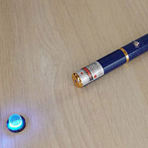
https://www.thegreenhead.com/imgs/blue-laser-pointer-2.jpg

You can see here how the brighter the blue light gets the more it shifts into cyan.

https://farm3.static.flickr.com/2294/2304691004_2327e9381e.jpg?v=0

You can see this bright light fade to black through different hues - yellows and oranges and reds.

https://www.juneauurgentcare.com/yellow-grad.jpg

A simple photoshop yellow grad that just drops luminosity on the same hue is usually ugly.

https://www.digitalartform.com/archives/images/gradColorMix.jpg

And a yellow-blue digital grad that isn't helped along the way to go through other hues looks flat.

Sep 07 08 06:22 pm Link

Photographer

digital Artform

Posts: 49326

Los Angeles, California, US

https://www.itchstudios.com/psg/tuts/middle.jpg

A boost of saturation in the middle of a grad

http://www.itchstudios.com/psg/art_tut.htm

And when you think about it, it makes sense.

Our eyes fail to see saturation in dark shadows, and bright highlights burn out color, too, so the saturation should be greatest in the mid tones.

Sep 07 08 06:25 pm Link
Photographer

digital Artform

Posts: 49326

Los Angeles, California, US

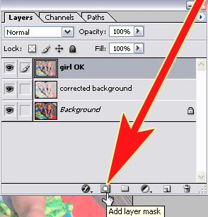
https://akvis.com/img/examples/sketch/photo-artistic-processing/layer-mask.jpg

I've been feeling lately that a simple black-gray-white Photoshop layer mask is not a great way to blend two things, because it doesn't allow a yellow-blue blend to get green in the middle, nor does it allow for a boost of saturation in the middle.

I guess even a simple layer mask blend needs to be dragged out into more steps.

Sep 07 08 06:31 pm Link

Photographer

Food 4 Less

Posts: 378

Los Angeles, California, US

this is fun--i'm reading the rest of it.

Sep 07 08 06:35 pm Link

Photographer

Food 4 Less

Posts: 378

Los Angeles, California, US

this is fun--i'm reading the rest of it.

Sep 07 08 06:35 pm Link

Photographer

digital Artform

Posts: 49326

Los Angeles, California, US

https://www.photoshoplab.com/images/tutorials/studio2.jpg

https://www.photoshoplab.com/images/tutorials/studio8.jpg

Not bad, but I believe it could be better with more attention paid to the grad.

http://www.photoshoplab.com/the-elegant … -shot.html

Sep 07 08 06:46 pm Link

Photographer

Jeffrey Engel

Posts: 22327

Waltham, Massachusetts, US

:: thousand mile stare ::

Sep 07 08 06:55 pm Link

Photographer

biwa

Posts: 2594

Pinole, California, US

beyond me.

Sep 07 08 06:56 pm Link

Photographer

Jeffrey Engel

Posts: 22327

Waltham, Massachusetts, US

i think i'm just zonked this weekend

i'm sure one of these days i'll be working on a grad problem and be like "OH!!!" and will rush to the forums to find this thread.

smile

Sep 07 08 07:10 pm Link

Photographer

MB-1

Posts: 2493

Honolulu, Hawaii, US

digital Artform wrote:
https://www.digitalartform.com/archives/images/gradColorMix.jpg

And a yellow-blue digital grad that isn't helped along the way to go through other hues looks flat.

I remember you talking about adding new hues to gradients in relation to one of my photos- this explanation is even more illuminating. I'm very curious to see how one would apply the concept to layer masks. smile

Sep 07 08 07:52 pm Link

Photographer

digital Artform

Posts: 49326

Los Angeles, California, US

Michael Bonner wrote:
I remember you talking about adding new hues to gradients in relation to one of my photos- this explanation is even more illuminating. I'm very curious to see how one would apply the concept to layer masks. smile

Yes, I noticed you were already making some very nice grads.

As far as layer masks go - I guess you'd have to do it more than once with gradually expanding grads, or something

Sep 07 08 08:00 pm Link

Photographer

digital Artform

Posts: 49326

Los Angeles, California, US

There is a trick for grabbing just the middle of a grad - the grays

https://www.digitalartform.com/archives/images/outline2.jpg

Start with a grad (or in this case, blur something sharp)

https://www.digitalartform.com/archives/images/outline3.jpg

Invert it in a second layer, and multiply it by the uninverted image.

https://www.digitalartform.com/archives/images/outline4.jpg

Brighten as needed.

http://www.digitalartform.com/archives/ … n_out.html

Sep 07 08 08:03 pm Link

Photographer

digital Artform

Posts: 49326

Los Angeles, California, US

I should add that the above method for pulling the middle out of a grad is pretty old-school. The only advantage to the technique being that sandwiching a grad and its negative also works in the real world with grads on film, like on an optical printer.

In Photoshop you can also just turn your slanted line in 'Curves' into an inverted V (or U)

Sep 07 08 08:34 pm Link

Photographer

LeWhite

Posts: 2038

Los Angeles, California, US

Excellent post sir
excellent!

Sep 07 08 08:46 pm Link

Photographer

Kristine Kreations

Posts: 1629

Davis, California, US

digital Artform wrote:
https://www.digitalartform.com/archives/images/gradColorMix.jpg

And a yellow-blue digital grad that isn't helped along the way to go through other hues looks flat.

Great idea!  I will definately keep this in mind for the future.

Sep 07 08 09:11 pm Link

Photographer

digital Artform

Posts: 49326

Los Angeles, California, US

LeWhite wrote:
Excellent post sir
excellent!

smile thank you

Sep 07 08 10:56 pm Link

Body Painter

Monad Studios

Posts: 10131

Santa Rosa, California, US

digital Artform wrote:
https://www.digitalartform.com/archives/images/gradColorMix.jpg

Interesting!  Thanks for posting!

Is there a way to tell PS to blend via HLS instead of RGB?

Sep 07 08 11:40 pm Link

Photographer

digital Artform

Posts: 49326

Los Angeles, California, US

Monad Studios wrote:
Is there a way to tell PS to blend via HLS instead of RGB?

Good question; not that I know of

Sep 07 08 11:44 pm Link

Photographer

Tim Summa

Posts: 2514

San Antonio, Texas, US

digital Artform wrote:
A simple photoshop yellow grad that just drops luminosity on the same hue is usually ugly.

https://www.digitalartform.com/archives/images/gradColorMix.jpg

And a yellow-blue digital grad that isn't helped along the way to go through other hues looks flat.

I'm lost. When did color theory change to the idea that yellow into blue, or blue into yellow turns to green in the center of the process? If the colors were yellow into cyan, or cyan into yellow there would be green in there.

Sep 08 08 02:40 am Link

Photographer

digital Artform

Posts: 49326

Los Angeles, California, US

Tim Summa wrote:
I'm lost. When did color theory change to the idea that yellow into blue, or blue into yellow turns to green in the center of the process? If the colors were yellow into cyan, or cyan into yellow there would be green in there.

That's fine for scientists.

I want my grads to be artistic. I choose the path they take.

Yellow goes through green to blue because I wish it to be so.

Sep 08 08 02:42 am Link

Photographer

Homer

Posts: 183

Los Angeles, California, US

Tim Summa wrote:

I'm lost. When did color theory change to the idea that yellow into blue, or blue into yellow turns to green in the center of the process? If the colors were yellow into cyan, or cyan into yellow there would be green in there.

that 1st grad has a blue that is more purple than it is "true blue" therefore it has magenta and is neutralizing (becoming tertiary) when you mix it with yellow.

Sep 08 08 02:48 am Link

Photographer

digital Artform

Posts: 49326

Los Angeles, California, US

digital Artform wrote:
https://www.itchstudios.com/psg/tuts/middle.jpg

A boost of saturation in the middle of a grad

http://www.itchstudios.com/psg/art_tut.htm

This thread is about taking control of your grads - adding something to the middle - and not just letting interpolation from one RGB triple to another get you there.

Sep 08 08 02:52 am Link

Photographer

digital Artform

Posts: 49326

Los Angeles, California, US

We accept the bright blue light in the crystal shifting into cyan in the photograph above. And in the other photo we accept the yellow around the sun falling off through orange and red into dark red and on into black.

But when we make a yellow grad falling off to black on our own in Photoshop we rarely add the oranges and reds.

And when we make a cyan falling off to black we rarely add the blues.

Sep 08 08 03:11 am Link

Photographer

fbimagery

Posts: 981

New Liskeard, Ontario, Canada

ummm.....err.....ah... ahem....yeah, what he said....yeah, yeah......

This is why I come here....to learn.

Sep 08 08 04:33 am Link

Photographer

digital Artform

Posts: 49326

Los Angeles, California, US

fbimagery wrote:
ummm.....err.....ah... ahem....yeah, what he said....yeah, yeah......

This is why I come here....to learn.

I guess that's about it.

Sep 08 08 05:00 pm Link

Photographer

digital Artform

Posts: 49326

Los Angeles, California, US

digital Artform wrote:
And a yellow-blue digital grad that isn't helped along the way to go through other hues looks flat.

https://modelmayhm-8.vo.llnwd.net/d1/photos/080914/22/48cdcad2c673b_m.jpg
photo by Image K

I noticed in someone's port a sunset with green in the transition. This is a natural part of what happens, (but I have been asked by clients on occasion to suppress green in sunsets. hmm )

Anyway - it makes for an interesting transition from warm to cool with green in the middle.

Sep 15 08 04:58 am Link

Photographer

netmodel

Posts: 6786

Austin, Texas, US

digital Artform wrote:
https://www.itchstudios.com/psg/tuts/middle.jpg

A boost of saturation in the middle of a grad

Interesting, I didn't think about that but it DOES make sense.

Sep 23 08 07:26 pm Link

Photographer

digital Artform

Posts: 49326

Los Angeles, California, US

netmodel wrote:

Interesting, I didn't think about that but it DOES make sense.

The bright light tends to desaturate color. (it 'washes out)

Darkness tends to desaturate color also. (we don't see it as well)

Sep 23 08 07:40 pm Link

Photographer

digital Artform

Posts: 49326

Los Angeles, California, US

I had this in a thread on vignetting, but it applies here...

--------------

photo on left by by G Dan Mitchell
https://img.photobucket.com/albums/v228/jfrancis/junk4/50mmVignetting.jpg

Real Vignetting

The pale blue sky becomes a deeper, richer, more saturated blue as it darkens. smile

Post Vignetting

The usual recipe, a soft fade to black, just drops the luminosity and grays down the color. sad

Nov 27 08 03:13 pm Link

Photographer

digital Artform

Posts: 49326

Los Angeles, California, US

https://www.houseind.com/showandtell/images/785.jpg

http://www.houseind.com/showandtell/

This photo caught my eye recently. It's interesting how in a real lens blur the soft region between the letters and the background picked up an intermediate color.

Jan 17 09 10:38 am Link

Photographer

digital Artform

Posts: 49326

Los Angeles, California, US

https://img.photobucket.com/albums/v228/jfrancis/junk4/LenBlurColor.jpg

A digital lens blur doesn't create the same color transition. It looks duller.

Jan 18 09 09:35 am Link

Photographer

Brian Morris Photography

Posts: 20901

Los Angeles, California, US

digital Artform wrote:
Lets talk about grads and photoshop and post-production.

Here's what I've been thinking lately.

Any thoughts?

-----------

EDIT:  This thread is about taking control of your grads - adding something to the middle - and not just letting interpolation from one RGB triple to another get you there.

Can you make a gradient paint brush ?

Jan 18 09 10:38 am Link

Photographer

Jason Haven

Posts: 38381

Washington, District of Columbia, US

I think the yellow to blue transition is very interesting, and am wondering where it'd be useful in the "real" world of editing....

I've done similar on skin before, when the skin was inconsistent in color... I went ahead and turned the skin black and white, then applied a gradient to it to get a more uniform skin tone... is that something similar?

Jan 18 09 10:46 am Link

Photographer

Andrew77uk

Posts: 320

Salisbury, England, United Kingdom

Digital Soup wrote:

Can you make a gradient paint brush ?

Kinda, you need to create a new canvas then do a gradiated fill in black to white, then define as a brush. Then you can get a simulated gradient. That's the only way I can think of doing one.

Jan 18 09 11:56 am Link

Photographer

Brian Morris Photography

Posts: 20901

Los Angeles, California, US

digital Artform wrote:
https://www.digitalartform.com/archives/images/2DhueShift.jpg

https://www.thegreenhead.com/imgs/blue-laser-pointer-2.jpg

You can see here how the brighter the blue light gets the more it shifts into cyan.

https://farm3.static.flickr.com/2294/2304691004_2327e9381e.jpg?v=0

You can see this bright light fade to black through different hues - yellows and oranges and reds.

https://www.juneauurgentcare.com/yellow-grad.jpg

A simple photoshop yellow grad that just drops luminosity on the same hue is usually ugly.

https://www.digitalartform.com/archives/images/gradColorMix.jpg

And a yellow-blue digital grad that isn't helped along the way to go through other hues looks flat.

That looks like you made a gradient paint brush? Eszplain how rikki

Jan 18 09 12:09 pm Link

Photographer

digital Artform

Posts: 49326

Los Angeles, California, US

Digital Soup wrote:
That looks like you made a gradient paint brush? Eszplain how rikki

No, it's just a normal hard-eded brush with opacity set to pen pressure.

Every color you see was applied separately.

Jan 18 09 12:11 pm Link

Photographer

digital Artform

Posts: 49326

Los Angeles, California, US

https://www.digitalartform.com/archives/images/hardBrushTechnique.jpg

https://www.digitalartform.com/archives/images/sketchBookPro.jpg

Jan 18 09 12:13 pm Link

Photographer

Brian Morris Photography

Posts: 20901

Los Angeles, California, US

digital Artform wrote:

No, it's just a normal hard-eded brush with opacity set to pen pressure.

Every color you see was applied separately.

Thank you sir photoshop now has an upgrade? Lets see if they will figure it out.

Jan 18 09 12:17 pm Link

Photographer

Sausage69

Posts: 125

Singapore, Singapore, Singapore

I'm not adept at applying hue shifts and all in photoshop.. is there a tutorial for this technique somewhere?


50409 wrote:
https://www.digitalartform.com/archives/images/2DhueShift.jpg

https://www.thegreenhead.com/imgs/blue-laser-pointer-2.jpg

You can see here how the brighter the blue light gets the more it shifts into cyan.

https://farm3.static.flickr.com/2294/2304691004_2327e9381e.jpg?v=0

You can see this bright light fade to black through different hues - yellows and oranges and reds.

https://www.juneauurgentcare.com/yellow-grad.jpg

A simple photoshop yellow grad that just drops luminosity on the same hue is usually ugly.

https://www.digitalartform.com/archives/images/gradColorMix.jpg

And a yellow-blue digital grad that isn't helped along the way to go through other hues looks flat.

Jun 16 09 06:28 pm Link