|
Forums >
Photography Talk >
What makes this image so "painterly"?
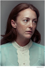
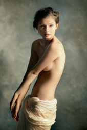
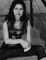
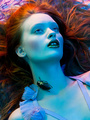
I'm a fan of MM photographer Daniel Murtach, but I'm at a loss what it is about this image that gives it that "painterly" look. Does anyone have any suggestions? https://www.modelmayhem.com/portfolio/pic/3997984 kind regards Guy Feb 02 13 08:14 am Link It's the classic lighting, the muted color palette, the low contrast, and the slight softness that gives it an ethereal look. Feb 02 13 08:20 am Link it may sound silly - you could always ask him... Feb 02 13 08:24 am Link John Horwitz wrote: not silly at all. Feb 02 13 08:57 am Link Asking him will only provide you with his opinion. What is important is that you understand how the elements of the photograph evoke the idea of a "painterly image". A simple exercise will help answer that question for yourself. Put the image in question next to two other images. 1 - a portrait-type image that does not seem painterly 2 - one of Rembrandt's paintings. Spend some time contrasting & comparing among the three images. You'll end up with a much richer understanding of the answer to your question than what you could achieve by asking anyone. Feb 02 13 09:07 am Link still-photography wrote: ...and perhaps that one is most important - who knows more about his art than the artist? Feb 02 13 10:11 am Link John Horwitz wrote: Bingo! Feb 02 13 10:28 am Link The lighting is one key. The "painterly" painted muslin background is another. Put the model in front of white seamless, and it wouldn't have the same look at all. Feb 02 13 10:39 am Link so.....I sent a message to the artist - can't wait to hear when he thinks. Feb 02 13 12:29 pm Link John Horwitz wrote: Please update thread if you get an answer, very curious myself. Feb 02 13 01:36 pm Link Damn nice look! Feb 02 13 02:10 pm Link One major thing making it look like an oil painting is the background. Feb 02 13 02:15 pm Link for starters, they don't call it rembrandt lighting for nothing. Feb 02 13 02:15 pm Link Guy Carnegie wrote: In a word: Light. Feb 02 13 02:16 pm Link Brian Diaz wrote: yep! Feb 02 13 02:22 pm Link Rebel Photo wrote: the colour palet (especially of the skin), and softness....not too hard light, not too deep shadows..... i used a hazy light with this one...and the white studio reflected some back Feb 02 13 02:27 pm Link Thanks for all the replies. I had considered contacting Daniel about it, but I often think the viewer CAN sometimes make more of an image than the photographer intended (not saying Daniel wasn't aiming for the painterly look in particular, but that's what I saw) - hence why I asked here. I think the muslin does have a lot to do with it, and also the tousled hair and skin tone variation (imperfection being the whole point) The imperfections in the tones make me think of brushstrokes and variations in pigment on canvas. Just that it hit me that on first viewing, it looks like a painting, but the more you look the more photgraphic detail is seen. Herman - stunning work. Kind Regards Guy Feb 02 13 03:28 pm Link Guy Carnegie wrote: I think it's window light, which is what painters would have been duplicating. I also think that the distance and material of the background is having an impact. I think if everything was left the same, but you changed the background to seamless paper, it would look significantly less painterly. Feb 02 13 05:42 pm Link John Horwitz wrote: The question is really "what's making me perceive this as painterly" not "how did he shoot this photo" Feb 02 13 05:46 pm Link MC Photo wrote: right.. What struck me is the the exotic look of the model which is reminiscent of some of the models the old masters used... To go along with the Rembrandt lighting and the Seargent background. Feb 02 13 07:07 pm Link MC Photo wrote: except its a crop frame Nikon D50 with a 50mm 1.7 prime shot a bit more open than 2.8. Feb 02 13 07:13 pm Link MC Photo wrote: Do you find it possible to cleave then one from the other? Feb 02 13 07:44 pm Link John Horwitz wrote: probably only if one perceived that the photographer had not succeeded 113% Feb 02 13 07:51 pm Link given the exif data it is UNLIKELY to be window light: IPTC Core (Adobe XMP) Expand All / Collapse All / Show/Hide XMP Source / Show/Hide XMP Legend xpacket = begin="" id="W5M0MpCehiHzreSzNTczkc9d" x:xmpmeta EXIF IFD0 Image Width = 504 pixels Image Length = 732 pixels Bits Per Sample = 8,8,8 Compression = uncompressed (1) Photometric Interpretation = RGB (2) Camera Make = NIKON CORPORATION Camera Model = NIKON D50 Picture Orientation = normal (1) Samples Per Pixel = 3 X-Resolution = 720000/10000 ===> 72 Y-Resolution = 720000/10000 ===> 72 Planar Configuration = chunky format (1) X/Y-Resolution Unit = inch (2) Software / Firmware Version = Adobe Photoshop CS3 Macintosh Last Modified Date/Time = 2009:11:17 15:31:08 EXIF Sub IFD Exposure Time (1 / Shutter Speed) = 1/40 second ===> 0.025 second Lens F-Number / F-Stop = 16/5 ===> ƒ/3.2 Exposure Program = normal program (2) ISO Speed Ratings = 400 Original Date/Time = 2007:07:28 16:59:12 Digitization Date/Time = 2007:07:28 16:59:12 Exposure Bias (EV) = -2/3 ===> -0.67 Max Aperture Value (APEX) = 8/5 ===> 1.6 Max Aperture = ƒ/1.74 Metering Mode = pattern / multi-segment (5) Light Source / White Balance = unknown (0) Flash = Flash did not fire Focal Length = 50/1 mm ===> 50 mm Last Modified Subsecond Time = 50 Original Subsecond Time = 50 Digitized Subsecond Time = 50 Colour Space = uncalibrated (65535) Image Width = 379 pixels Image Height = 550 pixels Image Sensing Method = one-chip color area sensor (2) Custom Rendered = normal process (0) Exposure Mode = auto exposure (0) White Balance = auto (0) Digital Zoom Ratio = 1/1 ===> 1 Focal Length in 35mm Film = 75 Scene Capture Type = standard (0) Gain Control = n/a (0) Contrast = normal (0) Saturation = normal (0) Sharpness = normal (0) Subject Distance Range = unknown (0) EXIF IFD1 Compression = JPEG compression (6) X-Resolution = 72/1 ===> 72 Y-Resolution = 72/1 ===> 72 X/Y-Resolution Unit = inch (2) Embedded thumbnail image: or is it Feb 02 13 08:21 pm Link John Horwitz wrote: ISO 400? shot at 1/40 close to wide open? sure could be. When I looked t the EXIF it was just to see if it was a 5D1 or not. everything else that wasn't 100% crystal clear I didnt bother with. Feb 02 13 08:28 pm Link MC Photo wrote: I agree. Feb 02 13 08:29 pm Link classic composition, model, clothes, pose, and no modern make. Very natural looking. The light is classic too, though in the sample image above, I see a beauty dish reflecting in her eyes. That's in camera. In post.... Desaturated as most "classic paintings" we know have their pigments faded with time. (see before and after images of the Cistine Chapel restoration) Crushed blacks. I don't think these are low contrast images at all. He also appears to "unify" the colors. Meaning that a single color was added slightly to the backgrounds, this giving the entire background a similar tone. A different color layer added slightly to the skins, thus giving all the skin a similar tone. Then I suspect in the sample image (thought not his others) a color gradient was subtly added to the background. I also think the backgrounds, and skin possibly to a far lesser degree, was shift a bit green. Or the skin and hair was shift toward brown. (or it could be just my monitor) I've experimented with similar painterly techniques.  Feb 02 13 09:16 pm Link moving pictures wrote: I don't see this image as painterly at all. Feb 02 13 09:51 pm Link AVD AlphaDuctions wrote: well, to each, his own. many in the fashion industry commented that it does. Feb 02 13 09:53 pm Link Not sure how much credibility to give that EXIF data. It says it was last modified in Nov'09, though MM says it was uploaded in 2007. I can also see the old master style in the image posted above, though the lingerie and makeup brings it bang up to date. I wonder if it was just the romany look of the model? I understand a lot of the old masters models were Romany's. Also, as you say the muted colour palette gives it a look of having been colour shifted over time like many antique paintings. Definitely going to have to get/make a background similar to that. Feb 03 13 12:04 am Link To me it is just the Rembrandt light and the soft creamy colours of the sking and background, the pose and models look helps but that is just it. Feb 03 13 12:40 am Link moving pictures wrote: Perhaps those with a broader knowledge would comment that it doesn't. Feb 03 13 12:52 am Link Kent Art Photography wrote: Everybody thinks they have broader knowledge then those they disagree with. Feb 03 13 02:13 am Link Guy Carnegie wrote: Wow. Never thought of that, but that's a really good observation of the masters and the model in the photo the OP linked to. Feb 03 13 02:16 am Link Guy Carnegie wrote: Guy Carnegie wrote: I'm please that you took it upon yourself to study the image and arrive at your own conclusions! Asking someone how they did something has little or nothing to do with how you may perceive the result. MC Photo wrote: And that is why some photographs tell you something profound about the subject, while others just say, "this is a picture of _____". Feb 03 13 09:01 am Link AVD AlphaDuctions wrote: I see it as very painterly: the body has painterly textures and it is also very good. Feb 03 13 09:11 am Link I agree that it is in the tones and the over all look that make up for a painterly image. I was playing with one the other day, only settings on raw. It has color in the shadows, a certain contrast range that makes it a photograph that could be the reference for a painting. I'm not a painter yet have added color gels into some of my pix to do what the painters did.  Feb 03 13 09:23 am Link Okay, let me try to give you a more detailed answer. Let's start by examining an "old master" painter -- Johannes Vermeer. Here are a couple of his most famous paintings -- google him for more:   In these images, you can see a big window in the painting, and yes, that window provides a large, soft, directional light source. There are additional windows that you can't see, contributing to the large & directional light source. The side of the figure opposite the window are backlit by reflected light off the walls. Now consider this photograph:  Model: Keira Grant This was lit by strobes. There is a big honkin' (4'x6') softbox positioned close the Keira -- it's on a boom arm & tilted slightly down, simulating a skylight. It is very close to Keira, just out of the image frame, producing a rapid fall-off of light. There is a small high softbox positioned off the right side of the image, filling in some shadows. Finally, this light does marvelous things to the various textures in the image. So, in short, start with the light. I'm in the habit of "deconstructing" images; I am especially interested in figuring it out how the scene was lit. That is a worthwhile exercise for all us photographers. Feb 03 13 09:42 am Link John Horwitz wrote: Sometimes they're not separate. "Why am I perceiving this photo as out of focus?" Because it is. Feb 03 13 12:28 pm Link Chuckarelei wrote: I do. Feb 03 13 12:32 pm Link |