|
ikonas wrote: ok thank you Aug 30 12 09:25 am Link eRwin wrote: Delete most of your composites (read my previous posts about these). Delete half your port as its too bulky. One simple way to go about choosing which ones to chop is to delete old images that have one or no comments. Listening to your viewers is sometimes a wise thing to do. If you hate deleting, at least hide them. Aug 30 12 09:12 pm Link Hmm what's my worst? Thanks! Aug 30 12 09:25 pm Link Madison P Cook wrote: A snapshot of three bored looking girls. Delete. Aug 31 12 06:06 am Link I think I may have been missed. I did look, but there are many comments here, so maybe I'M the one who missed your response? Sorry if that was the case! Aug 31 12 04:01 pm Link Jude S-R Photography wrote: Unlike the rest of your port, this one seems like a casual snapshot with no unique idea or concept. A clever caption might save this image, otherwise shred it. Aug 31 12 04:17 pm Link Please Thx Aug 31 12 04:18 pm Link ikonas wrote: Thank you. The one you mention to shred has been one I've been on the fence about for a while. I suppose I really should realize that if there's a question, that question being there in the first place is usually the answer. Aug 31 12 04:24 pm Link Jude S-R Photography wrote: Maybe the answer can be found by examining my port. The worst image is the image of myself. But I still keep it Aug 31 12 08:05 pm Link This may hurt a little... Aug 31 12 08:17 pm Link 
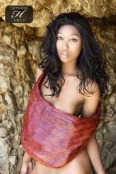
Photographer Posts: 48 Oeiras e São Julião da Barra, Lisboa e Vale do Tejo, Portugal Have a go at it... should i keep anything?? Sep 01 12 10:38 am Link *takes deep breath* Me? Sep 01 12 10:44 am Link Sam Matta wrote: Sam, yours is a creative and captivating port. The following images are weaker than the rest of your port. Sep 01 12 01:59 pm Link Focused_Photography wrote: You seem to be a newbie so I will try to be gentle Sep 02 12 05:49 am Link Miguel Portugal wrote: THe lighting is just not cutting it here. If she faced the other way it could of ade the difference. Delete. Sep 02 12 08:20 pm Link ikonas wrote: Thank you for all of your insight! Sep 02 12 08:28 pm Link Abigail Gladwell wrote: Sep 03 12 07:36 am Link Oh i think you missed my port on page 12.... Sep 03 12 07:58 am Link Love_mya wrote: Ooops, sorry for skipping you Mya. Sep 04 12 09:06 am Link Oh, this looks valuable - could I also undergo the knife, as it were? Comments much appreciated - how can I improve? What can I axe? And what should I work on to make the whole thing better? thanks! LM Sep 04 12 11:28 am Link LIGHTmatter wrote: At the first impression (which is most important) one gets the feeling you are a competent phtog able to create beautiful glamour images. I am sure any model seeing your work would be happy to work with you and will be sure to get great images. Sep 04 12 01:50 pm Link Hello friend Please review mine. As a helpful counter comment. Out of yours, I love this https://www.modelmayhem.com/661522#25800220 My eyes instantly fall on the model. The extra objects in the shot are added eye candy if I so wish to look. Sep 04 12 01:54 pm Link I'd like to know! Sep 04 12 01:55 pm Link Dan Brady wrote: Thanks for the note Dan Sep 05 12 12:24 pm Link JoannaMae wrote: You ought to delete half the images posted in the first four rows as there are multiple variations of the same scene. Please read my previous posts regarding htis subject. The following image is one example but there are at least 6 or 7 such examples. Rememeer LESS IS MORE. Sep 05 12 12:32 pm Link Do tell  Sep 05 12 01:22 pm Link Rik Image wrote: Great light but I find her fake boobs distracting. Delete. Sep 05 12 01:58 pm Link ikonas wrote: Done and done Sep 06 12 03:53 am Link DraytonKennedy wrote: You should delete the following image as you posted a near duplicate. Sep 06 12 01:36 pm Link go ahead. Sep 06 12 07:48 pm Link Vivendi Studio wrote: I recommend removing two images. Here, her expression is hard to interpret, and her swimsuit design has been overused. Sep 06 12 08:21 pm Link I'll play. Which is my worst...? Be as harsh as you wish? Sep 06 12 09:59 pm Link i'm game Sep 06 12 10:33 pm Link I'm in Sep 06 12 11:17 pm Link The Harlequins Mask wrote: I propose deleting this beach image for three reasons. It has the feel of a casual snapshot, there is no unique concept that I can decypher, and the angle is not flattering to the model's figure. Sep 07 12 06:55 am Link Paul Pardue Photography wrote: I propose deleting either your AVI or it's related image. I am not in favor of posting similar images. Furthermore, while the model is beautiful, photographically, your other images are stronge for various reasons which I would be happy to discuss in a PM. Sep 07 12 02:36 pm Link ikonas wrote: Thank you VERY much indeed, I really appreciate it! Sep 07 12 10:13 pm Link Rich__ wrote: Since you posted 3 almost identicl images, delete two. Sep 08 12 06:40 pm Link Greetings folks. I am back from vacation. Ready and eager to answer your new questions Sep 13 12 06:11 am Link Ok! Sep 13 12 06:18 am Link |