Photographer
Other Realms
Posts: 18
Portland, Oregon, US
Well, no one seems to have died from being critiqued, so fire away! (I left some possible variant images up because I'd like to know which ones you think are better and why.) Thanks.
Model
Dae Daniels
Posts: 401
Los Angeles, California, US
James Reed Photography wrote:
Sure, if you're still going. Thanks. Hello James! Well, you dont absolutely need 60 photos to have a strong portfolio, and many of them are variants (even though you've been sly and seperated them  , hehe). Others are just not as strong or unique as some that you have up. And often, its not the fault of the photographer, but of the model that's not quite up to par with the shot. Lets get started! , hehe). Others are just not as strong or unique as some that you have up. And often, its not the fault of the photographer, but of the model that's not quite up to par with the shot. Lets get started!
You have 9 shots of this white sand type background/set with the same girl/bikini, or almost the same girl/bikini. This is NOT necessary! It makes you appear less diverse in your work. Makes someone feel like as they look through your port that they're seeing the same basic image over and over again. these are the ones you should lose (at the very least)
![https://photos.modelmayhem.com/photos/100703/00/4c2eeb30480ce_m.jpg]()
![https://photos.modelmayhem.com/photos/100705/21/4c32b4429099a_m.jpg]()
![https://photos.modelmayhem.com/photos/100705/21/4c32ac928520a_m.jpg]()
![https://photos.modelmayhem.com/photos/100703/16/4c2fca2b876e7_m.jpg]()
so at the very least all the ones above need to go. and you still have 4 left... so you could stand to get rid of a couple more (if you could handle it, lol).
you have a photo very similar to this two rows down, and people like it more, so this one can go.
![https://photos.modelmayhem.com/photos/100705/22/4c32bf7a71b89_m.jpg]()
this goes. The pose is not appealing or captivating at all. the background outshines her. you have a better one. you have three of these so another will need to go also
![https://photos.modelmayhem.com/photos/100703/23/4c303090d73f2_m.jpg]()
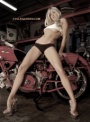
My personal opinion (and that of my partner in this forum - julius), is to stay away from photos with cliche' and over used themes like railroads and belts around womens breasts, etc. But again, at the very least you need to get rid of the following two, as you have three of them.
https://www.modelmayhem.com/portfolio/pic/18466657
![https://photos.modelmayhem.com/photos/100803/19/4c58ced14c888_m.jpg]()
you have many photos with the models wearing this same cowgirl hat, and some are much stronger than others. this shot is sort of soso. nothing to wow you. and her makeup job isnt all that great.
![https://photos.modelmayhem.com/photos/100705/16/4c327001a4f83_m.jpg]()
the other shot almost just below it is better so this can go.
![https://photos.modelmayhem.com/photos/100702/23/4c2eddbb7c41f_m.jpg]()
you have 3 of these pillar shots from the same angle. this on can go, and the one below it can go because you have another shot of her wearing the same thing in the street thats much stronger. Also... the girls are standing in bird shit. not all that hot. hahaha!
![https://photos.modelmayhem.com/photos/100703/15/4c2fbf7b75406_m.jpg]()
![https://photos.modelmayhem.com/photos/100703/16/4c2fc2c747e6e_m.jpg]()
this can go. you have another photo like this of her at the bottom of your port that is much more flattering. here it looks like she's bloated.
https://www.modelmayhem.com/portfolio/pic/18409256
this can go. Its not impressive... people will just scan right over it. you have stronger stuff.
![https://photos.modelmayhem.com/photos/100915/14/4c9140d4adcbe_m.jpg]()
and either get rid of this one or the other with the red draped chair. Also... be careful putting too many photos up of the models doing the same pose. you have a whole bunch of photos in your port of the models doing this pose. It gets redundant.
https://www.modelmayhem.com/portfolio/pic/18437519
Now... I know this seems like a lot of photos i told you to delete. but you still have plenty left, and i promise you that this will only make your portfolio look stronger, and more diverse and beautiful. it really does make a difference. Like shedding excess weight
you have some really lovely images too! here are some of my favs!
great wardrobe, model, pose, composition, and love the set with the pattern on the background.
![https://photos.modelmayhem.com/photos/100704/03/4c30618a6092b_m.jpg]()
lovely shot! tones are wonderful
https://www.modelmayhem.com/portfolio/pic/18722596
am mostly loving the fact that you're being bold with the setting! middle of the street is excellent! i really wish she didnt have that white shirt in the shot 
![https://photos.modelmayhem.com/photos/100703/16/4c2fc195b754f_m.jpg]()
this is nice too. again, loving the setting. you do have some wonderful ideas!
![https://photos.modelmayhem.com/photos/101127/16/4cf1a61f7c670_m.jpg]()
this is also cool. again with one of your awesome locations... the model is doing a nice job here as well
![https://photos.modelmayhem.com/photos/100725/13/4c4c9ecdb95b1_m.jpg]()
I would love for you to take a REALLY REALLY phenomenal model with you to some of these locations and see what you are capable of! I think you've got some wonderful concepts floating around in that head... and with your skill, and the skill of a terrific model really working the hell out of one of your sets... woo! hahaha!
I hope this helped! let me know if you have anymore questions! 
~Dae~
Model
Dae Daniels
Posts: 401
Los Angeles, California, US
Little Rouge wrote:
You guys forgot me no we didnt. there are still other people ahead of you lol. keep your panties on Doll!
Model
Dae Daniels
Posts: 401
Los Angeles, California, US

Hair Stylist
Jason Becker
Posts: 2817
Mount Holly, North Carolina, US
looks like fun i can handle it... 8)
Model
Semele
Posts: 161
Brussels, Brussels, Belgium
Photographer
Aaron - photographer
Posts: 35
Falls Church, Virginia, US
I wouldn't mind, if you're still in the mood.

Model
AlliRae
Posts: 26
Orlando, Florida, US
ikonas wrote:
I find your port quite well organized showing a good range of expressions and poses in portrait/figue/fitness and glamour styles in various settings. It serves as great example to our readers showing the wide range of work possible at a glance in a constaint of just 15 images.
I do propose removing this image as it portrays your thighs somewhat heavier than your other images. You also posted a variant image. While you changed your outfit, you still showing the same white shoes and striking identical pose.
![https://photos.modelmayhem.com/photos/120920/17/505bbb59cd7b5_m.jpg]()
I love your portrait for your beauty, captivating expression and light (although I wish it was larger)
![https://photos.modelmayhem.com/photos/120823/17/5036d16d3acab_m.jpg]()
This image has SOUL - it is incredibly beautiful.
![https://photos.modelmayhem.com/photos/120906/14/504913d65ccb6_m.jpg]()

Photographer
Worlds Of Water
Posts: 37732
Rancho Cucamonga, California, US
Been dying to get rid of at least one of them... which?

Photographer
ikonas Boston
Posts: 736
Boston, Massachusetts, US

David Desoer wrote:
New images coming in means some old ones get to leave. Just hid a few but would love to hear what else you think should go.
Cheers,
Dave Hello Dave. In a relatively short time since you joined MM you put together a decent port with a good range of locations offering some unique concepts.
While I like the unique concept offered in the following collage, I do advise you to can it, as the light is not at its best, the background is visibly creased, and the whole thing is not complimentary to the model's beauty. Note she chose not to post this image in her own port. Furthtermore it is a collage which is against rule [3].
https://www.modelmayhem.com/portfolio/pic/30030714
You should chuck also this collage. While the model, and location are captivating, you are providing a much stronger variant in a single, non-collage image. Or, alternately keep this image and remove the variant
![https://photos.modelmayhem.com/photos/121007/13/5071e27562719_m.jpg]()
You can also remove this one as I just dont find this image captivating, perhaps because the lightin is rather flat
![https://photos.modelmayhem.com/photos/120801/17/5019c6250aab3_m.jpg]()
Lastly you ought to remove this one as her expression is not captivating, plus you provided a variant with some concept behind it - backasswards 
![https://photos.modelmayhem.com/photos/120905/14/5047c06626038_m.jpg]()
I do love the light and composition provided in this B&W image
![https://photos.modelmayhem.com/photos/120928/16/5066379ec4301_m.jpg]()
The light is also pretty good here.
![https://photos.modelmayhem.com/photos/120905/14/5047bfd28830d_m.jpg]()
As a summary, avoid collages and variants, avoid plain crinckled backgrounds, and work more on your lighting skills. It will come, I am sure.
Model
Kasey Lestrange
Posts: 25
Costa Mesa, California, US
this is interesting. how about me?

Photographer
David Desoer
Posts: 148
Cayuga, Ontario, Canada
Photographer
ikonas Boston
Posts: 736
Boston, Massachusetts, US
GraysOfShade wrote:
A little port cleansing is always good. Please count me in. Your photography is quite captivating and your port is in a great shape.
While the individual images are strong, I dont like collages in photog's or llama's ports. It would be much better to post the top image as separately as it is a beautiful portrait all by itself, plus her expression does not go together with the concept of crucificaiton and suffering. You can also post separately the middle imgage and can the bottom one.
https://www.modelmayhem.com/portfolio/pic/30190578
While a great image and one of my favorites for the light, expression and tonality, delete this one as well as you posted an almost identical version
![https://photos.modelmayhem.com/photos/120830/22/504045d063d50_m.jpg]()
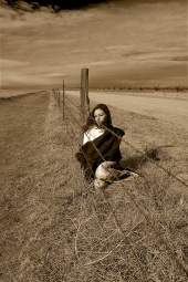
I find many of your images to be superb. this is one of them. The perspective offered by the barbed wire is a welcome departure from the cliche railroad shots found on other MM profiles
![https://photos.modelmayhem.com/photos/090226/20/49a76a5faf922_m.jpg]()
Photographer
ikonas Boston
Posts: 736
Boston, Massachusetts, US
Sydney Max wrote:
If you're still up, I'd love to hear a friendly critique! Greetigs Sydney. You are beautiful and sexy, but you dont need to hear it from me as surely you get it all the time. How to make your port stronger? Several ways. Remove the variants, as they weaken your port. This is the number one thing that drags model's and photographer's ports down. See rule [1]
For starters, please remove this one. While you look cute and beautiful, simply smiling at the camera, like in so many of your other photos, just looks a bit amateurish. Your MM port is not a high school year book. In the future, experiment with a range of expressions - anger, allure, surprise, etc - but always match expression to the scene. The other things that bothers me about this particualr image is that your breasts are touching. I advise my busty models, to pull their breasts apart.
![https://photos.modelmayhem.com/photos/120824/18/503828df2e0dd_m.jpg]()
I would propose also deleting this one and its sister image as you have stonger images posted, plus your breasts seem to droop here - unlike your other images. I ask my models to lift their breasts in one of several ways - pad from below, or use a transparent surgical tape to lift. But never use a duct tape (which all photographers own) as the glue would be hard to remove from your skin.
https://www.modelmayhem.com/portfolio/pic/16369498
I object to the crude way you censored this image. Either remove the image, have someone blur your breasts in photoshop, or take the plunge and bare it all. Hey, the public has presumably seen you bared in Playboy already, right?
https://www.modelmayhem.com/portfolio/pic/29681757
I love the class, elegance and artistry in this image. The tonality is captivating as well.
![https://photos.modelmayhem.com/photos/120824/19/50383b33f0b73_m.jpg]()
You chose your AVI wisely
![https://photos.modelmayhem.com/photos/120824/18/5038305bd3e58_m.jpg]()
Photographer
ikonas Boston
Posts: 736
Boston, Massachusetts, US
David Desoer wrote:
Thank you for the critique. I've taken your advice on most of the points but am leaving the first collage because I find it funny -- creased background and all. Besides, if I had to leave out images because models hadn't included them in their portfolios then I'd have a pretty crappy portfolio with only a few images (including some I consider among my weaker offerings).
As to the rest, points well made. No variants. Get good expressions. More dramatic lighting. I've been working on the last two, actually ... if I put my portfolio in chronological order I would hope you'd see a trend.
Cheers,
Dave "if I had to leave out images because models hadn't included them in their portfolios then I'd have a pretty crappy portfolio with only a few images"
Great point Dave. I stand corrected. Your feedback is much appreciated.

Model
Eleanor Rose
Posts: 2612
PASO ROBLES, California, US
ikonas wrote:
Hi Eleanor, you may recall I reviewed your port on page 13. Seems like you did not follow my suggestions. Please check it out and get back to me with your feedback.
https://www.modelmayhem.com/po.php?thre … 62&page=13 Ah, sorry. I forgot. I appreciate the opinion, but have received far more positive feedback than I have negative on that photo, and have gotten work because of it.

Wardrobe Stylist
BossyB
Posts: 112
Washington, District of Columbia, US
Photographer
ikonas Boston
Posts: 736
Boston, Massachusetts, US
Select Models wrote:
Been dying to get rid of at least one of them... which? I find your portfolio/profile somewhat confusing. Are you promoting your photography skills or pushing the rental of your studio, or both? An effective portfolio should be focused on one or the other.
Your work shows are a talented, creative photographer, however your port needs trimming drastically. We are not talking about cutting one image, but more like reduction by 150, to leave only your very best 40-50 images. (You can hide them if you dont have the heart deleting). Once I viewed 5-10 rows I was already getting overloaded so I started tuning out. Visiting a port should be an experience similar to dining at an authentic French restaurant. The portions are small so you are not overstuffed. When you are done, you are left with a feeling that you want to taste a bit more next time. This is what this forum is all about as explained in my original post. Less is more, and people will judge a port by its worst image. They are likely to miss the star images if they are burried deep.
Keeping a port organized requires constant pruning. Like trimming budding branches, it is a painful process but it must be done.
I will not advise which specific images ought to go, but I am sure you know what to do as you seem to have a great eye. I would love to see the results.
Photographer
ikonas Boston
Posts: 736
Boston, Massachusetts, US
I am back folks. I know I skipped a few of you so if you are one of them, holler and I will do yours.
Photographer
ikonas Boston
Posts: 736
Boston, Massachusetts, US
Rebecca Smith wrote:
Count me in! This sounds amazing Greeting Rebecca,
Like the previous port I reviewed, yours got some super images and it is quite compact. Even if you get MM membership which allow you more, never over post.
You have no variants - yay - and even your collages, which I usually oppose, are quite good with the exception of this one as you expression on the botto is not very captivating. I would just post the top one.
I also propose deleting the image with your fiance. Dont involve your family pics here, lets be professional. I am guilty in this regard as I posted my wife and baby, but I believe mine does not have a snapshot feel ike yours. Still, I am debating of removing mine as well.![https://photos.modelmayhem.com/photos/120627/04/4feae934eb903_m.jpg]()
This one is my favorite for your pose, expression, wardrobe and hair. Your viewers apparently agree.
![https://photos.modelmayhem.com/photos/100115/12/4b50cf52b3337_m.jpg]()
I also like your snake charmer for its light, classy setting, and subject matter. While I hate snakes, the inclusion of this creature in an open cage adds great tension and drama here.
![https://photos.modelmayhem.com/photos/111023/17/4ea4adb588d74_m.jpg]()

Model
Lea Eden
Posts: 32
Glastonbury, England, United Kingdom
Think you forgot me, can you have a look please.

Photographer
RachelReilly
Posts: 1748
Washington, District of Columbia, US
Photographer
Ken harris photo
Posts: 21
Harrisburg, Pennsylvania, US
I'll bite. Give me your opinion if you would.
Photographer
ikonas Boston
Posts: 736
Boston, Massachusetts, US
Audrey Dasia wrote:
I'd love to know! Greeting Audrey, you have an interesting port with a mixture of some great images and some clrearly mediocre ones. So my job is quite easy here.
There is nothing captivating in this image, yu have lackluster expression and even worse, there is no unique concept or light present. Delete. BTW, when you see you got 150 views and no comments, take a hint and listen to your audience, Now there are always exception to this rule, we all get attached to certain images, but in most cases, no comments means image is not captivating.
![https://photos.modelmayhem.com/photos/120908/17/504be6fce4f97_m.jpg]()
Here is an image with a very dull expression
![https://photos.modelmayhem.com/photos/120718/22/50079f0ad9de4_m.jpg]()
This image may be appropriate for a photographer to post, even this is questionable, but to you it does absolutely nothing as it shows nothing.
![https://photos.modelmayhem.com/photos/120803/22/501caf82cc458_m.jpg]()
I love the light and expression here
![https://photos.modelmayhem.com/photos/120322/10/4f6b6842cf4ef_m.jpg]()
Great light, beautiful figure and a very unique pose
https://www.modelmayhem.com/portfolio/pic/27954062
I also love your AVI
![https://photos.modelmayhem.com/photos/121012/22/5078fb1233139_m.jpg]()
Photographer
TheikPhoto
Posts: 10
Brooklyn, New York, US
Hello Ikonas - I'd really like for you to take a gander at my fledgling port. All feedback would be appreciated! Thank you in advance!
Photographer
Richard FBS
Posts: 83
Vero Beach, Florida, US
Take a look at my port and thank you in advance...
Model
Avalon Fell
Posts: 75
Rowland Heights, California, US
Model
Lea Eden
Posts: 32
Glastonbury, England, United Kingdom
[ Thank you, I agree with your comments. No the photographer didn't make me mad, lol, I was just playing around and that was the result quote=ikonas] Lea Eden wrote:
Think you forgot me, can you have a look please. Hello Lea, sorry for skipping you, I also skipped a dozen others as I got too busy. I figured those who come back like yourself deserve a review
You have a rare port in that it avoids all the common no no's in port construction as spelled out in the guidelines of my original post. No variants, no collages, no contrived poses and your port is compact. Now once you are ready to add some images I would propose removing this one as you are wearing the same outfit in anothe image.
![https://photos.modelmayhem.com/photos/121012/05/5078141cb67a6_m.jpg]()
I have a mixed feeling about this one. While the photography is great, and so are your pose and expression, the image seems over photoshopped. Keep the image, but avoid posting images where it is abvious that heavy retouching took place.
![https://photos.modelmayhem.com/photos/121005/17/506f820aea523_m.jpg]()
I love this yeller image. Did the photographer make you mad lol ?
![https://photos.modelmayhem.com/photos/121001/15/506a170f292c6_m.jpg]()
Model
MartaBrixton
Posts: 1022
London, England, United Kingdom
Oh I'd love to know

Model
Angeli Li
Posts: 24
Vancouver, British Columbia, Canada
skipped me 
|


 , hehe). Others are just not as strong or unique as some that you have up. And often, its not the fault of the photographer, but of the model that's not quite up to par with the shot. Lets get started!