This thread was locked on 2008-08-27 13:24:21
Photographer
SPRINGHEEL
Posts: 38224
Detroit, Michigan, US
Matt Towler wrote:
Okay, why not!
- Matt Hey Matt....really informative "About Me"....I found myself nodding in agreement and relating to it....all except the male model part...I won't ask why, everyone has their work preferances....
Row 1 Photo 1-I think there is a good shot in here but as it stands, this one is underlit and I really don't care for the angle....at first I thought she had a guitar neck in her hands.....
Photo 2-Lovely model and a great location....I feel that the camera is to high above here though and once again, she could use some lighting on her front...
Photo 3-Great location (I love waterfalls, esp. in urban areas)....the cropping on this is too extreme tho and you could have really used a reflector here....her back is just too overexposed...
Photo 4-Love the door behind her, great coloring.....she is lovely and the pose is nice....the lighting on this is much better....the nose is abit distracting but other than that, good job....
Row 2 Photo 1-This I like....great mood....I like that the model seems almost androgynous....
Photo 2-Very cinematic....this seems to be telling me a story...love the model's expression and the face behind her...this is really good....
Photo 3-WOW....fantastic work....dark and disturbing.....LOVE this one....
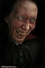
Photo 4-Ahhhh, a self-portrait.....I have two up myself and I laughed when I read you ask why it was the most viewed...the one of me kissing the vampire is, by far, my most popular photo...lol....as for the photo itself? It looks like a cellphone pic of Antonio Banderas....
Row 3 Photo 1-Very nice....maybe abit too much black corset on black background but I like the tone....and I have a thing for bob haircuts so, there you go....
Photo 2-The photoshop stuff overwhelms the model....I wonder what the original image looks like....
Photo 3-I'm not really sure why but this one stands out to me....I guess its the doppleganger aspect of it or maybe all the different effects....I can't say its a great photo but its interesting....I like it....
Photo 4-My only complaint here is the sizing of the photo....I want to see this larger....I love it....great mood....
Row 4 Photo 1-I don't use photoshop so I have no idea what this motion effect is called but I really like it....love the models eyes....this one has the "gotcha!" feeling one gets from horror films.....
Photo 2-This one is just great....love everything about it except the size....I'm just wanting to get closer to her as a viewer...
Photo 3-I can see where the concept for this was but i don't think it works...the "ghost face" feels tacked on....with a model and location like this, I'd rather get a better look at them than effects....
Photo 4-LOVE this one....very German Expessionalist.....don't change a thing but the sizing....I want to see this larger....
Row 5 Photo 1-Hate to sound like a broken record but I so wish this was larger....its an absolutely wonderful image but the full effect is lost....can't read the verse....
Photo 2-This works really well.....you've taken a beautiful woman and made her disturbing to look at.....that takes talent.....I'm not being funny either, damn good job....
So, I can't believe I'm saying this but you should REALLY keep working with photoshop....you take what others use as a big sloppy paintbrush and use it as a fine artist....however, if you're moving away from it, you seriously need to work on lighting.....great stuff overall....
Photographer
SPRINGHEEL
Posts: 38224
Detroit, Michigan, US
SickShooter wrote:
Ooohhh...me next? Ahhhhh, the lovely SickShooter.....I've admired you for awhile love...
Row 1 Photo 1-Starting off with a bang! Brilliant...the expression, the pose (love the moirroring effect you do with your hands), the colors....just fantastic....
Photo 2-This is cute....I actually prefre your expression here and think that should be the focus instead of the yellow guy...
Photo 3-I'll be honset, I've never cared for these types of photos....thsi a cliche I have yet to see anyone work to their advantage....
Photo 4-You have such an amazing, expressive face....everything about this photo works wonderfully....
Row 2 Photo 1-I'm in danger of repeating myself over and over about your face.....this is a great variation on the glamor photos of early Hollywood....those feathers shouldn't work but damn, they came out perfect...
Photo 2-Must....not....mention.....beautiful....face.....okay, I'm better....damn, there is just too much red here....it works better than it should but its bleeding off into the right area of your chest....
Photo 3-I'm not a fan of Dutch angles, even though it works pretty well here....the photo itself is too over-saturated....you pull it off tho....
Photo 4-Abit too much green but sexy....I like this one....
Row 3 Photo 1-This one works for me but at the same time doesn't....I love your expresion (here I go again) and the pose....until we get to your hip and that line bugs me....the color goes abit wonky toward the edges of the shot too....
Photo 2-This is so cute and it works....you're great in it but once again, the photographer doesn't seem to trust the colors and oversaturates....
Photo 3-Breathtaking....the only thing I would change is the position of your fingers....they seem to stiff and it honestly looks like you might be trying to pick something on your face....but I'm so blown away, that seems petty...
Photo 4-Such beautiful eyes....love the colors here....the photo should have stopped just below your waste tho, too much black at the bottom...
Row 4 Photo 1-Here is a case where over-saturation really works and adds to the photo....very well done...
Photo 2-Fun and sexy....simple shot, pulled off beautifully...I have such a thing for "rock chicks" and you nailed the look and added an impish humor to it....love this one...
Photo 3-This is just magnificent....I can't find anything about it that doesn't work....this baby fires on all cylinders...LOVE it
You have one of the best portfolios I've seen here...OH, how I wish I could do a shoot with you....
Photographer
SPRINGHEEL
Posts: 38224
Detroit, Michigan, US
Ãber Dami wrote:
im game Okay, two things before I start....what an impressive list of credits, damn you're a busy lady...and I'm just gonna get all sqeeling schoolgirl on you and say "OMFG, you are HOTT!!!"
Okay, now that I have control....
Row 1 Photo 1-After reading your credits, i was hoping I'd get to see you perform....unfortunatly, this photo is so poorly lit it does you a disservice...
Photo 2-Very striking but not as well lit as I'd like....abit too much blue saturation also....
Photo 3-You look great but the photo was composed sort of arbitrarily....I like the softness tho, so the overall feel works....
Photo 4-Great expression, great pose, great look....this photo works.....
Row 2 Photo 1-amazingly sexy here....everything about you is perfect in this photo....just needs to be cropped the tiniest bit down at the bottom of the frame...
Photo 2-Oh those eyes....love the feeling of closeness in this one....makes me feel like you're about to dare me to do something fun and dangerous with you....
Photo 3-My inner schoolgirl screams out again....you're just working everything here....probably my favorite photo of you....
Photo 4-Love the look but the angle is wrong and its not well lit.....I can see what the photographer was going for here but itdidn't come off...
Row 3 Photo 1-Wait, no, THIS is my favorite photo of you....love the pose and those sultry eyes.....the photo needs abit of cropping at the bottom tho....right before the skirt ends...
Photo 2-You look flawless....love the pose....that watermark is pissing me off tho....between it and the gate, its making the photo too busy and taking attention away from you and the location....
Photo 3-I find most Dutch angles unnecessary and this is no exception....the composition is off in this photo too....
Photo 4-Amazing....you are just....wow.....and the shot itself is great, captures you wonderfully...
Row 4 Photo 1-I want this to work....it just seems kinda...well, boring....if its an advert, I don't think it works....there is no center of attention in it...you, the other model and the guitar are all given a sort of blown over view and nothing jumps out and strikes me....
Photo 2-Having not shot contortion yet, I can't say how I would do it exactly but it seems to me that the composition should focus on the body and also have a vision....this photo does a better job showing your body than the first one, but the lighting is too harsh....
Photo 3-Great expression and that window is great but I can't figure out your position....it looks like you're holding yourself in the frame with your legs but I can't really tell....this should just be a more dynamic photo....
Photo 4-You're expression and pose are great...the composition works well....the color is a bit too drab and the other model's head looks like bad photoshop...
Row 5 Photo 1-Love this look...its David Lynch's Dune meets Braveheart....I don't care for the photo itself tho, its too drab and the background makes your costume confusing....
Photo 2-Great expession, great pose, LOVE the dress....the composition is abit off and the black is abit too saturated...
Photo 3-Love the coolness of the color....what a stomach you have! Its not well lit tho...
Photo 4-Very natural, well lit...I like this one....its you unaffected....
You have such a future....I can't wait to see you take over the world....

Model
Uber Dami
Posts: 5551
New Haven, Connecticut, US
wow thank you so much 
Photographer
SPRINGHEEL
Posts: 38224
Detroit, Michigan, US
Ãber Dami wrote:
wow thank you so much You're very welcome love....consider me a big fan....I thank you for letting me look over your work....
Photographer
Sponge Studio
Posts: 141
Waltham, Massachusetts, US

SPRINGHEEL wrote:
So, I can't believe I'm saying this but you should REALLY keep working with photoshop....you take what others use as a big sloppy paintbrush and use it as a fine artist....however, if you're moving away from it, you seriously need to work on lighting.....great stuff overall.... Thak you for all that, I am using Photoshop less and less (or at least not so obvious) and trying to work with the original lighting better. I don't use flashes or reflectors that much, especially outdoors. The size of the pictures online has to do with fear of image theft. The first row are from pics that I haven't done any extensive Photoshop work on, beyond levels. The model was unsure of how to hold the blade, I agree. These photos range from the past decade, so I'm glad there is improvement! :-)
The pic on which you reply (Photo 2-The photoshop stuff overwhelms the model....I wonder what the original image looks like....) is probably when I started really examining how much Photoshop to use and when to hold back.
Thanks!
- Matt
Photographer
SPRINGHEEL
Posts: 38224
Detroit, Michigan, US
Matt Towler wrote:
Thak you for all that, I am using Photoshop less and less (or at least not so obvious) and trying to work with the original lighting better. I don't use flashes or reflectors that much, especially outdoors. The size of the pictures online has to do with fear of image theft. The first row are from pics that I haven't done any extensive Photoshop work on, beyond levels. The model was unsure of how to hold the blade, I agree. These photos range from the past decade, so I'm glad there is improvement! :-)
The pic on which you reply (Photo 2-The photoshop stuff overwhelms the model....I wonder what the original image looks like....) is probably when I started really examining how much Photoshop to use and when to hold back.
Thanks!
- Matt Oh yes, there is certainly improvment and I can understand you wanting to push yourself out of your comfort zones....I use mostly natural lighting myself and I'm in no way a lighting expert....I've got a long way to go myself (plus my camera is an old P&S)....I predict you'll nail lighting in a couple of months and then your non-photoshopped images will kick ass as much as your best photoshopped ones....
Model
aubli
Posts: 66
Seattle, Washington, US
Would you look at mine? My personal interests lie towards alt/dark... I'm not sure how well my porfolio reflects this, though. btw, the first shot in my port will probably be replaced by a more polished version soon.
Model
Loretta Lightningbolt
Posts: 4127
DEVILS ELBOW, Missouri, US
Thank you so much for a very thorough critique!
Photographer
SPRINGHEEL
Posts: 38224
Detroit, Michigan, US
aubli wrote:
Would you look at mine? My personal interests lie towards alt/dark... I'm not sure how well my porfolio reflects this, though.
btw, the first shot in my port will probably be replaced by a more polished version soon. Hello Aubli....first let me say how much I admire your diversity ...and dreadlocks? VERY sexy...
Row 1 Photo 1-I agree, the polished version of this is better but this one is honestly very good...I'm no fan of fake backdrops but that usually because the photographer doesn't light the model to match the background.....this one is pretty well lit....and wow, what an amazing body you have....love the boots...
Photo 2-This works for one reason, it shows the skill you have in pole dancing....the background isn't good but at least its subtle....I'd love to see a more dynamic shot of you on the pole...
Photo 3-Same as the last only better posing....man, that is impressive....
Photo 4-Oh, this is beautiful...I actually said that outloud when I saw this....I have nothing but praise for this....magic....
Row 2 Photo 1-Although I admire anyone doing girl-girl photos that aren't explotive, this one just doesn't work....the pose is unflattering, the lighting is almost nonexistant....a photo like this needs to feel intimate, the viewer needs to feel as if they are sharing a private moment....
Photo 2-And this one does exactlt the opposite of the last...the pose is good, the feeling is there....it just feels like a snapshot....
Photo 3-BINGO! This is what the other two wanted to be....this is just perfect...well, lit, well composed, sexy.....fantastic....
Photo 4-I love the lighting here and you look great....something is going on with your knees tho....maybe this should be cropped higher, mid-thigh maybe....
Row 3 Photo 1-wonderful....confrontational....I love this....the composition and colors are perfect...
Photo 2-Wonderful in its simplicity....composition, lighting, everything works....and has anyone ever told you that you have a perfect naval?
Photo 3-I like the look you have but the shower thing isn't working for me....this photo should be just a portrait of you with this look....the water hitting you doesn't do anything for it and looks like an afterthought....
Photo 4-I love the feeling of this and the slight smile on your face....usually photos like this try for somber, I'm glad this one didn't....
Row 4 Photo 1-Oh, this is brilliant! Dark, primative, in your face...this is just great...Love the texture...
Photo 2-Too much color saturation and you're too far away for this to work....like the wig tho...
Photo 3-Beautiful, just beautiful....i wouldn't change a thing....
Photo 4-Not bad but kind of drab....also, the composition kind of throws me...what is that square thing next to your right hand?
Row 5 Photo 1-I honestly don't know what to think about this....too dark for me to make you out or what it is you're holding....
Photo 2-This is okay but I wish the lighting were better....it doesn't hit the mark like it wants to...
Photo 3-This one took me a minute but I like it....it should be bigger tho, I've a feeling the details its missing because of its size would make this much better....
Photo 4-Love this...stark and beautiful....love the color....your eyes are amazing....
You have a portfolio that has a mix of incredible photos and what feel like placeholders....Its my belief that if you took out about half of these shots, you'd have one of the top 10 portfolios here or anywhere....
Photographer
SPRINGHEEL
Posts: 38224
Detroit, Michigan, US
SickShooter wrote:
Thank you so much for a very thorough critique! You are welcome love and I thank you for allowing me the pleasure of viewing you and offering my advice....
Photographer
SPRINGHEEL
Posts: 38224
Detroit, Michigan, US
Anyone else? If you even think your stuff might qualify, it probably does....

Digital Artist
Koray
Posts: 6720
Ankara, Ankara, Turkey
go ahead man
Photographer
Erebus Media
Posts: 205
NORTH HOLLYWOOD, California, US
I would like to be critiqued I too feel that the dark themed shoots are not given any real credit. I have been trying to get some feedback but no one really seems interested in critiquing my work...
Photographer
SPRINGHEEL
Posts: 38224
Detroit, Michigan, US
Koray wrote:
go ahead man Hello my friend, thanks for offering yourself up....lol Perhaps I'm showing my age but do you happen to remember the old anthology magazine Night Cry? There was an artist that did the covers that your work reminds me of....
Row 1 photo 1-I seem to remember a debate about this photo.....I'm in the "its too dark" crowd...it doesn't hurt the photo at all but it would help to have it a smidge lighter...other than that, its wonderful....great concept....
Photo 2-This one brings to mind DePalma's Carrie and the Tomie films from Japan...to have that much light in a photo and to be able to wrangle it is an amazing talent....however, there is part of me that wishes she was nude under the gown....
Photo 3-You're probably one of the only people who use these kinds of effect not for effects sake but as art....great composition and use of light but somehow or another the photo itself just doesn't grab me....maybe its abit more whimsical than I like....
Photo 4-Another good concept where I don't think it was executed the best it can be....or maybe I'm just missing something...is that a storm or tidalwave behind the swimmer?
Row 2 Photo 1-This is just beyond words....the greatest photo in your portfolio...if I could create a shot even a third disturbing as this, I would be a happy man...
Photo 2-I appologize but for some reason MM won't let me get a closer view of this...I can make it out in the thumbnail but unless I can see the entire image, I'll not say anything about it...
Photo3-Very H.R. Geiger....I have no idea how you got this shot but its wonderful....
Photo 4-This just doesn't feel natural...it seems like a test idea instead of a finished image....the details of the head are great but I'm not caring for how the body is lit....
Row 3 Photo 1-Very exciting shot, love the work you did on it.....has anyone ever said that photoshopped wings are clixche? lol I do think that the sky should be the entire background, having it go white around the model makes it fel less fluid...
Photo 2-Oh is this good....the eye, at first, sees a model cast in gloomy light...let the eye wander and it comes to the eyes...kinda creepy....and then the eye is drawn to the hands....something seems wrong....count them....OH WOW.....
Great effect....I love that subtle macabre feel....
Photo 3-Another Geiger-esqe piece but to be honest, I kind of like your work better...its more organic and earthier....less "arty"....this would be a great cover for a sci-fi paperback....at first I didn't like her half-mask but the more I look at it, the more it grows on me....excellent work...
Photo 4-Oh is she disturbing....I just wish there wasn't so much negative black space....
Row 4 Photo 1-At first i didn't care for this....too busy, I thought....too dark....but as i look at it, more and more emerges....this is just wonderful....dark art my friend....this makes you work and rewards you for it....
Photo 2-I honetly hesitated looking at this one thinking "Any extra legs? Is her face missing an eye?"...LOL....between all the other images, this stands out in its simplicity and elegance....lovely work....
Photo 3-Someone left a comment on this one saying it looked like a book cover...I agree....its a strong image but feels more like an advert....nothing wrong with that but it feels slightly derivative....
Photo 4-Gruesome as all get out....one of the things that really works here is the lighting....it reminds me of the fluorescent lighting in hospitals....
Row 5 Photo 1-I love the middle image....I'm a fan of subtlty...the last one feels abit too Heavy Metal magazine for me....what a wonderful model btw....
If I had any advice it would be to move farther away from looking too similar to other artists....I think you're wearing your influances about too obviously....you are obviously a master of photoshop and you can write your own checks in the world of fantasy/horror advertising....
Digital Artist
Koray
Posts: 6720
Ankara, Ankara, Turkey
thanks man just one thing though, about the last image, I really did lighten it up after all the comments and I think its ok as it is now...my DA page has the previous version

Model
aenux
Posts: 571
Calgary, Alberta, Canada

Photographer
Nihilus
Posts: 10888
Nashville, Tennessee, US
Model
aubli
Posts: 66
Seattle, Washington, US
Such a detailed critique... thank you very much!
Photographer
Odins Eye
Posts: 1925
West Wendover, Nevada, US
Photographer
nevar
Posts: 14670
Fort Smith, Arkansas, US
um wow you've really cut yourself out for a ton of work....
do me next (lol)
need any help BTW?
Model
Mari Syn
Posts: 231
San Juan, Texas, US
Photographer
SPRINGHEEL
Posts: 38224
Detroit, Michigan, US
Erebus Films wrote:
I would like to be critiqued I too feel that the dark themed shoots are not given any real credit. I have been trying to get some feedback but no one really seems interested in critiquing my work... Love your Filmmaking Manifesto, very admirable....do you have a distribution deal set up?
Row 1 Photo 1-The blue tint is taking me out of this...it doesn't really set the mood the way, say, B&W or maybe a sickly green would....the concept behind the photo is a good one but the syringe just looks too big and the model isn't tied off as tight as I would think for realisim...its a striking image but feels alittle too stagey....
Photo 2-In this one, the model is doing a great job selling the image but the angle could be more dramatic....as is, I don't feel it....again, too stagey...
Photo 3-Now this one I like alot....its telling a story.....angle and composition are good, like the light coming in from behind the model's head....this photo feels "dirty"....good job...
Photo 4-The only thing I would change in the shot is the color...for some reason that blue is just not working for me....try it in a more desaturated blue....
Row 2 Photo 1-Lovely model, I like her expression....the Dutch angle isn't contributing tho and the photo feels more like a snapshot....
Photo 2-Honestly, the photo is too small but from what I can see this one also feels too much like a snapshot...once again, lovely model...
Photo 3-At first I didn't like this but its growing on me....I think what's bothering me is the angle....if she were cropped right below the elbows, I think this would be a much more dynamic photo....
Photo 4-Everything here is fine except the cropping once again....lovely girl but below her waist, the angle is unflattering....her pose itself is rather plain....I want to feel something from her....
Row 3 Photo 1-Okay, this one is dynamic and I like it....I would suggest cropping the top of the photo to about abit above her head.....
Photo 2-Best photo in your portfolio hands down....don't change a thing, this one is simple and powerful....
All in all I see alot of energy in your work but I think you need to work more on your compositions....try to see every photo as cinematic....try to tell the story in that one photo....send me the details about your films, I'd like to see one....
Photographer
SPRINGHEEL
Posts: 38224
Detroit, Michigan, US
Koray wrote:
thanks man
just one thing though, about the last image, I really did lighten it up after all the comments and I think its ok as it is now...my DA page has the previous version Very welcome....yes, it does look lighter....don't get me wrong, its a good image but it just feels like we need to see it just abit more clearly....
I know how agrivating it can be though to feel you've nailed an image and have everyone else not see it the same way.....

Photographer
DezLand Studios
Posts: 155
San Antonio, Florida, US
Ill play and critique, Ill warn you im not all that good at critiquing but Ill do my best, dark art is a personal fave of mine Ill critique all the people who posted before me, to be fair, But ill do it directly in your port so it wont get lost in the threads, ya know? -Kira
Photographer
Erebus Media
Posts: 205
NORTH HOLLYWOOD, California, US
SPRINGHEEL wrote:
Love your Filmmaking Manifesto, very admirable....do you have a distribution deal set up?
....
All in all I see alot of energy in your work but I think you need to work more on your compositions....try to see every photo as cinematic....try to tell the story in that one photo....send me the details about your films, I'd like to see one.... Thanks for taking the time to look at my work for now the films are on hold and I wont be doing one just yet the initial route I was going to take was mostly in films but for now its going more towards the photography side.
Photographer
Kollisions Studio
Posts: 1897
Los Angeles, California, US
I think I fit the profile- you can go ahead and critique me if you like.
Photographer
SPRINGHEEL
Posts: 38224
Detroit, Michigan, US
aenux wrote:
I'm game. ^_^ Well hello Aenux.....if you've been reading the posts I've written for others, I'm sure you'll notice that I'm very complimentry to all these lovely ladies....and for you, I must go even farther....you are astonishing.....hun, if you don't make it big time, planet Earth is in its final days.....just gorgeous....
Row 1 Photo 1-magnificent right off the bat....hair and make-up are superb....love your expression.....sexy and vulnerable....
Photo 2- Once again, you look amazing.....what great bone structure....photographing black shiny material like vinyl can be difficult (believe me I know) but I really think the lighting on this could be better...it just sort of peters out bellow your breasts...
Photo 3-You're looking wonderful, once again expression is right on....the problem I'm having here is the odd framing....you're cut off too far into your head and the coat takes up too much of the frame...
Photo 4-You look amazing here love but this feels off....the bling doesn't seem to match anything here....your outfit doesn't match the sheets....the expression doesn't match the outfit.....this feels like 4 different ideas that were just thrown together....
Row 2 Photo 1-Love the look and pose (whoever does your hair and make-up is fantastic)....the photo itself isn't lit as well as I'd like and the Dutch angle makes it look like you're in danger of sliding off the couch.....and that slight bit of hand we see shouldn't be there...
Photo 2-Love your hair and love the sky....everything else? I can't see it....as I said, black shiny material is difficult to photograp and putting you in front of anything dark is a mistake in that outfit....
Photo 3-I really like this....I only wish you were closer.....lovely coloring and lighting....
Photo 4-This isn't working for me....too much negative space and the lighting just seems willy-nilly....
Row 3 Photo 1-This I like, esp. the color....the framing is off though...other than that, very nice...
Photo 2-Love this one....wouldn't change a thing.....
Photo 3-Breathtaking....honestly, this is just beautiful...simple and very well done on all counts...
Photo 4-Love the expression...this feels like it belongs in Playboy (thats a compliment)....its cute and sexy....
Row 4 Photo 1-Okay, those lashes KICK ASS....this is a great shot....someone called this "Glamour's Evil Cousin."....couldn't say it better myself...
Photo 2-Lovely location....love the pose and your hair looks great....once again, I'm going to point out the black....the outfit just becomes a silhouette...
Photo 3-Love the hair...you have a wonderful profile....I'm just not liking the angle on the pose....
Photo 4-Now this is how you light and shoot a black outfit.....great pose....
Row 5 Photo 1-love the choices here....white clothes seem to fit you better...everything about this photo appeals to me greatly....love this one...btw, was it difficult balancing yourself up there?
Photo 2-What a magnificent body.....wonderful pose, love the lighting...there is a bit more pink in your face than I would like but other than that, wonderful....
Photo 3-I'm feeling about this one pretty much the same as the other "artistic nude"....this one is better but I just don't care for it as much as I would like....its the lighting mostly....if done improperly, lighting in these kind of photos just feel hapazard....
Photo 4-Loving this one....great pose and look....very confrontational....lighting is damn good....
I find it ironic that you have no interest in glamour since you seem so suited for it....it pleases me actually....Goth/alt photography needs its own "supermodels" and I certainly think you are it....you're exquisite
Photographer
hallopino
Posts: 666
Palatine, Illinois, US
Sure, I'll toss my hat in the ring. Love to get some feed back.
Photographer
SPRINGHEEL
Posts: 38224
Detroit, Michigan, US
Okay everyone....I really appreciate the offers to critique along with me but honestly, I can handle it.....thanks for the support though.....
Photographer
hallopino
Posts: 666
Palatine, Illinois, US
understood. Damn open flood gates.
Photographer
DezLand Studios
Posts: 155
San Antonio, Florida, US
SPRINGHEEL wrote:
Okay everyone....I really appreciate the offers to critique along with me but honestly, I can handle it.....thanks for the support though..... Your welcome!
Photographer
SPRINGHEEL
Posts: 38224
Detroit, Michigan, US
Nihilus wrote:
Oh, sure. I'll play. Ahhhhh Nihilus.....one of my favorite artists here....this is indeed an honor....
Row 1 Photo 1-My second favorite photo you did with the gorgeous Lamonica....great lighting and I love the green....Lamonica's pose is great...the Dutch angle works good here....I think you did the best you could getting the other model in there but she still seems to be sort of wedged in the shot....
Photo 2-Everything comes off wonderfully in this shot except it would work better if the photo ended just below her breast....having her midsection in the shot just sort of makes it look as if its trailing off and delutes the image....
Photo 3-The lighting, color and blur make me think of a horror film from the 70s....unfortunatly, it seems like alot of noise for what is esentually girls walking....
Photo 4-This one I love....its gritty and yet not overpowering....
Row 2 Photo 1-I'm not caring for the pose of the model lying down or the way she is framed....the angle makes me wonder if she has the gag in her mouth or not...well lit though and the models look very good physically....
Photo 2-Great concept, very well done....thanks for not going overboard with the lighting or going obvious with the color....
Photo 3-What a fantastic profile she has!!! At first I thought with such a tough yet sexy girl holding blades this should be on location but the more I look at it, the more I like this minimalist approach....
Photo 4-Again, i don't care for the angle and the color is oversaturated more than I'd like but I love the pose and the shadows on theirfaces make this slightly creepy....
Row 3 Photo 1-This has a warm, sensual feel I like....just wish the light caught her breast alittle more...
Photo 2-Really like this one, even the angle....there is something sexy in the way she pushes her thigh against the bars and that her face is cast in shadow....
Photo 3-Another excellent shot....love the color....I feel like I'm sharing a private moment with her....and I love the lighting on her groin....it teases and makes the area seem slightly unnatural....
Photo 4-You're one of the only people that I've seen make Dutch angles work....this one is a good shot, I like that I can't see her face....and two of my favorite parts of a woman (collarbone and foot) are very well lit....
Row 4 Photo 1-This is lovely.....great use of the model's physicality and her expression is wonderful....
Photo 2-I'm on the fence about this one....I like the dramatic angle and lighting....not crazy about the coloring.....what is going on with her crotch btw? The fact that it looks so odd makes me feel like I should study this one for awhile....
Photo 3-Lovely....the pose, angle, lighting....this is one of my favorites....
Photo 4-Oh I want to like this one but the dutch angle is killing me....everything else is great though....Really like the model here....
Row 5 Photo 1-It feels like this was some sort of test shot....Outside of having these (admitedly cool) chopsticks shoved forward toward the viewer and the model's interesting look, I just have no reaction to it....
Photo 2-Everything here is just fabtastic except the model's expression.....she looks slightly bemused....
Photo 3-this gorgeous model and sexy as hell pose makes this work for me....the lighting toward her leg doesn't seem to match the rest of the photo but I'm fine with that....the rest is so striking, I barely noticed....
Photo 4-This I really, REALLY like....gorgeous models, great pose, great location....as I've said before, my problem with most girl-girl shots is that the model's look uncomfortable with intimacy.....not a problem here....
Its just great to see someone who specializes in "Dark" sexuality and doesn't pander to exploitation....
Photographer
SPRINGHEEL
Posts: 38224
Detroit, Michigan, US
aubli wrote:
Such a detailed critique... thank you very much! You're very welcome love....thanks for letting me have the pleasure of looking over your work and sharing my thoughts....
Photographer
SPRINGHEEL
Posts: 38224
Detroit, Michigan, US
Odin's Eye wrote:
http://odins-eye.deviantart.com/
Linking to my DA page if you want to see the stuff there. Thanks my friend....I'll be sure to take a look....
Photographer
SPRINGHEEL
Posts: 38224
Detroit, Michigan, US
ravens laughter wrote:
um wow you've really cut yourself out for a ton of work....
do me next (lol)
need any help BTW? Yeah, I really didn't expect this much reaction.....I'm very pleased though....such wonderful work I'm seeing, I love being exposed to such creativity, its inspiring....
I'm cool with the load right now....
And now, I have the pleasure of going over yet another of my favorite artists here....
Okay, I just looked and saw you have 5 pages????? Oh man....okay, I'm not sure if I'll do a photo by photo here but I'll do my best....
Page 1 Row 1 Photo 1-I like how serpentine she is but the lighting on her skin looks a bit too plastic....
Photo 2-Love the concept, love the photo....just something abouth the model's face that isn't working for me....I just don't think her expession matches the rest of it....
Photo 3-Can't say enough good things about this one....sexy and disturbing....a combo dear to my heart...
Photo 4-Will I piss you off if I say this looks like it should be on the side of a conversion van circa 1976? I'm sorry my friend but this just doen't work for me at all....
Row 2 Photo 1-Love this one....the rich blacks, the lovely decay.....and the fact that the model looks like a former girlfriend of my wife and mine certainly helps....
Photo 2-I can't believe this wasn't shot on location....excellent work....gorgeous model...
Photo 3-Oh this is ballsy and I love that....nice composition, love the model (I'm a fan of women's backs and rears)
Photo 4-Nice portrait for her and its well done....just not as dynamic as I'm use to....
Row 3 Photo 1-Jebus you are a photoshop god.....love the composition and her pose....the curve of her back is lovely.....the only thing I ask is, are those heels she is wearing? Kinda looks like her foot is oddly shaped...
Photo 2-damn but I love this.....feels like a still from the 20s.....perfect....
Photo 3-Fluid and dynamic....great lighting.....
Photo 4-The lovely Shyly....I wish i could work with her.....you captured her sweetness and femininity.....
Row 4 Photo 1-I am awarding you the title "Master Back Photographer"....Another brilliant work....I love the fact that it feels so old and yet at the same time there is a coffee maker there...
Photo 2-Hmmmmm, this one feels like it should be more disturbing than it is....at first, I just thought it was portraiture but then I noticed her legs....not sure whats up here but it just doesn't feel complete....
Photo 3-This is adorable.....love the model and the pose...great colors......but what is the oval object behind her?
Photo 4-This feels like several different ideas tossed together....I wish it was just about the levitating model....and that her bottom wasn't hitting the doorway....and the wolf? Just not working for me....
Row 5 Photo 1-Nice and simple, an exercise in color and texture....I like all of that but the model's skin looks too photoshopped....
Photo 2-This is just brilliant.....reminds me of Polanski's Repulsion.....love the fact that the whole thing feels like its crumbling and decayed....
Photo 3-I'll be honest, this isn't my kind of photo....I can apreciate the obvious work you put into it but it looks like a perfume ad....
Photo 4-the ass man in me screams "thank you!!!".....this is such a good concept and you nailed it.....
Okay, I owe your other 4 pages critiqes and I will get to them but I'm going to take a break from your portfolio and try to get caught up on the others that are waiting.....hope you understand....
Photographer
SPRINGHEEL
Posts: 38224
Detroit, Michigan, US
~m-ODDe Sins~ wrote:
I believe that smile is an invitation? I can't resist when a lovely woman smiles....
Row 1 Photo 1-I like this....nice use of shadow and the skull is a nice touch.....you're just adorable....
Photo 2-This would be a real keeper if it were lit better....as is, not so good....
Photo 3-Okay, full disclosure....I HATE snakes....however, I LOVE beautiful, chesty women....
;-)
Anyway, the only thing that doesn't work for me here is the light across you breats....its too bright, it could use deflection....
Photo 4-You both have a fantastic look....however, this one once again looks like a snapshot....
Row 2 Photo 1-there is an honesty here that I like....the composition is not as good as it could be though.....
Photo 2-You look beautiful.....this comes of like a well lit and clearer version of a self taken MySpace photo....
Photo 3-You are absolutely adorable....you have amazing eyes....you're looks are the only think saving this tho....technically, this shot is just not good at all...
Photo 4-I really like your expression here.....unfortunatly, its the only thing of note in this shot....
Row 5 Photo 1-This is a snapshot but I kind like the mood of it....feels like you're going out to the club in abit....
You and your husband have great, unique looks....you're an absolute doll....I think you have a good future in alt modeling but you absolutely MUST hook up with better photographers...
Good luck hun....
Photographer
SPRINGHEEL
Posts: 38224
Detroit, Michigan, US
DezLand Studios wrote:
Ill play and critique, Ill warn you im not all that good at critiquing but Ill do my best, dark art is a personal fave of mine
Ill critique all the people who posted before me, to be fair, But ill do it directly in your port so it wont get lost in the threads, ya know?
-Kira Well everything was under control until I saw how ginormous Raven's Laughter's portfolio was!!!
Great "about me" btw....I smiled and nodded the whole way through it....some of those project names sound really cool too....
Row 1 Photo 1-Okay, I'm not one to start burning the photo cliche effegy at the drop of a hat but selective destaturation with babies almost always has me lighting the torch...its a good image overall but not only do I have issue with the color but there is something odd going on with the child's leg....what is that line? I don't use photoshop so I can't just name it and critiqe its use but it is pretty obvious....
Photo 2-Lovely smile and eyes but the color is way too saturated....the lighting gives her a double chin...
Photo 3-There are some photos where the image itself trumps the technical flaws....this is one of those....I honestly love this....priceless....
Photo 4-here is a case where overexposure really works....great work...
Row 2 Photo 1-This is an attention getter but it doesn't really offer anything after it gets the viewer to look....
Photo 2-What a doll....such wonderful expressions....I do believe you have a future model on your hands....
Photo 3-There is a warmth here that I like....its a bit blurry though....pretty good job with the photoshopped skin....A TIP- I have worked with plus-sized models and its usually always a good idea to be very aware of composition so you don't make them look large and unflattering....I would crop this at her left hand, just before the frame hits her right hand....try it, I think you'll agree its a better composition...
Photo 4-Lovely girl, gorgeous eyes (the slight color works here)....this is a nice, natural shot....I like it....
Row 3 Photo 1-I like everything about this except for the shine on her skin.....its just a tad too much...
Photo 2-Great looking couple....the lighting could have been manipulated better though....their faces are too dark, the rest too bright.....try a deflector next time...
Photo 3-Now this I REALLY like....everything works wonderfully....excellent job...
Photo 4-This one is almost there....the make-up is just abit too obvious....once again, I don't know photoshop but is there a way to make the lips look just a tad less bright? Do that and this one is perfect...
Row 4 Photo 1-I left a comment on this one back in August and I stand by what I said....I just love this shot....probably the best one in your portfolio...
Photo 2-Here is another one that is just wonderful.....I just LOVE the look of the woman and the light behind her...
Photo 3-I want to like this one but its just too dark....I think I'd like it alot if I could just make it out....
Photo 4-this is a nice character piece....I want to see where this character is going, I want to know more about him....very cinematic....that guy has a great face....
I'll be honest hun....I much prefer your "dark" work to your other more mainstream stuff and its not just because of my preferance.....it seems your heart just isn't in the other stuff....follow your heart and vision.....you've got some damn fine stuff here....
Photographer
SPRINGHEEL
Posts: 38224
Detroit, Michigan, US
Erebus Films wrote:
Thanks for taking the time to look at my work for now the films are on hold and I wont be doing one just yet the initial route I was going to take was mostly in films but for now its going more towards the photography side. I understand, believe me....I'm a frustrated filmmaker myself.....I can see you're bringing a cinematic look to your photography....keep it up my friend....
Photographer
SPRINGHEEL
Posts: 38224
Detroit, Michigan, US
Dearest_Grudge wrote:
I think I fit the profile- you can go ahead and critique me if you like. So after reading your "About me" I went and took a gander at your portfolio.....and went back and reread your "about me"....You only started this year?????
Whoa....VERY impressive.....
Row 1 Photo 1-And with your first photo, you kick my ass....Great model, coloring lighting, composition....hell, everything about thsi works....
Photo 2-Very nice capture of those lovely eyes....the lighting shouldn't fade down the face though....makes it look like artifical, photoshopped lighting....not sure if it is or not....
Photo 3-Lovely model, great expression....there is a slight angle to this that I don't think portrature like this warrants though....
Photo 4-I love everything about this photo but the background.....an image like this deserves to look fully dynamic and this (what looks like a garage door) works against it....
Row 2 Photo 1-Lovely and human....I'm crazy about this shot.....
Photo 2-Okay, I'm going to be a total guy here....OMFG what a sexy woman....great composition and color....
Photo 3-i like her face but the same issue I had with Photo 2 in Row 1 applies here only more so....her gloves just become this large black blurr....
Photo 4-And again, love the image (hell I have a similar one as my avatar) but the artifical lighting just doesn't work...
Row 3 Photo 1-Totally wonderful....honestly, this is just super.....this has to be one of the best photos I've seen in anyone's portfolio, esp. as far as concept and exectution are concerned....
Photo 2-Great composition....love the models pose....this feels slightly innocent and yet slightly of kilter....
Photo 3-This is okay....just okay....kind of drab and a bit too much like a snapshot....
Photo 4-Total J-Horror....I actually said "Whoa" when i first saw this....brilliant...
Row 4 Photo 1-I love natural shots like this...what a lovely girl....two things though....I wish her head weren't cut off where it is and what is that coming off of her jaw? Hair?
Photo 2-This is kinda cool....I like the colors and the image itself.....it just doesn't strike me as hard as some of your ther work....
Photo 3-I want to like this but the mask and watery colors are keeping me from it....
Photo 4-Wow, this is killer....reminds me of that famous National Geographic cover....excellent use of color and I like the composition....
Row 5 Photo 1-Great depth.....this one is great....alittle too much red in her neck but other than that, its damn good...
Photo 2-What an absolute doll she is!!! This a great shot, simple and to the point....you let the model own the shot.....
Photo 3-This one doesn't work for me that much....the model is too far away and the sky isn't so brilliant that I feel like I should be looking at it instead of the model...
Photo 4-This is nice and simple but i wish we were closer to the model....
Well meet your newest fan....damn man, where have you been hiding???? Its portfolios like yours that made me want to do this thread in the first place....you're one hell of an artist and I cannot wait to see what you do in the future....
|

