This thread was locked on 2008-08-27 13:24:21
Photographer
SPRINGHEEL
Posts: 38224
Detroit, Michigan, US
Serene Death wrote:
Oh, oh, count ME in please, and thank you for creating this thread, I'm so excited to see so many people in my favorite genres in one place! I'm going back in to peep at everyone else's port now.
Edit: typo, ick! You're welcome love and I thank you for allowing me the chance to critiqe you....yes, its been inspiring to see so much creativity that doesn't get its day in the sun (so to speak lol)
Row 1 Photo 1-I like the idea of this more than the actual photo itself....its the window blinds in the background I think....gives this a snapshot look...
Photo 2-You have such a striking, sexy look....the sharpness here is impressive as are the colors....However, the angle is unflattering and the location just feels like a "well, we don't have a location so lets just shoot in the den" thing....once again, it feels like a snapshot....
Photo 3-What a full, sensual face you have....LOVE your expression....unfortunately, outside of the chain, I can't make out anything else in the shot besides your face....there is just too much shadow....
Photo 4-Great look and I like the seatbelts....this composition leaves alot to be desired and there is alot of yellow blotches running around your skin....
Row 2 Photo 1-Oh now this is sexy as hell....I'll join the chorus and praise those amazing curves of yours....I do think the light may be abit harsh but this really shows of your amazing figure so I'll let that go....WOW
Photo 2-If it was just your lovely face and that chainmail heart, this would be killer....those bars don't work though and it brings the overall photo down...
Photo 3-If your left knee were down abit to where it wasn't obscuring the bottom of your breast, this would just be a perfect shot.....as is, its damn good....
Photo 4-I know, I'm repeating myself but if only your breasts were lit, this would be a wonderful portrait....
Row 3 Photo 1-Great composition and OMFG what a pose.....love the placement of the whip....there is the shadow of your head that is working against this but its still working like crazy...
Photo 2-And how crazy is this....here you are, in front of the window blind I didn't like and in a location that I didn't like and in this shot I love them all....if it weren't for that tripod leg, this would be perect....
Photo 3-Take the table out and this photo would be just wonderful...again, what a great set of curves....LOVE that wig btw...
Photo 4-Great shot to show off how sexy you look in a corset and stockings....harsh light but once again, you are so striking, it doesn't work against you as much as it could have....
Row 4 Photo 1-I'm loving that bad ass glare you're giving....this is a fine photo....
Photo 2-Okay, so I've given a free pass to alot of the harshlighting in your other photos but i can't do it here....your hair looks great and you have a lovely profile (I wouldn't have had you wearing the glasses) but the lighting on your back is just unflattering....
So I'm sure you noticed me saying "if only" alot.....well, its simple really....you are a one-of-a-kind girl...amazing curves and such a striking look....I just don't feel you're working with people who know how to capture all that you bring....
Photographer
Glen Berry
Posts: 2797
Huntington, West Virginia, US
Not all of my work is dark, but I would welcome an honest critique of my portfolio. Tell me what works, what doesn't work, what are my strong points, my weak points, etc.
thanks,
Glen
Photographer
SPRINGHEEL
Posts: 38224
Detroit, Michigan, US
rania wrote:
I know im in the wrong place...Im quite the opposite of dark, but i really like the way you are critiquing everyone's port.
Wanna do mine? In the wrong place? When a gorgeous woman comes to me with a portfolio full of striking images AND flatters me, I'm inviting her right in.....
Row 1 Photo 1-This is a wonderful portrait/glamour shot.....you're just amazingly sexy and have such a warmth to you....I'm not crazy about the angle butother than that? Superb...
Photo 2-You have an absolutely jawdropping figure....I even like the angle here....I do think that your hipbone is jutting out abit too much and is slightly distracting....
Photo 3-I love this....the color, the motion, the atmosphere...I do think the lighting around you looks abit odd (I'd have prefered a more subtle techique) but still, fine job...
Photo 4-I'm sorry but I just can't stop staring....I actually sighed "what a face"....the photo itself has a kind of nice, soft, mid 70s period feel to it.....the bunching up of the skirt is the onlything not working for me....
Row 2 Photo 1-Absolute perfection....I'm not kidding, this is just magic.....in a portfolio full of fantastic images, this one takes my breath away....
Photo 2-This is a cool, dynamic shot....I'm impressed with the shot....but thats the problem I have with it....its impressive to look at but I have no emotions looking at it....its a nice showcase for your abilities though....
Photo 3-Hmmmmm....not really feeling this one, even in a glamour kind of way....the pose is nice but the outfit isn't anything special and its too dark with too much orange in your skin....
Photo 4-"corsets are tight!"....yes but they are also sexy and you're blowing my mind in this one....great pose too....the location is drab but this isn't about the location, its about you....
Row 3 Photo 1-Can you stand me gushing on about you even more? Damn but you look fantastic here....this outfit is killer.....
Photo 2-I love how natural this is, the mood is great....the lighting and colors are just dead on....
Photo 3-As always you look lovely but man is this oversaturated.....good pose and the composition is good but damn, that is just too muchsaturation....
Photo 4-You have beautiful eyes and the camera is just in love with you....this feels abit too photoshopped, it takes away from your natural glow...also, no disrespect to the photographer but WHY is that watermark sitting on your shoulder??? UGH, I hate it when they do that.....
Row 4 Photo 1-Again, your skin is too photoshoped here and the composition is off....here you are in a towel and the way your framed leaves entirely too much to the imagination....
Photo 2-Women in ties are sexy.....this is just too dark...the framing is wrong too, we shouldn't see that doorway back there....it looks like you're in the hallway and thats the bathroom....
Photo 3-Great expression and pose (love that shirt on you) but once again, this is just too dark....
Photo 4-Whoa....you just have the most perfect eyes and smile....too much photoshoping going on ith your skin but you still shine through...
Row 5 Photo 1-Its really interseting to see this photo.....you've always had those amazing looks but the difference in your composure and comfort in front of the camera are obvious....as a photo itself, this isn't much more than an example of how lovely you are....
Outside of dropping to my knees and begging you too stop off in Michiagn on your way to California next year (lol) would be to try more themed work.....I'd like to see you out in location even more than you are and, of course, I'd love to see you do some "dark" work.....you have the beauty, style, poise and charm, you have it all....go get 'em love
Photographer
SPRINGHEEL
Posts: 38224
Detroit, Michigan, US
Michael Harmon wrote:
Only a small percentage of my images fit into this category - but, I'd like to say, I'm really enjoying this thread and the amount of creative dark imagery displayed is amazing! I've found that people who usually only claim to have a few "darker" works are usually the more creative photographers and models and thats what I'm really looking for....this is a place for all the people that get ignored by the mainstream....
Row 1 Photo 1-This is gorgeous....love the mood and its lit beautifully...I only wish the image were larger....
Photo 2-Very cool portrait.....great dynamic angle.....I really like the lighting and I thank you for giving her a black background instead of that bright white one so many others opt for....
Photo 3-I spoke too soon about the white background LOL....the white and the yellow of her outfit are fighting and taking away from her....she has a great musculature but the angle isn't giving us anything below her chest....
Photo 4-Love her look....don't care for the angle....
Row 2 Photo 1-The compostion on this feels off.....the harsh lighting is doing her make-up no favors either....
Photo 2-Great looking girl, like the pose.....I'd really like to have seen her on location though....
Photo 3-I'm not a fan of selective desaturation and and it really dosen't add anything here....that said, its a cool image, I like the action....also wishing her arm weren't blocking the girl's face behind her....
Photo 4-I'm really liking this....lovely model, great expression....the whole thing feels so 80s....even the Dutch angle is okay here...
Row 3 Photo 1-This photo is so much fun....what a great model, LOVE her look and expression....I know myself that sword blades can be difficult to photograph so if you do a shot like this again, try having the model angle the blade toward you so that it doesn't become such a straight line....great work....
Photo 2-You know, when I first saw this I thought the background might be abit too drab.....on further inspection though, I like it because the model is so sweet and bright, its a good counterbalance....good pose too....and I love the lighting on her collarbones...
Photo 3-I'm not a fan of photoshop special effects...this looks like a rotoscoped illistration and I just can't help feeling I'd rather see the original image....
Photo 4-I like the costume and the pose but the model just doen't work for me....she is just too thin....
Row 4 Photo 1-Will you be surprised when I say this is absolutely gorgeous? Probably not, me being The "dark guy" and all...lol....this is perfect...
Photo 2-I think the problem I'm having with this shot is the model....I'd just rather see someone with more curves doing this...as is, there are too many straight lines and she honestly looks uncomfortable....
Photo 3-This is beautiful....the model is gorgeous, the lighting and shadowplay are superb....just a perfect shot....
Photo 4-The model is absolutely adorable but again, not a fan of selective desaturation or photoshop special effects....
Row 5 Photo 1-Just lovely...the model is great, the color and lighting are not overdone....I really like this...
Photo 2-Too much shadow....I honestly don't care for this....
Photo 3-WHOA....gorgeous model!!! Love the choice of background too....passionate and sexy....
Photo 4-WHOA AGAIN....this model is an angel....this photo is just nailing it, brilliant job!
So usually this is the part where I give advice but I really can't think of anything....you're just fantastic at what you do....maybe try some more "dark" work perhaps?
Photographer
SPRINGHEEL
Posts: 38224
Detroit, Michigan, US
Parker Bronte wrote:
I'd love to be critiqued... And I'd love to critiqe you....lol.....
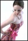
Row 1 Photo 1-This is really cute....the image is solid and not overdone....the verticle stripes are abit unflattering though....makes you look slightly wide in the midsection when viewed head on...
Photo 2-You've got a good look but this photo isn't really doing anything for me....
Photo 3-What a fantastic expression....this is really fun....just wish you were in front of a different backdrop or on location....
Photo 4-As a photographer, this is an appealing photo...for you as a model, it shouldn't be in your portfolio basically because you're not in it....
Row 2 Photo 1-Once again, its cute but just a variation on the others....and that shirt is just not flattering at all....
Photo 2-This is obviously a snapshot which, in and of itself, doesn't make it bad...however, the pose is awkard and your hand is blocking most of your face...
Photo3-you're such a lovely girl and I love the camera....this is a snapshot though...try doing something like this with a photographer...
Photo 4-This photo does its job....it shows you have a cute shape....
Row 3 Photo 1-I like your expression and the pose....this might have been a better shot on location...
Okay, so its obvious you're just begining....your photos show that you're adorable and have a real sense of fun....I don't think I have to tell you that you have to get more professional photos done.....I do think you should try to find someone that can give you the pin-up photos you want and that I think you could really pull off....if you ever find yourself in my area, I'd love to work with you....good luck hun....

Model
Ava Roulette
Posts: 320
Reno, Nevada, US
SPRINGHEEL wrote:
And I'd love to critiqe you....lol.....
...
Okay, so its obvious you're just begining....your photos show that you're adorable and have a real sense of fun....I don't think I have to tell you that you have to get more professional photos done.....I do think you should try to find someone that can give you the pin-up photos you want and that I think you could really pull off....if you ever find yourself in my area, I'd love to work with you....good luck hun.... Thank you very much for your help! It's nice to find someone that will critique me and not just the photography...
Photographer
SPRINGHEEL
Posts: 38224
Detroit, Michigan, US
Glen Berry wrote:
Not all of my work is dark, but I would welcome an honest critique of my portfolio. Tell me what works, what doesn't work, what are my strong points, my weak points, etc.
thanks,
Glen Okay Glen, because you have 4 pages of photos I'm going to have to narrow this down to about 20 or so images....I hope you'll understand...
Page 1
Row 1 Photo 2-Cute idea but the lighting, pose and composition are all terribly unflattering....
Row 1 Photo 3-Okay, I have a thing for women's backs and bottoms so this instantly appealed to me....I single this out though because you did everything right....the pose, the lighting, the costume, the background....all dead on....
Row 2 Photo 4-I LOVE this....the model's figure is just amazing and the fireworks are a perfect compliment....this has a natural feel that is just wonderful....
Row 3 Photo 2-I had a hard time picking one here of the three with Phoeona but this is the one that just "spoke" to me.....everything about her pose and the lighting are wonderful but its her expression, the line of blood and the caption that get me here....I really think this is fantastic work...
Row 5 Photo 3-this is just striking me as a snapshot and what is happening with the water? I think that was suppose to be diliberate but it comes off like bad pixelation...
Page 2
Row 1 Photo 3-Okay, I always look over a portfolio before I start critiqing and I'll be honest, this model just makes me all weak at the knees....she is absolutely gorgeous!! Who is she? *ahem* Anyway, I love this one....it has such a feeling of intimacy, you've done a beautiful job lighting her...I love the sheets hanging all around....her pose....oh, I just think the world of this photo....
Row 2 Photo 3-I'm on the fence about this one.....its a cute concept but its just coming off as a snapshot....but then, of course, that might be the point....maybe its suppose to feel like a natural moment? The lighting and composition make me think otherwise....
Row 3 Photo 3-I have always thought that fishnet and neon colors were VERY sexy....this is natural and honest and I really find her very attractive because of that....
Row 4 Photo 2-One of your most popular images and with good reason....I'm sure that many people are amazed by how good the effect is but what really gets me is that the effect is used for a reason....I get really tired of seeing effects for effects sake and you are one of the only photographers I've seen that doesn't overindulge....also, about the "reason"....how refreshing to see a photographer deal with female sexuality in such a fun and sexy way instead of the usually exploitive way...
Row 5 Photo 2-Ever sense I was a child 've had a fascination with ghost photography....this absolutely nails the look and feel of those old photograps I'd find in dusty Time-Life books on the supernatural....brilliant work...
Page 3
Row 1 Photo 1-This photo really makes me squirm...This is such a beautiful image but the "pixelated" effect is back and its just killing it for me....
Row 2 Photo 4-Simple and lovely....you let this lovely girl and her amazing tattoo have the floor....great job....
Row 3 Photo 3-One of my favorite models and one of the sweetest, most beautiful women I know....I just love the fact that you've taken her and made her a piece of art....there is honestly nothing wrong with this photo and everything that is just perfect....
Row 4 Photo 1-I'm not a bondage fetishist...I honestly don't see much of the appeal....however, if more bondage photographers would take a tip from thi, I think I would enjoy it more....and of course, I love the neon....
Row 4 Photo 3-Photos like this have a tendancy to get lost amongst all the beautiful women and special effects, thats why I point it out....its honest, humorous, natural...the models are just wonderful and I think its just great how you stand back and just let them tell the story....
row 5 Photo 4-This is all over the place....drab and too busy....there is a good idea in here somewhere though...
Page 4
Row 1 Photo 1-If you've read my other critiqes, you know I usually don't care for artistic nudes....this is everything most people try and fail....you show the human body in all its artist splendor here, not just as an excuse to badly light some poor girl's tits....fantastic job....
Row 2 Photo 1-Oh man, well I guess we all have to start somewhere....I imagine this is an old attempt at photoshop? As a record of your progress it does its job but it really shouldn't be here...its just not good at all....
Ever have one of those "I'm not worthy" moments? Thats what I had when I saw you wanted a critique....one of the joys of this thread has been getting to comment on the work of so many artists that I admire and you my friend, are right at the top of my list....
If I'm going to give you what you'd asked for, I would say your best work is the work of imagination....I would like to see you try moving away from repetition though....you do a great job with levitation and neon and such but its starting to look as if you need to branch out....also, as i stated on the photo with the two girls in the messy room...I have a hard time deciding if thosetypes are photos are candid snapshots or if they are only suppose to look that way....
Regardles, I'm in awe of your abilities....
Photographer
Montgomery Montague
Posts: 14
Albuquerque, New Mexico, US
SPRINGHEEL wrote:
Oh, I have no problem critiqing more "mainstream" photos as long as the photographer does interesting things with them....a visionary, so to speak....
Row 1 Photo 1-So I have the feeling you didn't have enough lighting so you made this one B&W? I've done that myself and its perfectly legitamate as long as the image works.....this one doesn't because its about the model and the car and we can't really see either of them....
Photo 2-Not sure this was your originally planned image, it feels like a crop....her hair seems to be in a style I'd think you'd want to have in the composition and quite honestly, her expression looks as if she is feeling nauseaous....this just doesn't add anything to your portfolio....
Photo 3-Was this a test photo? A test for photoshop? To be honest, it shouldn't be here....I like the model's legs but other than that, it doesn't feel like it should be in a portfolio you want people to consider your best work...
Photo 4-This is awfully cute....I really like the colors....hell, I like it all okay only her pose isn't the best....she should have her torso positioned more toward the camera....
Row 2 Photo 1-I really like her face and what a sweet smile....the lighting here fails her completely....
Photo 2-WHOA....this is absolutely fantastic!!!! Everything here works like crazy....excellent use of B&W, love the lighting....and this model? Such a uniqe look....she almost appears to be a child...this is disturbing and I love it....
Photo 3-Once again, the lighting and use of B&W are just wonderful....this pose is unflattering to her abdomen though and there is something (blood?) above her lip that makes her appear to have a moustache...
Photo 4-If the camera were only getting her face abit clearer, this would be perfect....as is, its a damn good atmospheric shot...
Row 3 Photo 1-Love the sepia tone, the composition, the shadow work on her face....the only way this could be better (its damn good in the first place) is, once again, if she were framed to where her abdomen weren't so promenent...
Photo 2-Beautiful, just beautiful....perfect capture of a lovely girl....this one works wonderfully....
Photo 3-LOVE IT.....maybe it could be better technically but the viscerial impact more than makes up for those flaws....
Photo 4-abit more grain than it should have but this is just lovely....also try cropping the leaves more to where the photo will begin abit more closely to his head....wonderful work....
Row 4 Photo 1-Beautiful work....perfect capture....this is real and yet "arty"....fantastic composition....
Photo 2-This is a good idea but the lighting is too muddy....try this shot again though, there is something there....
Photo 3-Cute model, nice pose....the lighting is too harsh around her shoulder...
Photo 4-Same as the photo before it only I don't care for the pose....
Row 5 Photo 1-She is posed very well and the lighting is very good....I feel like her face should be here though....I'm all for focusing on body parts and not always on the entire model but this feels like it was just focused on her chest and her face didn't matter....if that the case, her head shouldn't be in the photo at all...
Photo 2-This is just okay....crop her at the midway point on her chest and it might be better but even then, its just not that dynamic a shot....like her expression though...
Photo 3-Great pose....its moody but it feels forced....abit too dark lighting-wise...
Photo 4-I would so love this if it weren't for that cell shading thing thats going on with her....sexy model though....
I know you'll probably think "Oh sure, he would think that but I really do feel its your Alt work that excited you the most here....those shots are the ones that seem to have the most thought and "heart".....I, of course, would like to see you do even more work like your "bride" photos but even if you don't, try working away from the "traditional".... Awesome critique... and I'm ashamed that you caught me on my it's too dark so turn it into B&W... the model was a bit blurry also so that's me trying to save the image. I guess it was obvious though. I agree the bride stuff (and things in that vein) are more interesting to me... thanks for the comments!
Photographer
SPRINGHEEL
Posts: 38224
Detroit, Michigan, US
Parker Bronte wrote:
Thank you very much for your help! It's nice to find someone that will critique me and not just the photography... You're very welcome hun.....you have alot of potental and if people aren't going to be honest with you, what good are their opinions? Let me know when you have new photos up btw....I can't wait to see you progress....
Photographer
SPRINGHEEL
Posts: 38224
Detroit, Michigan, US
Montague wrote:
Awesome critique... and I'm ashamed that you caught me on my it's too dark so turn it into B&W... the model was a bit blurry also so that's me trying to save the image. I guess it was obvious though. I agree the bride stuff (and things in that vein) are more interesting to me... thanks for the comments! You're very welcome my friend and please, no shame.....as I said, I've done that exact same thing myself....and its funny you mention blur....here is a photo where I had to turn it B&W because it was blurry and dark and yet, its one of my most popular photos....
![https://img4.modelmayhem.com/060826/11/44f077004a83b.jpg]()
Yes, please follow your darker side.....its where your art is....

Model
Rania
Posts: 2514
Montclair, New Jersey, US
SPRINGHEEL wrote:
In the wrong place? When a gorgeous woman comes to me with a portfolio full of striking images AND flatters me, I'm inviting her right in.....
Row 1 Photo 1-This is a wonderful portrait/glamour shot.....you're just amazingly sexy and have such a warmth to you....I'm not crazy about the angle butother than that? Superb...
Photo 2-You have an absolutely jawdropping figure....I even like the angle here....I do think that your hipbone is jutting out abit too much and is slightly distracting....
Photo 3-I love this....the color, the motion, the atmosphere...I do think the lighting around you looks abit odd (I'd have prefered a more subtle techique) but still, fine job...
Photo 4-I'm sorry but I just can't stop staring....I actually sighed "what a face"....the photo itself has a kind of nice, soft, mid 70s period feel to it.....the bunching up of the skirt is the onlything not working for me....
Row 2 Photo 1-Absolute perfection....I'm not kidding, this is just magic.....in a portfolio full of fantastic images, this one takes my breath away....
Photo 2-This is a cool, dynamic shot....I'm impressed with the shot....but thats the problem I have with it....its impressive to look at but I have no emotions looking at it....its a nice showcase for your abilities though....
Photo 3-Hmmmmm....not really feeling this one, even in a glamour kind of way....the pose is nice but the outfit isn't anything special and its too dark with too much orange in your skin....
Photo 4-"corsets are tight!"....yes but they are also sexy and you're blowing my mind in this one....great pose too....the location is drab but this isn't about the location, its about you....
Row 3 Photo 1-Can you stand me gushing on about you even more? Damn but you look fantastic here....this outfit is killer.....
Photo 2-I love how natural this is, the mood is great....the lighting and colors are just dead on....
Photo 3-As always you look lovely but man is this oversaturated.....good pose and the composition is good but damn, that is just too muchsaturation....
Photo 4-You have beautiful eyes and the camera is just in love with you....this feels abit too photoshopped, it takes away from your natural glow...also, no disrespect to the photographer but WHY is that watermark sitting on your shoulder??? UGH, I hate it when they do that.....
Row 4 Photo 1-Again, your skin is too photoshoped here and the composition is off....here you are in a towel and the way your framed leaves entirely too much to the imagination....
Photo 2-Women in ties are sexy.....this is just too dark...the framing is wrong too, we shouldn't see that doorway back there....it looks like you're in the hallway and thats the bathroom....
Photo 3-Great expression and pose (love that shirt on you) but once again, this is just too dark....
Photo 4-Whoa....you just have the most perfect eyes and smile....too much photoshoping going on ith your skin but you still shine through...
Row 5 Photo 1-Its really interseting to see this photo.....you've always had those amazing looks but the difference in your composure and comfort in front of the camera are obvious....as a photo itself, this isn't much more than an example of how lovely you are....
Outside of dropping to my knees and begging you too stop off in Michiagn on your way to California next year (lol) would be to try more themed work.....I'd like to see you out in location even more than you are and, of course, I'd love to see you do some "dark" work.....you have the beauty, style, poise and charm, you have it all....go get 'em love Thank you so much for the honest critique!! I really appreciate you taking the time to look through my whole port. You pointed out alot of things that i did not even realize- so thank you!!!
~Rania
Model
Rikki Zenith
Posts: 34
Beverly Hills, California, US
I would appreciate your opinion!
Photographer
SPRINGHEEL
Posts: 38224
Detroit, Michigan, US
rikkiz wrote:
I would appreciate your opinion! And I shall give it to you my friend....to be honest, male models already get ignoredand alternative male models get it even worse....its people like yourself I had in mind when i created this thread....I'm just tired of seeing good, hardworking, talented people get ignored....
Row 1 Photo 1-Great style, great face, great hair....I'm not a fan of selective desaturation and as far as I'm concerned, this is an example of why...it does nothing for you...and there is way too much overexposure here...
Photo 2-So my same complaints about the first photo apply here....I'll also add that the photoshop on your skin is overdone....however, you have a fantastic face that comesthrough despite all that added on junk....
Photo 3-Outside of the overdone photoshoped skin, I like this alot....its bold and stylish and you look fantastic....man, can you wear clothes....I envy you...
Photo 4-This is a variation on the last photo but as a photographer, I like this one alot more....and surprisingly, I really like the oversaturation of your skin....this is a really cool image...
Row 2 Photo 1-Okay, for some reason MM won't let me see this photo and its pissing me off....from the thumbnail, it looks like a winner...
Photo 2-This I really like...the light is abit harsh but your look and pose are just great....I like the location too...good work...
Photo 3-Okay, another thing I don't care for is photoshop effects and backgrounds....I think this image would kick ass in an actual location....your look here is cool as hell though, you come off as a more suave version of Two-Face from Batman...
Photo 4-Okay, so I've made several mentions about my photoshop bias but this is an exception....I really like this image....esp. the cracks in your face...good stuff...
Row 3 Photo 1-Honestly, the selective desaturation isn't doing anything here except making you look like a special effect.....when I'm looking at a model's portfolio, one of the things I want to see is how they look "as is".....this photo is too dark also...
Photo 2-My feelings about this are no different than your first two shots....waaaaay too much overexposure...
Photo 3-Okay, THIS is a shot I've been waiting for....your form is good and you have that "dashing" thing that I always think is a plus in male models....this is a good photo, though its abit too dark....the girl is adorable...
Okay, I'd mentioned it earlier and it bears repeating....you honestly MUST have more looks in your portfolio that don't involve special effects....you're obviously a great looking guy but after looking at your portfolio, I still don't have a clear idea one exactly what you look like....I suggest more location shoots and work with more photographers that are going to capture all the different sides of you....
Model
Rikki Zenith
Posts: 34
Beverly Hills, California, US
SPRINGHEEL wrote:
And I shall give it to you my friend....to be honest, male models already get ignoredand alternative male models get it even worse....its people like yourself I had in mind when i created this thread....I'm just tired of seeing good, hardworking, talented people get ignored....
Row 1 Photo 1-Great style, great face, great hair....I'm not a fan of selective desaturation and as far as I'm concerned, this is an example of why...it does nothing for you...and there is way too much overexposure here...
Photo 2-So my same complaints about the first photo apply here....I'll also add that the photoshop on your skin is overdone....however, you have a fantastic face that comesthrough despite all that added on junk....
Photo 3-Outside of the overdone photoshoped skin, I like this alot....its bold and stylish and you look fantastic....man, can you wear clothes....I envy you...
Photo 4-This is a variation on the last photo but as a photographer, I like this one alot more....and surprisingly, I really like the oversaturation of your skin....this is a really cool image...
Row 2 Photo 1-Okay, for some reason MM won't let me see this photo and its pissing me off....from the thumbnail, it looks like a winner...
Photo 2-This I really like...the light is abit harsh but your look and pose are just great....I like the location too...good work...
Photo 3-Okay, another thing I don't care for is photoshop effects and backgrounds....I think this image would kick ass in an actual location....your look here is cool as hell though, you come off as a more suave version of Two-Face from Batman...
Photo 4-Okay, so I've made several mentions about my photoshop bias but this is an exception....I really like this image....esp. the cracks in your face...good stuff...
Row 3 Photo 1-Honestly, the selective desaturation isn't doing anything here except making you look like a special effect.....when I'm looking at a model's portfolio, one of the things I want to see is how they look "as is".....this photo is too dark also...
Photo 2-My feelings about this are no different than your first two shots....waaaaay too much overexposure...
Photo 3-Okay, THIS is a shot I've been waiting for....your form is good and you have that "dashing" thing that I always think is a plus in male models....this is a good photo, though its abit too dark....the girl is adorable...
Okay, I'd mentioned it earlier and it bears repeating....you honestly MUST have more looks in your portfolio that don't involve special effects....you're obviously a great looking guy but after looking at your portfolio, I still don't have a clear idea one exactly what you look like....I suggest more location shoots and work with more photographers that are going to capture all the different sides of you.... I really appreciate your indepth critique.
This is the pic you couldnt see.
as far as over saturation goes on the 1st two. I tried to make it like that.
but now i see what you mean, a little overdone.
I had them normal at first but thought they looked too matte.
As per your request I redid three images, especially photo 2. and the one with the special effects blue eyes.. i agree they look better now.
let me know watcha think.
Model
Serene Death
Posts: 541
Calgary, Alberta, Canada
SPRINGHEEL wrote:
Photo 3-Take the table out and this photo would be just wonderful...again, what a great set of curves....LOVE that wig btw.. Actually most of these "snapshot" shots Were taken as snapshots with an excellent photographer during a local event, so you're right on target there, but I wouldn't let the blame fall on his shoulders at all, they were from our first mini-shoot together to test for compatibility. I keep them because I love them all...
The harsh lighting ones were from a test for SG, a project which I have long since abandoned, so it was I who limited the photographer yet again trying to follow a silly guidline, but all for a good cause.
YAY your critique was everything I had hoped for, you have an excellent eye for detail, even spotting my fading bruises...darn it, I was hoping no one would notice! hee hee... Oh, and I quoted you up there because that's no wig, that's my hair and that's why it never changes! Thank you again!
Photographer
Michael Harmon
Posts: 1412
Austin, Texas, US
SPRINGHEEL wrote:
I've found that people who usually only claim to have a few "darker" works are usually the more creative photographers and models and thats what I'm really looking for....this is a place for all the people that get ignored by the mainstream....
Row 1 Photo 1-This is gorgeous....love the mood and its lit beautifully...I only wish the image were larger....
Photo 2-Very cool portrait.....great dynamic angle.....I really like the lighting and I thank you for giving her a black background instead of that bright white one so many others opt for....
Photo 3-I spoke too soon about the white background LOL....the white and the yellow of her outfit are fighting and taking away from her....she has a great musculature but the angle isn't giving us anything below her chest....
Photo 4-Love her look....don't care for the angle....
Row 2 Photo 1-The compostion on this feels off.....the harsh lighting is doing her make-up no favors either....
Photo 2-Great looking girl, like the pose.....I'd really like to have seen her on location though....
Photo 3-I'm not a fan of selective desaturation and and it really dosen't add anything here....that said, its a cool image, I like the action....also wishing her arm weren't blocking the girl's face behind her....
Photo 4-I'm really liking this....lovely model, great expression....the whole thing feels so 80s....even the Dutch angle is okay here...
Row 3 Photo 1-This photo is so much fun....what a great model, LOVE her look and expression....I know myself that sword blades can be difficult to photograph so if you do a shot like this again, try having the model angle the blade toward you so that it doesn't become such a straight line....great work....
Photo 2-You know, when I first saw this I thought the background might be abit too drab.....on further inspection though, I like it because the model is so sweet and bright, its a good counterbalance....good pose too....and I love the lighting on her collarbones...
Photo 3-I'm not a fan of photoshop special effects...this looks like a rotoscoped illistration and I just can't help feeling I'd rather see the original image....
Photo 4-I like the costume and the pose but the model just doen't work for me....she is just too thin....
Row 4 Photo 1-Will you be surprised when I say this is absolutely gorgeous? Probably not, me being The "dark guy" and all...lol....this is perfect...
Photo 2-I think the problem I'm having with this shot is the model....I'd just rather see someone with more curves doing this...as is, there are too many straight lines and she honestly looks uncomfortable....
Photo 3-This is beautiful....the model is gorgeous, the lighting and shadowplay are superb....just a perfect shot....
Photo 4-The model is absolutely adorable but again, not a fan of selective desaturation or photoshop special effects....
Row 5 Photo 1-Just lovely...the model is great, the color and lighting are not overdone....I really like this...
Photo 2-Too much shadow....I honestly don't care for this....
Photo 3-WHOA....gorgeous model!!! Love the choice of background too....passionate and sexy....
Photo 4-WHOA AGAIN....this model is an angel....this photo is just nailing it, brilliant job!
So usually this is the part where I give advice but I really can't think of anything....you're just fantastic at what you do....maybe try some more "dark" work perhaps? Thanks for the critique! We must be on similar wavelengths - the images you liked best are also my favorites. I did slide a couple of things past you...Row 3, image 3 - this image isn't a Photoshop special effect, it's actually a pen & ink illustration (photo reference). You'll be happy to know most of my illustrations venture into darker areas - I used to illustrate for Steve Jackson Games "In Nomine" role playing game books...Row 4, image 4 - this image is not a Photoshop "double exposure" with one model, it's a single shot, two models - twins. I am going to take your advice and shoot some darker imagery. Thanks again, -Michael.
Photographer
NovoCain
Posts: 192
Nanaimo, British Columbia, Canada
Ho ahead... Tell me how much I suck. I can take it.
I think.

Model
Zimat
Posts: 16
Fairfax, California, US

Model
Shura
Posts: 1112
Jefferson City, Missouri, US
I'd like some feedback. And I think some of my photos a bit darkish, at least I wish for them to be.
Photographer
SPRINGHEEL
Posts: 38224
Detroit, Michigan, US
rania wrote:
Thank you so much for the honest critique!! I really appreciate you taking the time to look through my whole port. You pointed out alot of things that i did not even realize- so thank you!!!
~Rania Glad to be of help lovely lady....
Photographer
SPRINGHEEL
Posts: 38224
Detroit, Michigan, US
rikkiz wrote:
I really appreciate your indepth critique.
This is the pic you couldnt see.
as far as over saturation goes on the 1st two. I tried to make it like that.
but now i see what you mean, a little overdone.
I had them normal at first but thought they looked too matte.
As per your request I redid three images, especially photo 2. and the one with the special effects blue eyes.. i agree they look better now.
let me know watcha think. Quite honestly Rik, I went and looked and saw no changes....
Photographer
SPRINGHEEL
Posts: 38224
Detroit, Michigan, US
Serene Death wrote:
Actually most of these "snapshot" shots Were taken as snapshots with an excellent photographer during a local event, so you're right on target there, but I wouldn't let the blame fall on his shoulders at all, they were from our first mini-shoot together to test for compatibility. I keep them because I love them all...
The harsh lighting ones were from a test for SG, a project which I have long since abandoned, so it was I who limited the photographer yet again trying to follow a silly guidline, but all for a good cause.
YAY your critique was everything I had hoped for, you have an excellent eye for detail, even spotting my fading bruises...darn it, I was hoping no one would notice! hee hee... Oh, and I quoted you up there because that's no wig, that's my hair and that's why it never changes! Thank you again! You're very welcome hun....thats really your hair in that photo? Oh, now that is sexy....
Photographer
SPRINGHEEL
Posts: 38224
Detroit, Michigan, US
Michael Harmon wrote:
Thanks for the critique! We must be on similar wavelengths - the images you liked best are also my favorites. I did slide a couple of things past you...Row 3, image 3 - this image isn't a Photoshop special effect, it's actually a pen & ink illustration (photo reference). You'll be happy to know most of my illustrations venture into darker areas - I used to illustrate for Steve Jackson Games "In Nomine" role playing game books...Row 4, image 4 - this image is not a Photoshop "double exposure" with one model, it's a single shot, two models - twins. I am going to take your advice and shoot some darker imagery. Thanks again, -Michael. You're very welcome Michael....first off, knowing thats an illistration makes it VERY impressive....nice work....did you label it that though? You might want to if you didn't....two models? wow, they certainly are identical....knowing that, I would have to say it would have been cool if you'd have had them in a pose where they were interacting in some way...as is, it honestly does appear to be the same model...
Model
Hannahcakes
Posts: 113
San Francisco, California, US
Photographer
SPRINGHEEL
Posts: 38224
Detroit, Michigan, US
photiesto wrote:
Ho ahead... Tell me how much I suck. I can take it.
I think. "Ho ahead".....okay, that was a typo but damn that was funny......
I love it when I read an "About Me" and totally relate to what is being said....I feel the same way you do my friend...
Row 1 Photo1-This is your wife? Lucky man...she is lovely....she has a great jaw line and sultry eyes...the lighting on her face maybe abit harsh but it works okay...my problem is, what is on her chest? Is it a whip? Its kind of confusing....
Photo 2-I like this....very striking, I like your choice of color....
Photo 3-VERY sexy model, I like the pose....it wasn't a good idea to shoot her against a black background though, her hair totally disappeared....this fuzziness going on around the edges is bugging me....its okay around her feet (I like that actually) but on the right hand side of the photo it just looks like something smudged the lens...
Photo 4-She has a lovely smile and a very sexy look....that photoshoped gloss is something I like here...because of her look, it gives it a retro feel....I really think the angle and pose make her thighs look really rough.....
Row 2 Photo 1-I love this.....what a look, what a pose....I find it interesting that you take negative things like gloss and overexposure and really make them a positive in your work....thats impressive....I think maybe the camera should have been back farther or is this a crop?
Photo 2-Oh man, is that gorgeous.....that must be awe-inspiring to see....ever think about using that as a background with a model?
Photo 3-I saw this photo in another thread here and was really impressed with it....I'm a huge fan of "real life" photos and this one is just filled with drama and emotion....this is a shot to be proud of...
Photo 4-I really want to like this....the impression of it is lovely and I really like the title....its not well lit though (if I hadn't read the title, I wouldn't have known there was someone else in the photo) and I'm not crazy about the tint color....
Row 3 Photo 1-This is a sweet shot....I'm assuming that this wasn't staged so I'll go alittle bit easier on it....although I must say that the light and overexposure is making her arm too orange.....in fact, I would crop it to just above where her arm bends....try it and see....it makes the photo just that much more intimate and gets rid of alot of the blur and exposure problems...
Photo 2-Beautiful girl, I really like the framing here and the lighting is great (isn't natural light wonderful?) My only problem is the weird white spaces at the bottom of the frame....I'm guessing thats caused by her top? Its kind of distracting...
Photo 3-Oh this is beautiful....I have a slight issue with the lighting....the shadow from her nose is abit much but other than that? Just lovely....
Photo 4-This I love....there is a stroy here and those are my favorite kinds of shots....the grain and tint work really well here...damn fine job...
Row 4 Photo 1-This is the best photo in your portfolio...absolutely magnificent....this works like crazy....my man, this is one of the sexiest images I've seen in a long time....my hat is off to you....
Photo 2-I say it again, you do such a great job taking things like over exposure and making them work...I love this....honestly, its just a damn good shot....gorgeous model and this just nails the cool and almost cruel nature of a Dom...
Photo 3-And here is another photo thst is just wonderful! Everything here is dead on....she really sells it too...
Photo 4-This isn't working for me and I think its the model's expression (or lack thereof)...also think this may have worked better in straight B&W...
Row 5 Photo 1-The lighting is just way too harsh here....for fuller models, its usually a good idea to try to put distance between their head and their body....also a good idea to shoot at a slightly higher angle....this photo should honestly go...
Photo 2-This is a haunting effect and I like it....try using it with a more dynamic image....
Photo 3-Its a good candid shot and she is just adorable.....the grain is okay but its just too overexposed...
You're the type of artist I started this thread for....you have some fine work here, a few of these images are absolute favorites of mine (Again, row 4 Photo 1....amazing)....my advice to you? Watch out with the overexposure and tints....you make them work really well but only sometimes....don't over rely on it....and also, try for more location shooting.....
I can't wait to see what you do next....
Photographer
SPRINGHEEL
Posts: 38224
Detroit, Michigan, US
Sara Houseman wrote:
I can be darkish... I really am fascinated with all of your interests...its so refreshing to see a model with so much going on in their creative life....
Row 1 Photo 1-If you've been reading my other critiqes, you know I have almost a fetish for a woman's back and bottom....you my dear have a perfect bottom...this is just a lovly photo, a really good showcase for your physique...this is just a knockout...
Photo 2-I'm not a huge fan of artistic nudes and I think nudes in rocky areas are getting abit cliche but this one is more than just "look at the flexable naked girl on the rocks".....this makes me think of a child in the womb and how the human body is a such an interesting structure....whoa, was I just sitting around thinking esoteric thoughts while looking at this photo? LOL This is art....
Photo 3-This is an example of what I mentioned in my thoughts on the last photo....("look at the flexable naked girl on the rocks") Its okay but you're overexposed and it pulls you away from the terrain...
Photo 4-Great location and I like the pose....this is oddly passonless for me though....I think it maybe the lighting but it just doesn't feel complete....
Row 2 Photo 1-Amazing work....this is a photo for the ages.....honestly, this is an example to give anyone if they claim photography can't be art....you should be so proud...you're amazing here...
Photo 2-Again, you and the landscape don't match....you're over lit and everything else is underlit....
Photo 3-This is unreal....simple and reflective....so very human...I feel like I'm just rattling on but this is just another brilliant example of the art you bring...
Photo 4-Once again, I must point out you have one of the most incredible bottoms I've seen....just amazing.....
Row 3 Photo 1-Okay, I'm sure this is a photo that just dies because of the overexposure....it honestly doesn't work at all....its practically invisible...
Photo 2-This is just lovely.....I really like the face cast in shadow and the sensuality of your lips....I feel it could have been framed better though....I think that is your hand pushing through the material on the bottom right hand? It shouldn't be there, it makes the image complicated...
Photo 3-I found reading the comments on this photo rather interesting....I agree with all of them....I really don't care for this at all...
Photo 4-I've never seen the appeal of ropes....I like seeing a woman tied up but its because of the way she looks when she is bound....for me, there is nothing sexual in the ropes themselves....maybe this photo works for the rope and knot enthusiast but for me, its just a fuzzy poorly lit shot....
Row 4 Photo 1-This is the horse you mentioned? I really wish that the two of you were closer to the camera....there really isn't anything here I can critiqe....sorry...
Photo 2-Ugh....this is just not working....waaaaaay too overexposed and the selective desaturation is just not good....
Photo 3-I was hoping you would have a photo of you dancing....you look great but the image itself is fuzzy, too dark and doesn't really capture the passion of your dance...
Photo 4-You're just gorgeous....I'd like this alot more if you were full frame....
Row 5 Photo 1-Exotic and sensual....this is obviously just a snapshot and it should just be a placeholder but it gives photographers a good idea of what kind of beauty you are that they don't see when all the other photos focus on your stunning figure...
I hate to see you leave fine art since yours are some of the only ones I've seen that I actually like....that said, I am really looking forward to seeing you do fashion/glamour.....good luck beautiful Sara....
Photographer
SPRINGHEEL
Posts: 38224
Detroit, Michigan, US
Shura wrote:
I'd like some feedback. And I think some of my photos a bit darkish, at least I wish for them to be. Its been my experience that if a person thinks their "dark", they usually are....
Thank you btw for pointing out the photoshoping of your eyes in some of the shots....its always a good idea to disclose info like that to photographers...there are some models I've worked with that I wish had been more honest...
Page 1
Row 1 Photo 1-I like the concept of this but the photo itself isn't what it can be....great pose, I like the clothes and gun....it all works but this is just too snapshoty and I wih it were in a better location...
Photo 2-This is better than the first one but I feel pretty much the same way...I will say that you're a VERY striking looking woman...love your looks....and your expression here is good....
Photo 3-Nice pose, good outfit....its never a good idea to cut a model off at the ankle and the framing on this could be alot better, its too high....
Photo 4-You state "This is a snapshot of me so you can see what I look like without makeup or photoshop.: which I find ironic because i honestly think this is a good moody photo and that your pose and expression are really good....as for the stated purpose of the photo? Its too dark to see that you aren't wearing make-up...
Row 2 Photo 1-I love your looks and you look so natural brandishing that gun....there is a feeling of motion to this that I like but its underlit and I would like to see more expression from you...
Photo 2-Another underlit photo...the composition is good though....try not to hold your chin down without first liftting your shoulders and straightening your neck...
Photo 3-I like this....well, its underlit but still....you have such a great look, I love the pose and the briefcase is an interesting touch.....this would have worked better if you were wearing a different outfit though...
Photo 4-outside of the angle on this shot being unnecessary, this a great shot....
row 3 Photo 1-You've got a cute shape, lovely hair and such a great face....this photo though? UGH....everything here is just wrong....its too overexposed, the lighting is awful....honestly hun, take this out....
Photo 2-This is the exact oposite of the last photo.....I love it....its such a sweet shot and everything works.....good job...
Photo 3-There is something going on with your eyes here....maybe its the lighting but you have dark circles and your eyes have red lines...its a good pose but you need to be more expressive....
Photo 4-More of a smile here and this would work better....also, I would have liked to see you framed to where all we could see was the corset and not the jeans...
Row 4 Photo 1-Crop this above your knees and this would be just wonderful....I really like this....I even like the lighting....
Photo 2-Abit too much light makes you look too pale and the angle is unnecessary but this is an okay shot.....
Photo 3-Too dark...this is just so poorly lit you might as well not even be in it....
Photo 4-The only way this photo could have been better is if you were wearing a long frilly skirt and the angle were abit lower...as its, its one of the best in your portfolio....good job...
Row 5 Photo 1-Whats going on behind you? Are those wings? This photo just about fails everywhere...poorly lit, badly composed....it just doesn't work...
Photo 2-Oh, this is good....crop it abit at the top and this is the best photo in your portfolio....beautiful...
Photo 3-You've got great legs.....this is kind of cute but its a snapshot and it shows....
Photo 4-Honestly? This is just boring....I'm sorry hun but there is no reason for this to be in your portfolio....
Page 2
Row 1 Photo 1-There is a good shot in here somewhere but this one isn't it....
Photo 2-This one does its job....you have a wonderful shape....
Photo 3-Another snapshot that does nothing for you....
Photo 4-This is an example of how everything could work wonderfully if a shot were taken by an actual photographer.....you look lovely and the dress is great...
Okay, a couple of points.....first, you honestly need to work on your expressions...second, you REALLY need to work with some better photographers...outside of about three shots, I can't tell what are snapshots and what are ones you actually worked with someone....
You have a wonderful look....just loosen up some and work with people who have vision instead of people who just happen to have cameras...good luck hun....
Photographer
Michael Kountz
Posts: 2932
Albuquerque, New Mexico, US

Not dark, but a little more specialized than usual. I'd like to take you up on your offer, kind sir.
Photographer
SPRINGHEEL
Posts: 38224
Detroit, Michigan, US
Xaha wrote:
Gimme gimme. I love your "About Me"....its direct and shows some personality....Okay, lets just get this out of the way...OMFG you are sexy....okay, that said....
Row 1 Photo 1-This is simple, good composition, I like that drainage hole, great use of color.....my issue is with your overall pose....I'd like to see you have more "expression" here and not just facially.....
Photo 2-Wonderful location, love your expression and look....I REALLY like the overall shot.....has your skin been photoshoped? It seems abit too white and plastic-y...
Photo 3-This is a good portrait of you but its too dark and slighty fuzzy....
Photo 4-Whoa....now THIS is one hell of a good shot....the colors, the expression, the background....everything works here....very striking, I love it....
Row 2 Photo 1-You are amazing here....damn but you know how to work the camera....good choice for B&W too....if only that reflection of the care weren't there, this would be perfect....
Photo 2-I'm not a fan of blood just for bloods sake...this is not working on more levels than just that however...cutting you off at the forearm and having you raise your leg without seeing your leg? Bad compostition.....what is that in your right hand? And I really wish photographers would realize you can't have a dark haired model in front of a black background and then light them poorly....sorry hun, this just doesn't work....
Photo 3-Great portarit shot....this is real and natural....you look so lovely....just wish we could see more of the mohawk.....I'm a gigantic Skinny Puppy fan so major props for the shirt....
Photo 4-Do you have a band? I saw this and instantly though "promo shot"....this is very 80spunk/industrial and since I'm from that time and remember seeing great images like this on band leaflets posted yo lamposts while waiting in line to see a great band like Puppy, I really like this....Great pose, great colors...I just really like this...
Row 3 Photo 1-Jeebus....you have absolutely AMAZING eyes....this is just a lovely portrait....its so great to see someone "alternative" showing how beautiful they are and not just tossing out cliche snarls and "bad girl attitude"
Photo 2-This is cute but its a snapshot....like your expression but the way your holding your chin down is catching the light and making you appear to have a double chin....I have a cat just like that btw....
Photo 3-Oh gorgeous....great lighting and you look absolutely lovely....I like the grain on this too....I would have cropped it a bit higher toward your chest area but still, great shot....
Photo 4-Oh this is just wonderful....everything here just works....another image you should be proud of....this might be a good avatar photo btw...
Row 4 Photo 1-This is good....I really like the blacks in this.....its alittle similar to the last two however and I think its the lesser of the three....
Photo 2-Oh man, this shot is something else....its humorous and grabbed my attention instantly....I have no idea how you got the donkey or what its doing there but this is such a uniqe photo....(How odd this is going to sound to people who haven't seen the image yet...LOL)
Photo 3-I'm torn on this one....you look so sexy and cute but the composition is off and its too dark....
Photo 4-Ahhhh, finally someone knows how to shoot a girl with dark hair in front of a dark background.....I think i would like this more if it weren't for the goat....the photo feels like its not cenetred in an attempt to get the animal in the shot and it makes it feel gimmicky...
Row 5 Photo 1-I want to like this shot...I love your expression but the framing is really sloppy and its not well lit....
Photo 2-You have a fantastic look and its a good idea to have at least one photo where people who may want to work with you can see how you look in real life but this should just be a placeholder photo until you have one that is more professional...
Photo 3-Great showcase for the make-up but thats about it....its a snapshot and it does its job....
Photo 4-of all the what i would call "showcase photos" this is the one I like best....you look fantastic, your make-up is superb and there is action in the shot.....it looks less like a snapshot than the last two....kepp this one up for awhile...
as far as your looks, don't change a thing....you are just gorgeous....if I have any advice it would be to try to do more dynamic, storytelling shots....I'd like to see you do more things than just standing and "posing" also....you are a beauty...
Model
Hannahcakes
Posts: 113
San Francisco, California, US
Thanks! yeah, some of the lesser ones are just snapshots to show my versatility as far as looks go.
Photographer
SPRINGHEEL
Posts: 38224
Detroit, Michigan, US
Triphammer Industries wrote:
Not dark, but a little more specialized than usual. I'd like to take you up on your offer, kind sir. I do specialized here....I'm sure you'll fit in just fine.....btw-LOVED your "About Me"....you've got a great sense of humor....such a nice change of pace from most photographers....
Row 1 Photo 1-On looking at this my first thought was "What a gorgeous model!!! Who is she???"....I must admit I was thrown when I saw the first name david....but thats neither here nor there.....This is just lovely....great pose, great lighting, very subtle....I REALLY like her pose and how it almost seems to interact with the negative space....thats something i wish more photographers would understand....there must be a reason for negative space....great job....
Photo 2-I like her expression....the pose would work but the choice of outfit works against it and that in combination with the lighting, give her an unflattering look....
Photo 3-Great outfit....once again I'm having lighting issues though....and what is happening with her face? Is that a blur?
Photo 4-Oh man, having this many beautiful women in one room? I envy you....the photo itself though is way too dark and there is some oversaturation going on....
row 2 Photo 1-I like the composition...I do wish the colors were brighter, seems abit drab....I wish the model were more striking though.....as is, it looks like you just grabbed a girl in street clothes and had her stand there...
Photo 2-I really like this....the contrasts are great and I so love the model's face here....the left arm throws it off abit but other than that, damn fine work...
Photo 3-the idea here is good but the photo isn't dynamic enough.....I want to see him REALLY blowing that fire....as is, it just looks like he is passively holding it....
Photo 4-Great shot, very striking....this one really works for me....this should be your avatar....
Row 3 Photo 1-When doing a shot like this its a good idea to make sure you have everything properly lit before hand....it looks as if you're just relying on the fire to do that and you end up with oversaturated flames on the bottom, a whole lot of negative space and the faint image of a man's face.....this just doesn't work even though I can apreciate the act itself....
Photo 2-This would work better if it were more obvious that was flame in his hand....its an okay shot but there is the oversaturation issue again and it needs to be cropped lower to his head...
Photo 3-Good model, its composed well....but all of that oversaturation just works against it....
Photo 4-This is just okay....its not framed the best it could be (should be cropped closer to her head)....the model's expression is odd and everything else is just sort of drab....
Row 4 Photo 1-Okay, get rid of all the flame photos and keep this one because it is excellent and does everything the others don't....a slight oversaturation issue with his face but other than that, its just lovely....
Photo 2-Have you tried adjusting the exposure this abit and making it B&W? I think it would be much better than what you have here....its a good image, lovely girl....try that and see...
Photo 3-Lovely girl, good pose and a good image....abit too much photoshop but its good...
Photo 4-Good composition...this one is telling a story and thats always a plus in my book....try adjusting the expossure though....that sky is washing out...
Row 5 Photo 1-Very cool and dynamic shot....wish it was framed abit better...
Photo 2-That guy is amazing and that seems to be the point of this shot....if thats you, cool, it shows a physicality you should be proud of...if not, this should really come out because its just a snapshot and not a very good capture....
photo 3-There aren't enough dance photos...I honestly would like to see more people do them....this though is once again just a snapshot....try having them do this pose again and capture it in the studio or an interesting location....
Photo 4-If you don't make the other one I recomended your avatar, this would be the other choice...this is fantastic...ordinarily, I'm anti-over photoshop but it works so well here....its very sleek....I love this shot....
i think you're on the right track with your more action oriented work....it seems to be where your heart is....if I were you I would stay away from portraits and such until I had my lighting issues resolved....thats probably why so much of your oversaturation is coming in....try to shoot more outdoors and learn lighting.....avoid stangnant shots....you do much better with action...good luck to you...
Photographer
SPRINGHEEL
Posts: 38224
Detroit, Michigan, US
Xaha wrote:
Thanks! yeah, some of the lesser ones are just snapshots to show my versatility as far as looks go. Thats what I thought but I would say you have such great professional shots that you don't need them....try to have those looks done by photographers.....
Model
Paz Crystal
Posts: 373
Toronto, Ontario, Canada
my turn 
Photographer
SPRINGHEEL
Posts: 38224
Detroit, Michigan, US
Paz Crystal wrote:
my turn Hello Paz...what diverse experiences you have....
Row 1 Photo 1-You have gorgeous eyes and a wonderful profile....those eyelashes are really neat and the make-up is sexy....there is a bit of shine to your face that I would ordinarily have an issue with but on you, shine is sexy....
Photo 2-This is striking and I like your expression....the color is sharp as is the lighting....its the framing of the pose that isn't good...you're cut off in mid-thight and your right foot is cut in half by your thigh...abit too much bunching in your crotch area also...
Photo 3-I love pink wigs....its just a thing I have, I think they're sexy....I really like your expression....the only things that I have issue with here are-if we're going to see your legs, we should see more than a chunk of your thighs and that watermark thing is a huge distraction....nothing you can do about that I suppose...
Photo 4-You're look here is beautiful...the hair, your expression, the tilt of your head....wonderful....I don't think the top was a right choice though....this photo needs for you to be more bare, it would suit your expression and pose...
Row 2 Photo 1-Ahhhhh, this is what my heaven would look like....there is too much black going on here and even though its lit well enough, we're still losing the hair of some of the girls....speaking of which, I question the choice of having this in your portfolio....your portfolio should always emphasize you and you aren't the focal point here....maybe not a good idea to have it here...
Photo 2-Once again, you have a wonderful profile and I like the almost stern expression....just about nothing else works here though...poorly lit and that top just sort of hangs off of you....
Photo 3-You know, I haven't mentioned how damn good that background effect is....You have a lovely figure and I like the outfit, its kinda all over the place and it adds some fun to the shot....this is a good shot to have as an example of how well you sell a shot....its funny, with the special effect background and all the big red balls, none of it work work and would be rather boring if you weren't giving such a great pose and expression...
Photo 4-You look great here, very sexy expression, but thats about all that works....this one looks as if it were poorly lit and somone tried to save it in photoshop....I assume you're upside down and the image is right side up? Its a pointless effect if nothing is going to be done with that besides your hair rising...
Row 3 Photo 1-I wish this were framed so that we could see more of your abdomen and hip....are those rose pedels? Your skin looks too photoshoped here also and the framing is sloppy....
Photo 2-Okay, we have too much harsh lighting in your face (you're squinting) and your face is also oversaturated....your right arm is cut in such away that it looks, quite honestly as if its been amputated...I really like that outfit though, very sexy....
Photo 3-Once again, too much harsh light but other than that? I love this....you're breathtaking....everything about you here is just hot as hell...you have an fantastic stomach....
Photo 4-Gorgeous....its a variation on your very top photo but it kicks that one's ass...everything here is perfect....fantastic job....
Row 4 Photo 1-This is a self portrait? Nice job....I like the pose and your expression....outside of your shoulder getting too much light, this one is really good....I also like how large the image is...not only do we get to see those beautiful, sultry eyes even closer but it lends some intimacy that works really well....
Photo 2-I really like the pose and you have a wonderful figure but this is so poorly lit, its working against you....this photo is just taking up space hun, I'd lose it....
Photo 3-This feels like a snapshot and its too small....I like your pose and the angle you were shot though....
Photo 4-If it weren't for the obvious lighting issues, this would be perfect....this is a great showcase for your phenomenal legs....wow, those are nice....
Row 5 Photo 1-The colors are nice and solid and you have great bedroom eyes....not sure if its the angle or the top you're wearing but your getting no cleavage at all and in a case like that, it would have been better if the photographer had framed more of your entire chest area....
Photo 2-A wonderful showcase for that perfect body (damn but you have great legs and thighs) and that gorgeous, exotic face of your's....I would be crazy about this if your skin weren't so oversaturated, esp. on your legs...
Photo 3-This is slightly snapshot-y but its good....the focus is on you here and you look great....love the pose and its framed well....
As I looked over your photos, I found myself discovering more and more about you....you are just an amazing model because not only are you just gorgeous and are just wonderful with poses and expression but in every photo you bring something new that don't think most of the photographers you were working with even noticed....my advice to you is to work with people outside of the more fashion/glamor types....work with some poeople who are going to match your looks and ability with their inventivness....also, try to give yourself abit more vulnerability in some shots....you have a great face and have sexy nailed nut I'd like to see you try some other moods....good luck to you hun, you're going to kick some ass out there....
Model
Paz Crystal
Posts: 373
Toronto, Ontario, Canada
aww thank you 
Model
Mz Machina
Posts: 1754
Chicago, Illinois, US
C'mon over Springheel..... critique away!!!! Don't be afraid you know i'll like ya either way .... Spelling and punctuation doesn't count ! I am a shitty typist and I know it !!!
Model
mia vaughn
Posts: 854
Chicago, Illinois, US
SPRINGHEEL wrote:
So I see all these people offering up critiques and have noticed that people who do dark, alt., rockabilly pin-up, etc. type work usually get short shifted....
So i thought, why not offer up critiques for more specialized photographers and models....I enjoy giving advice to others and since I can only really critique work I can relate to, I'm offering up my services to anyone that would like them....
I'll be going through your portfolio and either giving you a photo by photo analysis or just an opinion on the overall work...
My opinions will be based on the work itself and what I think works and what doesn't....I look forward to talking with you all.... LOve to hear your opinios.......
Photographer
SPRINGHEEL
Posts: 38224
Detroit, Michigan, US
doug hoeschler photo wrote:
can i play too? Well of course my friend....two things first.....I'm always happy to see a photographer saying that they would rather work with different types of models instead of just the stereotypical and also, its not a good idea to list your phone number up for public view...
Row 1 Photo 1-Its not often I see an image and immediately have to leave a comment but this one just grabbed me....totally cinematic, great lighting and framing....the model is perfect....I've not seen anyone here nail Noir as good as you did here...brilliant...
Photo 2-Very good composition and the feel of it is very turn of the century (20th that is)....I do think I would like this more if there was more than just (what appears to be) a bedsheet behind her...
Photo 3-I really like the technique here and the model's expression is very cute....the overall image isn't as dynamic as it should be....
Photo 4-Absolutely wonderful....was this a location shoot? I just love how rich the blacks are in your B&W work....the only thing I question here is her footwear but thats just a quibble...
Row 2 Photo 1-This has such a 20s feel.....since I'm a huge fan of that era and its an inspiration to me, this caught my attention....loveley model, great expression....it does seem that this photo is more about techniqe than subject though....
Photo 2-Love the model, her expression is wonderfully morose....the image itself is striking and there is a story here....her skin feels abit oversaturated but other than that, good job....
Photo 3-What beautiful portraiture.....how did you get this look? Intimate and I just love the richness...
Photo 4-This is kind of drab, esp. after looking at the photos before it....not every photo has to be a knockout but this is the lesser....she is too oversaturated and the skirt isn't flattering....
Row 3 Photo 1-Magic....this is just fantastic....I did a fairytale based shoot and I don't know why more people don't do them....this is just so damn cinematic, wonderful posing, expression, composition...and those birds!!!! Are they really there?
Photo 2-Another photo with fantastic technique that seems to exist only for the technique....don't get me wrong, I love this look (teens/20s again) but the actual image itself isn't telling me anything....
Photo 3-You're like some kind of portrait genius.....this is just great.....
Photo 4-The lighting here is too harsh and doesn't flatter her face....it has a sort of Noir feel but after your very first photo, you set the bar really high and this one just doesn't nail it....
Row 4 Photo 1-What a gorgeous model....I really like the slightly off kilter framing here and once again, you just do amazing portraiture....
Photo 2-Okay, I've seen Todd McFarlane....you managed to to make him look cool...that in and of itself is an amazing feat....lol.....if the guy doesn't have you shoot him all the time, he is nuts.....great mood, you gave him a slight Trent reznor mid 90s NIN look...
Photo 3-Lovely expression....that necklace is blurring and causing an odd effect that I want to ignore but can't.....
Photo 4-Slightly darker than I'd like but this is a cool moody shot....I do think this is another shot that is more about technique though...
Row 5 Photo 1-Very good composition and once again, I love the saturation you do....I only wish this were larger....I feel like I'm missing details....
Photo 2-Gorgeous...one of the only art nudes I've seen where its obvious the photographer honestly sees the beauty of the female form and isn't making just an arty T&A shot....I question the framing though....
Photo 3-Everything here works.....its fun and sexy and also slightly moody....great composition...I'm guessing this is a PR shot? DAMN good work....
Photo 4-Sexy girl...this feels abit too harsh lighting wise and slightly overexposed....also, there is whats going on in the bottom right of the frame....I realize thats the bottom of her lingerie but my eye keeps trying to tell me its her thigh....
You're a master of technique and when you go for cinematic storytelling work, no one can touch you....if I have any advice, it would be to go even farther in that direction.....your work has been an inspiration....I thank you so much for sharing....
Photographer
SPRINGHEEL
Posts: 38224
Detroit, Michigan, US
CareLyn Anita wrote:
C'mon over Springheel..... critique away!!!! Don't be afraid you know i'll like ya either way ....
Spelling and punctuation doesn't count ! I am a shitty typist and I know it !!! HAHAHAHAHAHAHAHA....since I'm already a giant fan of your work, this should be fun....I do hope we can still be friends when we're done....
;-)
Row 1 Photo 1-Okay, it will be no surprise at all when I mention how gorgeous I think you are....you look fantastic here (Oh! I sooooo love pigtails!) and the pose is wonderful....there is way too much negative space at the top of the frame and the lighting is abit harsh on your face...
Photo 2-Love the pose and the tone of your skin....I've read here in the forums about people who don't get the gas-mask look....I myself think its VERY sexy....everything here works but I do with the camera had been a bit higher and had framed your bottom better...
Photo 3-LOVE the look, pose and attitude....I'm not crazy about the lighting though....I'm a back and bottom man, I love a woman's back and bottom and I wish I could see them
Photo 4-Most girl on bike shots don't work because the girl comes off as inanimate as the bike....this is very sexy (damn but you have a sexy stomach)....I only with the camera were closer to you....it feels abit snapshot-y
Row 2 Photo 1-What amazing legs....once again, this is a snapshot and your skin has too much overexposure....damn, those LEGS.....what was I saying again?
Photo 2-Absolutely sexy as hell....wish the lighting was bit more even but what a great image....your pose and expression are perfect...
Photo 3-Great costume, great pose, great expression, great composition....abit of a lighting issue but other than that, really good...
Photo 4-Love the pose and expression....this is a case where oversaturation works wonderfully....this gives you a stark, otherworldly feel....I love it...
Row 3 Photo 1-Another example of how good oversaturation can be when used properly....this is so dramatic....you're absolutely brilliant here....your expression is just heartbreaking...this is isn't just modeling, this is actually becoming someone else....
Photo 2-Such sultry eyes and oh I love those gloves....you sell this photo, you're honestly the reason this works....I wish it were framed better....the bottom of the frame should stop at your waist...
Photo 3-I've complained before in other critiqes that most photographers don't seem to know how to light dark haired models in front of black backgrounds....pay attention folks, THIS is how you do it.....this is the photo that made me go "Hey wait a minute, she is 4'11"????" You have such power and strength here...I love this photo....
Photo 4-This is a photo I've always had issues with....I think the concept is better than the actual photo....I can't quite pinpoint it but this one just doesn't work for me....
Row 4 Photo 1-I want to like this more than I do....its a lighting issue....just abit more light in front of you I think....the issue is the blade....its either the way you're holding it (handle up might have been better) or the blade itself needs more light....it has the right mood but it just needs that extra touch...
Photo 2-I'm such a fan of your form....see that pose on the left hand side? I love that....I've got alot of issues with this one though....its too small, you're too far from the camera, I want you to be lit better.....
Photo 3-This one screams lighting issues....its a shame because from what I can see, you look fantastic and it looks like the pose is really good....
Photo 4-Oh damn but you have sexy eyes....I would haveprefered this to be darker actually....around the back of your head anyway....and tighter on your face....something is going on with the right hand side of yourface too....looks like the light is hitting the make-up badly and its odd looking...
Row 5 Photo 1-Jawdropping....I love it when the photographer is able to actually show the physical motion of the model...I've seen other models who dance and such that have photos in their portfolio that just doesn't do justice to their physicality....this is just an amazing showcase for you...
Photo 2-Much like the last photo, this is just astonishing....so well done on your part and Vegas'....this is such a wonderful piece of art....
Photo 3-And words fail me with this one....this is a photo one could just study all day....you amaze me....
Photo 4-And in a porftolio full of fantastic images, this one reigns supreme....I don't think there is anything I can add to the chorus of astonished viwers except this is and image that should be seen everywhere....perfection....
Okay, what can I possible say to you that isn't some sort of pitiful cry for you to please come to my area and let me shoot with you? Honestly, when I'm doing better financialy and when i believe I may be good enough, I would like to come out to your area and work with you....there have been no other models that I have felt that strongly about.....you amaze me.....
|