This thread was locked on 2008-08-27 13:24:21
Photographer
SPRINGHEEL
Posts: 38224
Detroit, Michigan, US

Model
Adieu
Posts: 6427
Thank you. I really appreciate that  -Monica
Photographer
SPRINGHEEL
Posts: 38224
Detroit, Michigan, US
Monica Jay wrote:
Thank you. I really appreciate that
-Monica You're very welcome Monica....

Model
MichelleS
Posts: 377
Baltimore, Maryland, US
I don't have dark side pics but am welcome to any and all critique!
Photographer
SPRINGHEEL
Posts: 38224
Detroit, Michigan, US
Michelle72183 wrote:
I don't have dark side pics but am welcome to any and all critique! Wow, you weren't kidding where you? Hmmmmm....well, I'll do my best although I will admit at the begining here that these aren't really my types of photos....
Row 1 Photo 1-Everything here is exceptionaly well done...lighting, composition...my problem is, your smile looks put on....a "model smile"....
Photo 2-The light on your right arm is abit too harsh....I'm honestly not understanding the whole thing with the feathers and from your expression, you aren't either...
Photo 3-I really like your pose and expression....I want to like this photo more than I do but it just feels too cleaned up...there isn't alot of life in it...
Photo 4-Slightly overexposed, you look alittle orange.....its nice but once again, I'm not feeling you...
Row 2 Photo 1-I really like your pose and you look great....the photographer is guilty of one of my pet peeves....shot a dark outfit against a dark background and didn't light it properly....
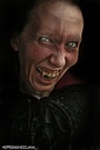
Photo 2-Okay, I'm just going to come right out and say it....this photo is just not good....the Dutch angle is awful, everything in it looks phony (what is wrong with the guy's face???) Its certainly eyecatching but in my eyes, it has nothing going for it except your pose....
Photo 3-Now this I LOVE.....slight lighting issues but you look so beautiful and natural here....gorgeous smile....
Photo 4-VERY sexy....once again, I love how natural you are here and you let your girl-next-dooor sex appeal shine through....
Row 3 Photo 1-I have a slight issue with the lighting (Too much shadow on your face) but other than that, this kicks serious ass....you look fantastic and I love the atmosphere....
Photo 2-You're just beautiful.....I have a framing issue here (seeing some of your hand at the bottom of the frame is distracting) and you're face is abit too orange but other than that, I really like this one...
Photo 3-This is just lovely.....I question the angle though...
Photo 4-Glad to see more of that sexy figure....I really light the lighting and colors....you seem abit stiff though...
Row 4 Photo 1-Now this is more like it....I just love your smile and you feel at ease here...once again, we get to see those lovely curves....good shot...
Photo 2-See, these are the kind of photos I'm just not good at critiquing....you look lovely here and everything is fine with the image....it just feels like there isn't any life in this shot.....its not telling me anything....
Photo 3-Lovely look, you eyes look amazing.....however, I feel about this the same as I did the one before it and several others...
Photo 4-Love your look and pose...the lighting is flat though....this could really stand some color....
Row 5 Photo 1-Wonderful.....you have an incredible body, why don't you show it more often? This is a great shot...
Photo 2-You look sexy as hell (LOVE your eyes!) but damn, your face has been way over photoshoped....
Photo 3-Very sultry look....I have no idea why your face keeps getting so orange in so many of these photos though....
Photo 4-Part of me wants to scream "DAMNNNNN....she is sexy as HELL!!!".....the other part of me just can't get over how plastic photoshop has made your face....
So there are several things I noticed...one-for some reason your face keeps going orange....I'm not a special effects guy and don't use photoshop at all so I have no idea why this is happening but I'd see if I could get the photographers I worked with to cool it if I were you...
Two-As your portfolio went along you went from attractive but stiff to natural and sexy....if thats what the type of modeling you want to do and are doing calls for, okay then...if not, please go for the natural sexy look more....it seems more you....
Three-Try to do some "Dark" shoots...
;-)
What, you didn't think I was going to mention that?
Photographer
SPRINGHEEL
Posts: 38224
Detroit, Michigan, US
So I figured I'd bump this up one more time before calling it quits....
Anyone else?
Photographer
nevar
Posts: 14670
Fort Smith, Arkansas, US
okay I'll bump it... and if you're tired, I can always take over for you till your brain is rested.
Model
Natalie Addams
Posts: 200
Los Angeles, California, US
hello again! I got alot of new pics up, interested for re-critique-ing me?

Photographer
Tog
Posts: 55204
Birmingham, Alabama, US
My ports a mixed up mess right now, but some of my more recent stuff has taken a bit of a dark turn..
Considering I didn't have the shiny happy people in mind when I shot it.. I'd welcome a critique from the warped and wicked..
Photographer
SPRINGHEEL
Posts: 38224
Detroit, Michigan, US
ravens laughter wrote:
okay I'll bump it... and if you're tired, I can always take over for you till your brain is rested. Whoa....hey thanks RL....I figured this thread was dead!
Or undead as the case may be....
Thanks for the offer but I'm more than rested.....I missed doing this actually....
So, anyone that wants to step up feel free.....looks like we're back in black....
Photographer
SPRINGHEEL
Posts: 38224
Detroit, Michigan, US
Natalie Addams wrote:
hello again! I got alot of new pics up, interested for re-critique-ing me? Well hello there beautiful Natalie.....I'm always more than willing to come and view your portfolio.....oh how I would love to do a shoot with you.....
Okay, looks like the top 8 are new correct?
Row 1 Photo 1-I said it before and I'll say it again.....if I've ever seen an Alt. model that could crossover into the mainstream, its you.....just a lovely photo and it shows that incredible face....outside of that odd blurring down by your arms (I have a feeling thats suppose to be like that), I think this is just wonderful....
Photo 2-Okay, this is probably going to sound weird but I look at this photo and I think "She looks like a dessert".....okay, let me explain that.....the blue and white make the photo feel as if it wants to be cold and yet the warmth you exude and the textue of the photo mak the image look inviting and comforting.....does that make sense? LOL You look just incredible and this photo regardless of my bad analogies) is just fantastic...
Photo 3-Just another example of the unique gift you seem to have....those piercings in your chest should make the viewer want to cringe.....instead, you make it sexy (I find it sexy anyway, I'm just imagining Johm Q. Public's reaction)....fantastic composition and lighting...
Photo 4-Okay, I have finally come to grips with this fetish i have for large eyes on a woman....and oh, what this photo is doing for me!!! I'm so glad to see more photos in your portfolio that show off that beautiful face....this is just a nice soft shot...I like it....
Row 2 Photo 1-I've seen these types of photos before and always felt they were done wrong....the model wouldn't sell it properly or the photographer would shoot it as if it was just a human shaped bag.....this is lit so well and you use you physicality so well that it works wonderfully.....very interesting shot....
Photo 2-Such a gorgeous face....however, I really wish you weren't in that bag thing....I'd rather see your actual body in this shot....just a personal preferance though....
Photo 3-This is nice but you have two other portraits in your new photos and this one is just lesser than the other two....any photo of your face is going to be a good photo but the lighting on this is subpar and the pose is awkward.....it feels like a placeholder and you're too damn good to have a placeholder in your portfolio....
Photo 4-Damn, I hate to end this on a bad note.....this is just terribly oversaturated and more than anything else, you are too far from the mirror so instead of seeing that lovely bottom, we see blur.....
Overall, the new photos are, as always, fantastic....i swear, you are one of my favorite models on here and its great to see you pushing yourself in different directions....please keep me updated on your work Natalie, I am a huge fan....
Model
Natalie Addams
Posts: 200
Los Angeles, California, US
thank you!! you're critique is amazing, you have a great eye, and attention to detail. I agree 100% with your words again, which is really nice. take care, and hopefully someday we'll get the chance to shoot
Photographer
FotoMark
Posts: 2978
Oxnard, California, US
I welcome your critique, it would be painful but still interesting to hear your crtiques. I promise I won't cry too much.
-Mark
Model
Bella Sin
Posts: 512
Cleveland, Ohio, US
well .. im in .. hit me with your best shoot.. please dont kill me.. //
Model
Alex Concas
Posts: 87
San Leandro, California, US
Wow, I'm really impressed with the diversity of this thread! I love it... I would love to get some dark work in my portfolio, something to look forward to since I am pretty new to this! I am a big fan of dark work!... Not much to critique on mine...
Photographer
SPRINGHEEL
Posts: 38224
Detroit, Michigan, US
W.G. Rowland wrote:
My ports a mixed up mess right now, but some of my more recent stuff has taken a bit of a dark turn..
Considering I didn't have the shiny happy people in mind when I shot it.. I'd welcome a critique from the warped and wicked.. Ahhhhhh, W.G. Rowland......this is indeed an honor good sir.....I've already told you I'm an admirer of your work and now I get to talk smack about it....
Let the Warped and Wicked Critique begin!
Row 1 Photo 1-Very well lit and composed....great use of negative space....I suppose the only thing that I'm not crazy about is the overall shot itself....if a photo is going to be quiet and contemplative, I feel that it should reward you in some way for spending time with it....this one just feels too mundane...
Photo 2-What an adorable model....everything works here but I question cropping her off slightly above the knees....
Photo 3-I want this one blown up and in a frame on my wall....its so well lit and composed and it rewards the viewer with it depth and story.....brilliant work...
Photo 4-I usually don't care for art nudes but I LOVE this one....I esp. like the symmetry of the head and the bottom.....amazing use of lighting...
Row 2 Photo 1-the composition and symmetry once again are fantastic....the model is lovely (Great expression) but her face feels abit plastic....
Photo 2-The texture here is just astonishing.....the image itself isn't quite as good as I'd like (that big section of what looks like hair is bugging me) but DAMN, that TEXTURE....I feel like I can reach right into my monitor and touch her....
Photo 3-You once again do a great job with composition and light....you always seem to know how to weild negative space....and hey, nice ass......
Photo 4-Oh, one of my absolute favorite models! I love this shot.....we see just enough of her and the space around her almost feels like some other dimensional space.....
Row 3 Photo 1-Once again, I marvel at your ability to capture texture......great location....your model looks ALOT like Kevin Spacey.....
Photo 2-Absolutely breathtaking....I love everything here.....erotic and beautiful....thank you for taking what is ordinarily used as explotation and showing it as art....
Photo 3-Gorgeous eyes....love the mood.....feels abit too soft focus though....
Photo 4-This is interesting.....its been so Photoshopped it feels like CGI animation and yet, at the same time, it feels strangely alive.....I'm not crazy about it but I can't dismiss it outright because there are just too many things catching my eye...
Row 4 Photo 1-This feels like a film still.....the models do a great job selling this, it feels so human....
Photo 2-Absolutely gorgeous.....I get so tired of seeing every photo involving more than one model just being about mechanical sex....this is so warm and intimate....I don't care who you are, if you look at this photo and don't feel the urge to hold and cuddle someone you love, you're no friend of mine....
Photo 3-I like it enough but it feels abit too precious....
Photo 4-Okay, take what I said about photo 2, Row 4 up there and add it here too....just beautiful.....
Row 5 Photo 1-Absolutely fucking amazing.....I can't say enough here....honestly, this is just one of the greatest photos I've seen in anyone's portfolio.....the lighting, pose, composition, attention to detail.....its all here.....and once again, thank you for taking a concept (suicide) thats been so overdone and explotited and making it art....
Now what the hell can I tell you that you haven't heard before? You're a genius and an inspiration....I suppose you could do some even darker work or perhaps do something more whimsical (like the good folks over at BlackWatch) but thats about it.....
Thank you for sitting still and letting me do this.....I've learned alot from your work today my friend....
Photographer
SPRINGHEEL
Posts: 38224
Detroit, Michigan, US
MarkW wrote:
I welcome your critique, it would be painful but still interesting to hear your crtiques. I promise I won't cry too much.
-Mark Awwww Mark, I promise it won't be too painful.....
Row 1 Photo 1-Honestly? This feels like a snapshot.....nothing here really works....poorly lit, not well composed.....I do like his attitude though...
Photo 2-She is obviously a sexy lady with a very impressive chest but the photo itself, once again, feels like a snapshot....
Photo 3-I like this one so much, I had to leave a comment on it.....DAMN, what a great shot....you absolutely nailed the energy and excitement of a show....I'm usually not a fan of this type of work but if more concert photographers would capture the raw power of a show like you have, I'd change my mind....
Photo 4-I really like the life in this photo and the mood it captures....how does it look as a larger shot though? As is, it feels alot more mundane than I think it is...
Row 2 Photo 1-These guys have a great look....what I like about this photo besides its simple composition and good use of B&W is that I get a feeling of the personality of the bad...good work...
Photo 2-I like the composition and the energy.....it feels like you had a hard time with the lighting...were you only using available light?
Photo 3-Again, there are lighting problems here....I realize you probably took this in available light and while he was playing.....If you can bring down the saturation in this shot and maybe make it B&W, it might be better....
Photo 4-Okay, I'm sure you're aware that this photo is the size of a postage stamp so the back tattoo isn't visible....if you can't enlarge this, I suggest dropping it...it looks like a cellphone shot....
Row 3 Photo 1-Same problem as the last photo and I suggest the same thing....
You mention pin-up and skating photography in your About Me section but there isn't any in your portfolio....I'd have liked to have seen that....as is, I think the concert photos you have are excellent and if I can make a suggestion, you should keep going with that....there aren't enough good (living) concert photographers and you certainly seem to have a gift for it....
Good luck my friend....

Photographer
Webspinner Studios
Posts: 6964
Ann Arbor, Michigan, US

Just wait until I redo my port....
Photographer
SPRINGHEEL
Posts: 38224
Detroit, Michigan, US
Bella Sin wrote:
well .. im in .. hit me with your best shoot.. please dont kill me.. // Uh oh....welllllll, maybe its not the best idea to do a critique of a model that you like and are going to be working with in a month but I'm always up for a chalenge....
Row 1 Photo 1-This is cute....I like the pose and of course I'm going to be abit bias since I think you two are sexy as hell....lol....the photo itself is just okay....the composition isn't the best and the lighting is too harsh on your faces....
Photo 2-This would work so much better if the angle weren't so high....slight saturation issues....man, that background is killing me....its just way too busy and distracting....
Photo 3-I absolutely love your expression here....very sexy.....Suzie feels like an afterthought though....the whole thing with holding her arm just seems like a halfway idea that was abandoned.....
Photo 4-I would like this so much more if it were tighter on your face....99% of all Dutch angles are unnecessary and this is no exception.....
Row 2 Photo 1-This is a fantatic shot but I have to mention two things....first, it needs to be bigger and second, that gigantic watermark is KILLING the image....
Photo 2-You have such lovely eyes and sultry lips....I like the sepia tone here and you do a great job with your look and expression....what looks to be a crumpled bedsheet as a background is distracting and once again, that bigass watermark is just ruining the photo....
Photo 3-Okay, I'm sounding like a broken record here....have Studio J either give you larger photos or ask that the watermark be made smaller....Its literally covering you and I can't see you.....you're what the shot is suppose to be about, not the photographer's logo....
Photo 4-Okay, at least its off to the side now and not engulfing you....you look delectable, I love the costume, pose and expression....I have a slight problem with the lighting (usually not a good idea to photograph dark hair or clothes against a dark background)
Row 3 Photo 1-Once again, I really like the expressions you give....this photo is just okay....you look good face-wise but there is really nothing else going on here....I don't care for that top either, it feels too bulky....
Photo 2-Too much harsh light, its making your hose look odd.....the pose is cute and I like the outfit....
Photo 3-Once again, the lighting is too harsh and there is too much of you in absolute shadow...a reflector would have really worked here....I like your look here though, esp. your eyes and hair.....cool blade too....
Photo 4-The angle isn't working and the pose is unflattering to your face....I question the composition too....I like the costuming and as always, your hair and make-up are dead on.....
Row 4 Photo 1-*Note to self, have Bella wear a corset at the next shoot* Damn woman, you look sexy as hell here....everything about you here is kicking my ass.....not crazy about the lighting and the sitting on a drum just seems out of left field but you look fantastic....
Photo 2-Okay, I'll just ignore the enormous SJ smack-damn right in the middle of this.....I like your look, love your lips.....can't really make out much else....seems too oversaturated....
Photo 3-Not only is the photo too small and the watermark too big but now you have some kind of cloth in front of you.....
Photo 4-This feels abit snapshotty....I like it okay but its just missing something....the lighting is too low and there is abit of blurring going on down by your legs.....you look really good here though....classy outfit and sexy expression...
Row 5 Photo 1-Ahhhhh, look at you! Just sexy as hell....you were born to be the foxy dom.....outside of the odd bit of flesh showing at the bottom right hand, this is just fantastic.....and once again, DAMN you look good....
Photo 2-Okay, I'm not trying to be a prick but what is it with these photographers and their gigantic watermarks? And why do they keep putting them in the middle of the photo???? *sigh* Everything here is good inspite of that though except the right hand side of the photo should be cropped abit where your shoulder is...
Photo 3-I think you look so damn good here....love the pose, the outfit is smoking hot (Those legs and thighs! YUM!)....problem is the composition is totally off....not only are you whacked off at the elbows but the area behind the backdrop is plainly visible in the left-hand corner...
Photo 4-Get rid of that awful watermark and this is just jawdropping.....gorgeous...
Oh man, how do I say this without sounding like I'm being biased and opportunist? You have such a great look....sexy as hell, make-up and costumes perfect....you really know how to work the camera....the problem I have is the photographers....they've either let you done with their composition and/or lighting but they've worried more about someone stealing the image than they have about getting you the best photo....I'm probably putting myself on the spot by saying that and I'm sure there will be knive-sharpening over the next month but thats my honest opinion....
btw-bring a corset!!!!
Photographer
SPRINGHEEL
Posts: 38224
Detroit, Michigan, US
Alex Concas wrote:
Wow, I'm really impressed with the diversity of this thread! I love it... I would love to get some dark work in my portfolio, something to look forward to since I am pretty new to this! I am a big fan of dark work!... Not much to critique on mine... Yes, there is so much diversity in the alt/goth crowd....I get so tired of more mainstream people thinking its nothing but a bunch of blood, cemeteries and pale people in Halloween costumes...
Well Alex, let me take a look at your portfolio and see if I can give you some advice....
Row 1 Photo 1-Well first of all, you have really good strong features.....the make-up here is interesting but this feels like a snapshot....I'd like to see you have this look and be involved in a concept with it...
Photo 2-There is a harshness here that I like photo-wise.....I really like your stance and expression too....I honestly wish you weren't in that make-up here, it would be a compelling shot without it....
Photo 3-I really suggest getting rid of this one....its nothing but a repeat of the other two and the quality of the photo itself is subpar....in fact, you have the same look in all three of these....pick one (I suggest the second one) and ditch the other two....
Photo 4-Out of focus and (obviously) self-taken....this is another one I suggest you get rid of....
Row 2 Photo 1-So I've noticed in just about every photo so far it looks as if your eyes have been touched up....whoever has been doing it has done a good subtle job....until this one.....its too much....actually, the photo itself is unflattering....it should probably go...
Photo 2-Tone down the green in the eye and try to do something about that distracting glint from your metal filling and this one is an absolute keeper...you show alot of winning personality here and once again, its a good showcase for those eyes of yours....
Photo 3-This is kinda cool.....if you were a photographer, I would think it was okay....you being a model though, I think it does nothing for your portfolio....even if you did the effect yourself, this portfolio is for your modeling.....you should try to keep it focused on your physicality....
Photo 4-You have a fantastic face.....I'm not caring for the selective desaturation here and the pose is odd....make it all B&W and crop it across your chest using the bottom of your tattoo as a line guide....I think it would be a decent shot....
Row 3 Photo 1-Okay, forget what I said about that last shot.....I'm serious here....take this photo, crop it right across your left forearm right between the space between your ring finger and pinky....do that and this will be the best photo in your portfolio, hands down....
You have a great look.....lips, eyes, jaw, hair....honestly, you are selling yourself way too short with these photos....find a few good photographers in your area and do some different concept shoots....I really think you can do well in alt/goth modeling....you have the looks and a winning personality....you just need the photos to show that....
good luck my friend....
Model
Alex Concas
Posts: 87
San Leandro, California, US
SPRINGHEEL wrote:
Yes, there is so much diversity in the alt/goth crowd....I get so tired of more mainstream people thinking its nothing but a bunch of blood, cemeteries and pale people in Halloween costumes...
Well Alex, let me take a look at your portfolio and see if I can give you some advice....
Row 1 Photo 1-Well first of all, you have really good strong features.....the make-up here is interesting but this feels like a snapshot....I'd like to see you have this look and be involved in a concept with it...
Photo 2-There is a harshness here that I like photo-wise.....I really like your stance and expression too....I honestly wish you weren't in that make-up here, it would be a compelling shot without it....
Photo 3-I really suggest getting rid of this one....its nothing but a repeat of the other two and the quality of the photo itself is subpar....in fact, you have the same look in all three of these....pick one (I suggest the second one) and ditch the other two....
Photo 4-Out of focus and (obviously) self-taken....this is another one I suggest you get rid of....
Row 2 Photo 1-So I've noticed in just about every photo so far it looks as if your eyes have been touched up....whoever has been doing it has done a good subtle job....until this one.....its too much....actually, the photo itself is unflattering....it should probably go...
Photo 2-Tone down the green in the eye and try to do something about that distracting glint from your metal filling and this one is an absolute keeper...you show alot of winning personality here and once again, its a good showcase for those eyes of yours....
Photo 3-This is kinda cool.....if you were a photographer, I would think it was okay....you being a model though, I think it does nothing for your portfolio....even if you did the effect yourself, this portfolio is for your modeling.....you should try to keep it focused on your physicality....
Photo 4-You have a fantastic face.....I'm not caring for the selective desaturation here and the pose is odd....make it all B&W and crop it across your chest using the bottom of your tattoo as a line guide....I think it would be a decent shot....
Row 3 Photo 1-Okay, forget what I said about that last shot.....I'm serious here....take this photo, crop it right across your left forearm right between the space between your ring finger and pinky....do that and this will be the best photo in your portfolio, hands down....
You have a great look.....lips, eyes, jaw, hair....honestly, you are selling yourself way too short with these photos....find a few good photographers in your area and do some different concept shoots....I really think you can do well in alt/goth modeling....you have the looks and a winning personality....you just need the photos to show that....
good luck my friend.... Thank you sooo much for the GREAT advice! I honestly have been doing all of this on my own, I took the pics, posed for them, and edited them.... I def. need a professionals help! ... Again, thank you! Please keep in touch, I am ALWAYS open to your critiques! They're valid!
Photographer
FotoMark
Posts: 2978
Oxnard, California, US
Thanks for the critique springheel, I appreciate it. I know what to work on now.
-Mark
Photographer
SPRINGHEEL
Posts: 38224
Detroit, Michigan, US
Serena Toxicat wrote:
Darkstar here!! Hey Serena....love the humor in your About me and man, what a list of credits!!!
Row 1 Photo 1-was this self-taken? If so I'm even more impressed than I was when I first glimpsed it....Sexy, disturbing and that thing with your hair is just fantastic....I always admire a photo where someone uses just the camera and expression to make a "Dark Work"...excellent shot....
Photo 2-You have gorgeous eyes and I like the fingers to mouth thing....too much harsh lighting though.....
Photo 3-I'm not a foot fetishist so I think there may be a layer here that escapes me but as is, this is a great photo....I'm really like the colors and mood here....
Photo 4-Love the expression and costume...once again, you have great eyes....not crazy about the composition (it feels too tight) and the Dutch angle isn't doing anything for it....
Row 2 Photo 1-What a fantastic face! Love your hair and make-up....the photo itself is kind of blah though and doesn't match the rather extreme look you have here...
Photo 2-I feel the same about this one as I do the last one but I would like to mention that you look absolutely AMAZING....
Photo 3-Brilliant image....not crazy about all the negative space and the barely visible fingers at the bottom though....crop it abit and this will be killer...
Photo 4-the composition on this is just off and its oversaturated....its a nice showcase for your eyes but thats about it....
Row 3 Photo 1-Strangely enough, even though the two photos have very little in common at first glance, I feel the same about this as I do photo 4, row 2....
Photo 2-This is okay but I think it would be much better if it were tighter on your face, hand and the feathers.....
Photo 3-This is a nice showcase for that fantastic face of yours but there really isn't anything else going on in the shot....
Photo 4-Not crazy about the angle and the lighting isn't doing justice to that top....
Row 4 Photo 1-I really like your look here but the lighting is too harsh.....
Photo 2-Love the expression and outfit....I'm wishing this were on location though....
Photo 3-I have an issue with the harsh lighting here but this is a pretty good shot....good expression...
Photo 4-I feel the same about this one as i did the other foot photo....although I think the other one is the better of the two...
Row 5 Photo 1-Just gorgeous....what a fantastic look....I think this is my favorite photo in your portfolio....
Photo 2-And once again we have a nice showcase for your lovely eyes and face but the photo just feels uninspired....like an outtake....
Photo 3-Oh how I want to like this.....You look sexy as hell and I'm finally seeing you outside of a boring studio setting....however, this photo is just soooooo washed out.....
Photo 4-I wish this were bigger but its a nice photo regardless.....the fairy look really fits you and I like the pose and composition....
So you have an absolutely eyecatching look but when I was looking over your photos, all I kept thinking is "Why does she look so bored?" I really think you need to find photographers and concepts that are just much more creative and "extreme"....there is a repetition in your portfolio that really should be addressed....you have the look but I just want to see the photos match you....
Photographer
SPRINGHEEL
Posts: 38224
Detroit, Michigan, US
Webspinner wrote:
Just wait until I redo my port.... Will do....let me know when you're ready....
Photographer
SPRINGHEEL
Posts: 38224
Detroit, Michigan, US
Alex Concas wrote:
Thank you sooo much for the GREAT advice! I honestly have been doing all of this on my own, I took the pics, posed for them, and edited them.... I def. need a professionals help! ... Again, thank you! Please keep in touch, I am ALWAYS open to your critiques! They're valid! You're very welcome Alex.....I will certainly keep in touch and if you ever find yourself in my area (or if I'm in yours), we should try to arrange a shoot....
Photographer
SPRINGHEEL
Posts: 38224
Detroit, Michigan, US
Photographer
SPRINGHEEL
Posts: 38224
Detroit, Michigan, US
MarkW wrote:
Thanks for the critique springheel, I appreciate it. I know what to work on now.
-Mark You're very welcome my friend.....let me know when you have some new stuff....

Photographer
Fotographia Fantastique
Posts: 17339
White River Junction, Vermont, US
Michelle72183 wrote:
I don't have dark side pics but am welcome to any and all critique! Understatement of the year.
I think your portfolio is the opposite of dark side photography.
Kind of like antimatter or Reverse Flash.
Not that I'm saying that's a bad thing, Sunshine. ;-)
Photographer
SPRINGHEEL
Posts: 38224
Detroit, Michigan, US
Eric Tragedy wrote:
Understatement of the year.
I think your portfolio is the opposite of dark side photography.
Kind of like antimatter or Reverse Flash.
Not that I'm saying that's a bad thing, Sunshine. ;-) I agree that her photos weren't "Dark" by any means and she seems to not have cared for my critique (since I never heard anything back from her) but I am a sucker for lovely women....lol
Model
Rosalya Naomi
Posts: 187
Grove City, Ohio, US
Well, I haven't gotten much feedback or advice on mine either. So if you could please . Not all of mine are dark, but the first few are. Just please remember I've only had 3 shoots. Mandy
Photographer
SPRINGHEEL
Posts: 38224
Detroit, Michigan, US
Mandy_May wrote:
Well, I haven't gotten much feedback or advice on mine either. So if you could please . Not all of mine are dark, but the first few are. Just please remember I've only had 3 shoots.
Mandy Hello Mandy......lets correct that no feedback/advice problem shall we?
Row 1 Photo 1-Okay, obviously the lighting here is way to harsh but there is something about this photo I like....I think you've got a good pose going, the composition is decent and I like this tint.....your expression is odd though, you look irritated....
Photo 2-Good concept and it feels like an explotation horror film from the 70s....The tint in this one doesn't work though and its pretty poorly lit....you also really don't seem to be into it....I'd like to see you having some sort of reaction here....
Photo 3-Lighting is not good and I'll be honest, you're holding your head at an unflattering angle.....try lowering your shoulders, lifting your head with your neck and tilting your chin forward and down....
Photo 4-the same as the last only with unnecessary cloning.....
Row 2 Photo 1-I really like your eyes in this shot and that top kicks ass....same lighting issues as before, its too oversaturated and the Dutch angle isn't necessary....
Photo 2-Too oversaturated....decent composition......
Photo 3-Snapshot thats really doing nothing for you photography-wise and based on your expression, you seem like you'd rather be somewhere else....
Photo 4-Okay, there is a smile! This is a decent shot.....that one necklace is jumping up your neck but still, this is okay....
Row 3 Photo 1-If the light that was on your chest were instead on your face, this would be a winner...as is, its still pretty decent.....
Photo 2-Snapshot but at least the composition is interesting.....
Photo 3-I have no idea whats happening here but I like this....feels like its a promo for a film maybe? It has me interested....
Photo 4-Another one that looks like its from a film....I like this look on you and there is a flow that I like.....there is action going on and I like the determend look and stance you have.....once again, I'm interested...
Row 4 Photo 1-This isn't bad....I like the natural feel of it, the lighting is good....and the background is really interesting....
Photo 2-The lighting on your face is alittle blown but other than that, this is a good portrait.....once again, odd expression....
Photo 3-I'll be honest....this is just a snapshot with really no reason to be here....
Photo 4-Same here....
Row 5 Photo 1-And here.....
Photo 2-Outside of the lighting, this is a better photo than the "edited" one....
Okay, its obvious most of these photos are nowhere near professional or even really all that competent....that can always be fixed, just find better photographers.....however, there is a more pressing issue here.....do you really want to llama? In virtually every photo you seem to have the same sour or distant expression and for the most part, you seem to be putting very little thought or effort into what you're doing......I suggest you decide what it is you really want to do and let your passion flow into it.....you mention in your About Me that you want to do Goth and Artistic....is that why you seem so disinterested? Because you aren't doing what you want to do?
Mandy, I believe anyone can get at least close to what they want as long as they know what they want.....you need to know in your heart what kind of llamaing you want to do, find the photographers in your area that want to do that kind of work or who already do it and then put 1000% of yourself into the work....
If this is what you want to do, do it....if not, go where your passion leads....I wish you well.....
Model
Bella Sin
Posts: 512
Cleveland, Ohio, US
SPRINGHEEL wrote:
Uh oh....welllllll, maybe its not the best idea to do a critique of a model that you like and are going to be working with in a month but I'm always up for a chalenge....
Row 1 Photo 1-This is cute....I like the pose and of course I'm going to be abit bias since I think you two are sexy as hell....lol....the photo itself is just okay....the composition isn't the best and the lighting is too harsh on your faces....
Photo 2-This would work so much better if the angle weren't so high....slight saturation issues....man, that background is killing me....its just way too busy and distracting....
Photo 3-I absolutely love your expression here....very sexy.....Suzie feels like an afterthought though....the whole thing with holding her arm just seems like a halfway idea that was abandoned.....
Photo 4-I would like this so much more if it were tighter on your face....99% of all Dutch angles are unnecessary and this is no exception.....
Row 2 Photo 1-This is a fantatic shot but I have to mention two things....first, it needs to be bigger and second, that gigantic watermark is KILLING the image....
Photo 2-You have such lovely eyes and sultry lips....I like the sepia tone here and you do a great job with your look and expression....what looks to be a crumpled bedsheet as a background is distracting and once again, that bigass watermark is just ruining the photo....
Photo 3-Okay, I'm sounding like a broken record here....have Studio J either give you larger photos or ask that the watermark be made smaller....Its literally covering you and I can't see you.....you're what the shot is suppose to be about, not the photographer's logo....
Photo 4-Okay, at least its off to the side now and not engulfing you....you look delectable, I love the costume, pose and expression....I have a slight problem with the lighting (usually not a good idea to photograph dark hair or clothes against a dark background)
Row 3 Photo 1-Once again, I really like the expressions you give....this photo is just okay....you look good face-wise but there is really nothing else going on here....I don't care for that top either, it feels too bulky....
Photo 2-Too much harsh light, its making your hose look odd.....the pose is cute and I like the outfit....
Photo 3-Once again, the lighting is too harsh and there is too much of you in absolute shadow...a reflector would have really worked here....I like your look here though, esp. your eyes and hair.....cool blade too....
Photo 4-The angle isn't working and the pose is unflattering to your face....I question the composition too....I like the costuming and as always, your hair and make-up are dead on.....
Row 4 Photo 1-*Note to self, have Bella wear a corset at the next shoot* Damn woman, you look sexy as hell here....everything about you here is kicking my ass.....not crazy about the lighting and the sitting on a drum just seems out of left field but you look fantastic....
Photo 2-Okay, I'll just ignore the enormous SJ smack-damn right in the middle of this.....I like your look, love your lips.....can't really make out much else....seems too oversaturated....
Photo 3-Not only is the photo too small and the watermark too big but now you have some kind of cloth in front of you.....
Photo 4-This feels abit snapshotty....I like it okay but its just missing something....the lighting is too low and there is abit of blurring going on down by your legs.....you look really good here though....classy outfit and sexy expression...
Row 5 Photo 1-Ahhhhh, look at you! Just sexy as hell....you were born to be the foxy dom.....outside of the odd bit of flesh showing at the bottom right hand, this is just fantastic.....and once again, DAMN you look good....
Photo 2-Okay, I'm not trying to be a prick but what is it with these photographers and their gigantic watermarks? And why do they keep putting them in the middle of the photo???? *sigh* Everything here is good inspite of that though except the right hand side of the photo should be cropped abit where your shoulder is...
Photo 3-I think you look so damn good here....love the pose, the outfit is smoking hot (Those legs and thighs! YUM!)....problem is the composition is totally off....not only are you whacked off at the elbows but the area behind the backdrop is plainly visible in the left-hand corner...
Photo 4-Get rid of that awful watermark and this is just jawdropping.....gorgeous...
Oh man, how do I say this without sounding like I'm being biased and opportunist? You have such a great look....sexy as hell, make-up and costumes perfect....you really know how to work the camera....the problem I have is the photographers....they've either let you done with their composition and/or lighting but they've worried more about someone stealing the image than they have about getting you the best photo....I'm probably putting myself on the spot by saying that and I'm sure there will be knive-sharpening over the next month but thats my honest opinion....
btw-bring a corset!!!! You are to kind.. lol.. thank you for all the advise... i will take it and run with it.. Corset..Checked,..

Photographer
215 Studios
Posts: 3453
Center Point, Texas, US
Do photographers count....? I'd love to know what you think about the few images I have in my port. I have (literally) thousands of images that are not included here, but most are with either the same model(s) or very "senior picture"-ish.
I hope this doesn't hurt too badly!
Major
P.S.
Since this is my first full day here and my first post: Hello, MM!
Photographer
Fred Greenwood
Posts: 106
Pueblo, Colorado, US
Go for it I haven't been critiqued by my own kind yet lol
Photographer
SPRINGHEEL
Posts: 38224
Detroit, Michigan, US
215 Studios wrote:
Do photographers count....? I'd love to know what you think about the few images I have in my port. I have (literally) thousands of images that are not included here, but most are with either the same model(s) or very "senior picture"-ish.
I hope this doesn't hurt too badly!
Major
P.S.
Since this is my first full day here and my first post: Hello, MM! Of course photographers count! Welcome to MM my friend.....now lets see what we have here....
Row 1 Photo 1-Very well done....I like the fact that the blonde seems almost oblivious to the brunette's advances....interesting take on a girl-girl photo....nice tone and lighting....
Photo 2-Lovely girl, nice use of B&W....feels abit mundane though....
Photo 3-This is fantastic.....once again, great use of B&W and lighting....the models are great, love the expressions....what is really getting to me is the pose and that blanket....it makes this feel so much more real than other photos of this type....
Photo 4-This is good....that part of the sleeve thats covering her chin is bothering me though....
Row 2 Photo 1-Gorgeous model, love her expression....great texture here too....this one is just lovely....
Photo 2-Another gorgeous model (those eyes!!!!)....I'm just crazy about this photo....everything here works....she feels so graceful and feminine just laying there...
Photo 3-WHOA....brilliant shot!!!! Its like a goth shoot done in the 1920s.....just fantastic....
Photo 4-What a breathtaking photo.....damn man, this is just beautiful....I'm honestly speechless....
Quite honestly, you have entered this site and thrown down the guantlet.....your work is just incredible.....meet your newest fan......
Please keep me updated whenever you post new photos.....
Photographer
215 Studios
Posts: 3453
Center Point, Texas, US
Springheel,
I've just want to thanks for the glowing review! I will definately keep you updated as to when I post new images. I tend to be very critical, so when I decide to put something out there, I tend to tell EVERYONE!
Major
Model
Serena Toxicat
Posts: 313
Oakland, California, US
You're a gentleman and a...genius! Thank you SO much for the time and thought you've put into all of these.
Photographer
SPRINGHEEL
Posts: 38224
Detroit, Michigan, US
Fred Greenwood wrote:
Go for it I haven't been critiqued by my own kind yet lol I'm glad to be of service Fred....our kind has to stick together....
btw-thanks for the comments on my photos......you're too kind....
Row 1 Photo 1-Initially I was going to say that I wish there were more light here and that the composition was off but its the damnedest thing....the more and more I studied this shot, the more and more it just made sense to me....any photo that makes me question my thoughts is a damn good one in my book...btw-I love the way her neck curves....makes it look like its broken.....very eerie....
Photo 2-Now this one is under lit and the composition is off.....
Photo 3-I really like the model's expression....its cute but feels more like a snapshot....
Photo 4-Another cute one....still, this one feels like a snapshot too and its under lit....
Row 2 Photo 1-This is honestly a sexy image....what I find interesting is, I want the hands and dagger to be on her body and my eyes keep wanting to see that wall as a body....interesting....
Photo 2-Wow....once again, you play tricks on the eye and preconceived notions....the choice of color of whatever the arms are resting on makes me keep thinking its flesh.....this is really great stuff.....
Photo 3-And here you're doing it with light too....I really admire someone using optical illusions instead of Photoshop tricks....my hat is off to you, fascinating....
Photo 4-You're blowing my mind here....the lighting, the curves, the optical effect....just fantastic work...
Row 3 Photo 1-And here is ANOTHER fantastic image....the compositionand lighting fooled me at first into think that she was licking a mannequin....its always nice to see someone do a girl-girl photo that is about more thn the visual surface...
Photo 2-Great work by the model....I like this because it feels like its a still from a 70s horror host segment....
Photo 3-I really like this scarf outfit and the model's expression is sweet....I'd like to see this used on location somewhere...
Photo 4-Hmmmm....well, if you were going for exploitation, it does its job....the models are doing a good job selling it the photo itself feels like all its about is this dom/sub situation.....the lighting is harsh and oversaturated....
Row 4 Photo 1-This has the same lighting issues as the last one....I think what would save it from being just exploitive and snapshoty would be to try it in B&W....
Photo 2-The compositition is good and so is the concept.....the lighting isn't though and its causing the colors to bleed out....
Photo 3-This is very good....I love the fact that I'm looking at body parts but I'll be damned if I can pinpoint exactly which ones....excellent lighting and composition....
Photo 4-Very good composition and use of sepia.....the model looks uncomfortable though....I find it interesting that she appears as thin as the trees.....maybe try this again and have her stance echo the trees....
Row 5 Photo 1-I like the model's expression....the harsh lighting appears to be making whatever she is holding pixelate pretty badly.....
Photo 2-I like the location and the fact that the model is brave.....this feels to much like a straight on nude....it would have been interesting if she had been more in the shadows...
Photo 3-I love natural lighting....however, the photographer has to be able to use and/or manipulate it properly....her face and shoulders are too far into the shadows....also this, like the last one, feels more like a straight on nude and slightly like a snapshot....
Photo 4-I like the location.....this would have worked much better I think if you had moved in tighter....as is, there are too many blown out areas.....good use of B&W....
So your portfolio is a mix of fascinating and unique art photos, exploitation BDSM-lite and nude snapshots.....I don't think you'll be surprised when I say I hope you move more toward your experimental work and leave the other stuff to the people with far less talent than you....it might also be a good idea to have a few more models work with you.....when you look at a photographers portfolio and you see the same woman over and over, you can't help but think "Girlfriend/Wife" and even though there is nothing wrong with using a significant other is your work, they should never dominate it or it makes the viewer feel as if you lack seriousness about your work....
Good luck my friend and keep me informed when you have new work....
Photographer
Aaron S
Posts: 2651
Syracuse, Indiana, US
I hadn't really read this thread before.
But I am pleasently surprised at the quality of the critiquing being done.
|

